Benjamin Moore Sterling (1461) is a sophisticated light gray paint color that exudes elegance and versatility. Perfect for both modern and traditional spaces, Sterling offers a soft, approachable aesthetic that effortlessly complements a wide range of design styles. Its understated charm makes it an ideal choice for homeowners and designers seeking a neutral backdrop that enhances rather than dominates a room’s décor.
Sterling is a cool-toned gray with subtle blue undertones, providing a crisp and clean feel without veering into stark or icy territory. These blue undertones give Sterling a gentle softness, making it less severe than other grays with green or beige influences. In certain lighting conditions, particularly in rooms with abundant natural light, the blue undertones may become more pronounced, lending a serene and calming quality to the space.
However, Sterling’s undertones are not overpowering, allowing it to remain versatile and adaptable across various lighting scenarios. It’s a great choice for spaces with northern-facing windows, as the cooler light will complement its inherent tone beautifully.
Benjamin Moore Sterling (1461) pairs effortlessly with both muted tones and bold accents, creating endless possibilities for cohesive designs. Some coordinating colors to consider include:
These pairings make Sterling perfect for creating multidimensional color schemes that work well across various design themes. Whether you’re crafting a tranquil retreat or a vibrant, contemporary space, these colors will help you achieve your desired aesthetic.
Sterling’s versatility makes it suitable for a wide range of applications throughout the home, from walls to cabinetry and even furniture. Here are some design ideas and spaces where Sterling shines:
Sterling provides the perfect backdrop for living rooms, allowing furniture and décor to take center stage. Pair it with plush textures and metallic accents to create a luxurious yet welcoming atmosphere.
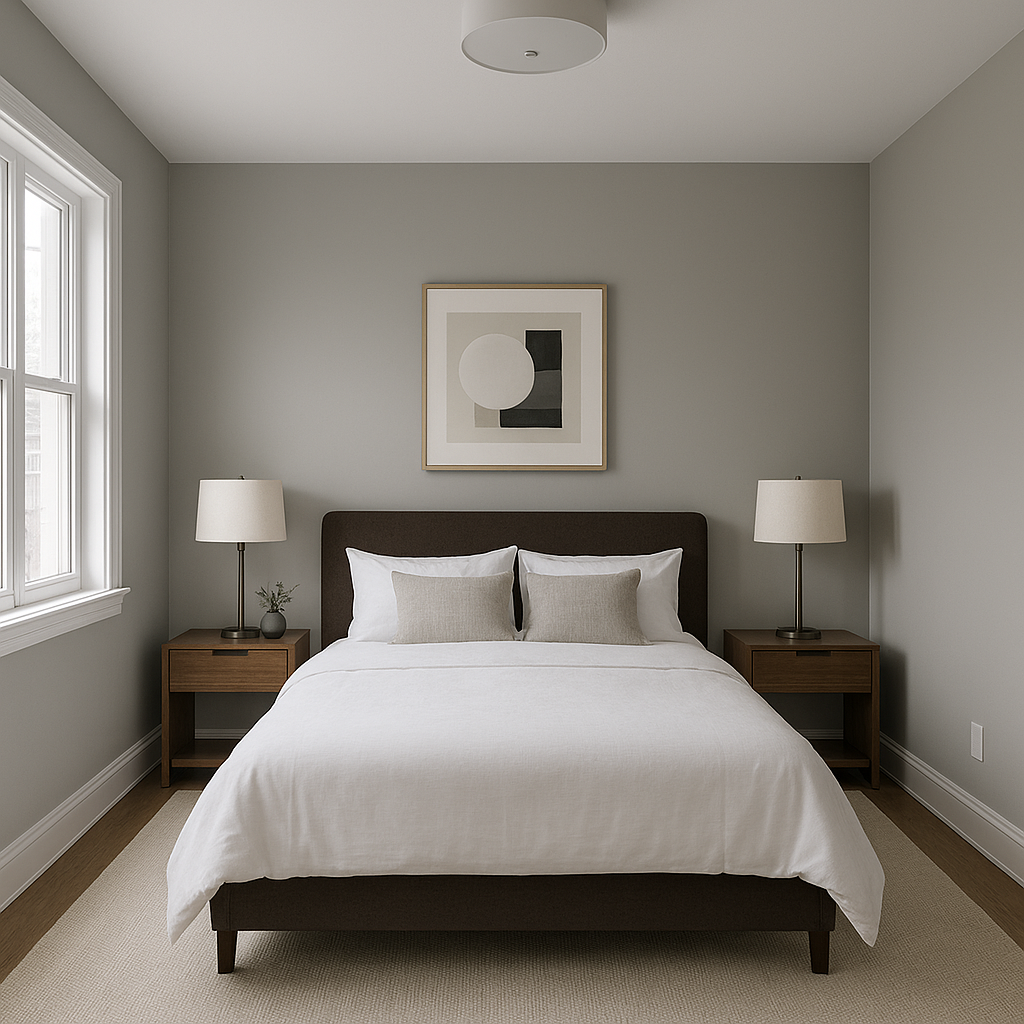
The calming blue undertones of Sterling make it an excellent choice for bedrooms. Use it to promote relaxation and serenity by combining it with layered neutrals, soft linens, and soothing accents like pale blues or muted greens.
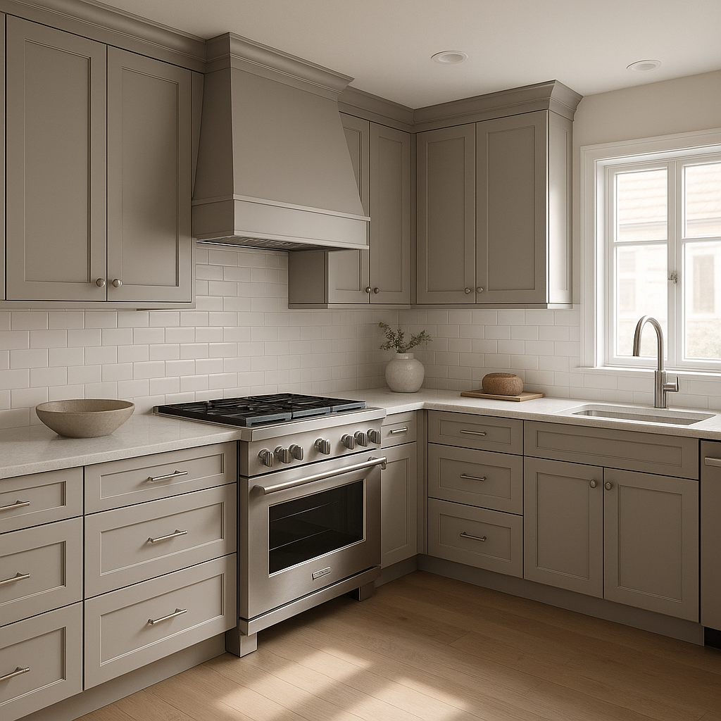
Sterling works wonderfully for kitchen cabinetry or walls, particularly in combination with crisp white countertops and stainless steel appliances. Add pops of navy or emerald green for a contemporary twist.
A bathroom painted in Sterling feels fresh and rejuvenating. Pair it with polished chrome fixtures and bright white accents for a spa-like escape.
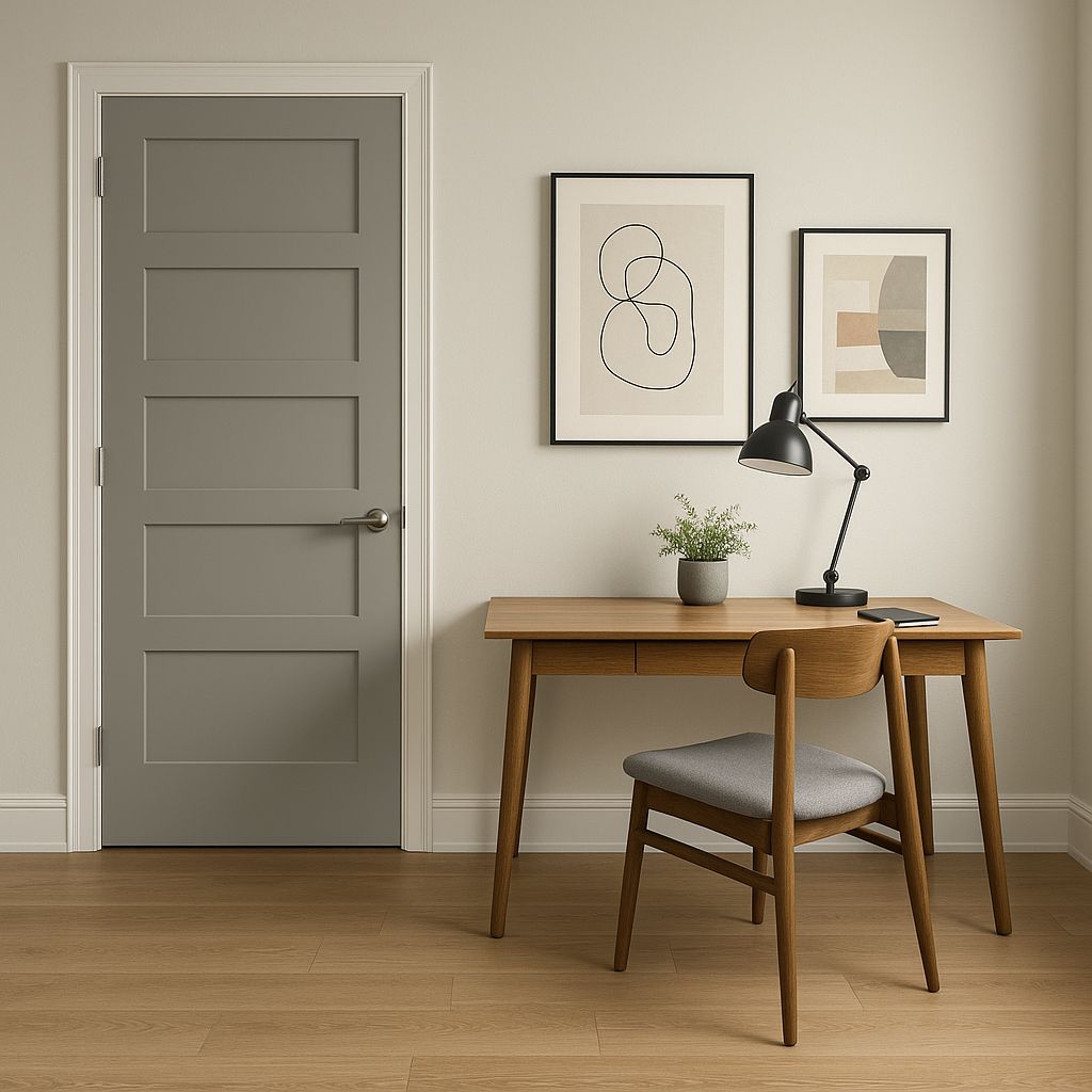
Sterling’s cool undertones create a focused and uncluttered environment, making it an excellent choice for home offices. Add warm wood finishes or contrasting dark hues for a balanced, productive space.
If you’re considering Sterling for an exterior project, its refined neutrality pairs beautifully with white trim and darker accent colors like charcoal or navy. It’s a timeless option for creating curb appeal that stands the test of time.
Because Benjamin Moore Sterling (1461) is a cool gray, it reacts differently to varying light sources. In rooms with abundant natural light, the blue undertones may stand out, creating a fresh and airy effect. In dimly lit spaces or under artificial lighting, the color may read as a more neutral gray, offering a sophisticated and subtle appearance.
Benjamin Moore Sterling (1461) is more than just a paint color—it’s a design tool that brings balance and elegance to any space. Its ability to adapt to different styles, lighting conditions, and color pairings makes it a perennial favorite among interior designers and homeowners alike. Whether you’re revamping a single room or reimagining your entire home, Sterling’s timeless appeal ensures it will remain a cherished part of your design palette for years to come.
View Colors Only by Brand (No Imagery):
Sherwin-Williams
|
Benjamin-Moore
|
Behr
|
Valspar
Live on the Eastern Slope of Colorado and looking for a local painting professional, check out all our painting services and reach out for a free estimate.
Copyright © 2026 : Wild Fox Painting Inc. : 12435 Mead Way, Littleton, CO 80125


