Benjamin Moore Nimbus (1465) is a sophisticated and versatile paint color that effortlessly bridges the gap between warm and cool tones. With its understated elegance and soft gray appearance, Nimbus is a favorite among interior designers for creating serene, balanced spaces. Whether you're refreshing a living room, updating a bedroom, or transforming a kitchen, this color is a go-to choice for homeowners seeking a refined yet approachable aesthetic.
Nimbus (1465) is a light-to-medium gray with subtle undertones that give it depth without overwhelming. It features a delicate hint of beige, which warms the color just enough to keep it from feeling stark or cold. At the same time, you’ll notice a whisper of blue that lends a refreshing, airy quality to the paint. These nuanced undertones make Nimbus highly adaptable—it plays well with both warm and cool palettes and adjusts beautifully under different lighting conditions.
In natural light, Nimbus tends to lean more beige or greige, while in artificial or cooler lighting, the faint blue undertones may become more apparent. This dynamic quality ensures that Nimbus can harmonize with a wide variety of design styles, from contemporary to coastal, traditional to transitional.
The versatility of Benjamin Moore Nimbus makes it a perfect partner for a wide range of coordinating colors. Here are some suggestions to help you achieve a cohesive and stunning design:
Trim Colors: Pair Nimbus with crisp whites like Benjamin Moore Chantilly Lace (OC-65) or Simply White (OC-117) for a clean, classic look. These whites provide contrast and highlight Nimbus’s soft gray tones beautifully.
Accent Colors: To create depth and interest, incorporate darker grays like Benjamin Moore Chelsea Gray (HC-168) or Kendall Charcoal (HC-166). For a pop of color, try muted blues like Wythe Blue (HC-143) or greens such as Guilford Green (HC-116).
Warm Tones: Nimbus’s beige undertones make it a natural pairing with creamy neutrals like Benjamin Moore Edgecomb Gray (HC-173) or taupe hues such as Revere Pewter (HC-172). These combinations evoke warmth and coziness.
Nimbus (1465) shines in a variety of spaces, thanks to its adaptable nature and calming presence. Here’s how you can use this color to elevate your interiors:
Nimbus’s neutral palette sets the stage for comfortable and inviting living areas. Pair it with soft furnishings, textured rugs, and warm woods for a modern farmhouse vibe, or combine it with sleek metals and bold art pieces for a contemporary aesthetic.
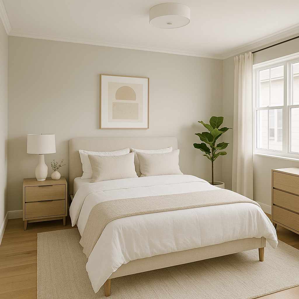
Create a tranquil retreat in your bedroom by using Nimbus as the main wall color. Its soothing tones promote relaxation, making it an excellent choice for a restful environment. Complement it with soft linens in whites and muted blues for a coastal-inspired look.
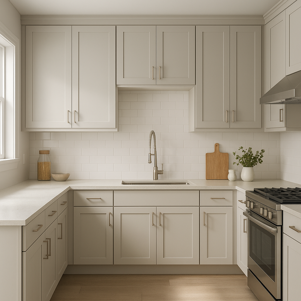
Nimbus works beautifully in kitchens, whether you’re going for a clean, minimalist design or a cozy, cottage-style space. Pair it with white cabinetry for a timeless combination or with darker, matte finishes for a bold yet sophisticated contrast.
Nimbus’s subtle gray is a fantastic choice for bathrooms, where it evokes a spa-like serenity. Coordinate it with white subway tiles, chrome fixtures, and natural stone for an upscale appearance.
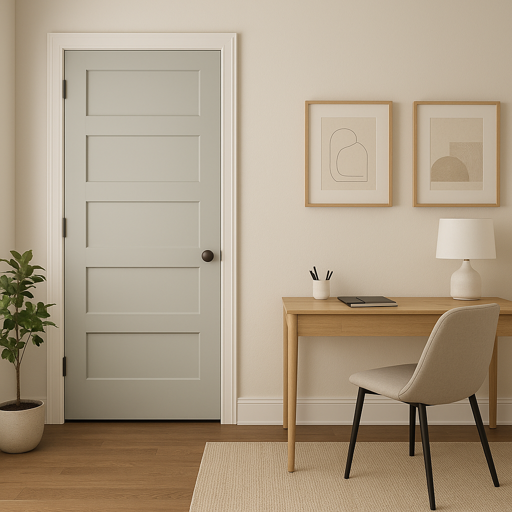
In home offices, Nimbus fosters a calm, focused atmosphere. Pair it with dark woods or industrial accents to create a productive yet stylish workspace.
While Benjamin Moore Nimbus is a highly adaptable color, lighting plays a crucial role in how it appears in your space. In rooms with ample natural light, Nimbus will lean toward its warmer beige undertones. In spaces with cooler artificial lighting, its blue-gray side may become more prominent. Test the color in different areas of your home and at various times of day to ensure it complements your lighting conditions perfectly.
Benjamin Moore Nimbus (1465) is a true standout when it comes to versatile neutral paint colors. Its balanced mix of warm and cool undertones makes it a designer favorite for achieving timeless elegance and effortless cohesion. Whether you’re refreshing a single room or redesigning your entire home, Nimbus adapts to your needs, bringing a sense of harmony and sophistication to any space.
Make your home feel inviting, calm, and beautifully curated with Benjamin Moore Nimbus—an exceptional gray that doesn’t just complement your walls but transforms your entire living experience.
View Colors Only by Brand (No Imagery):
Sherwin-Williams
|
Benjamin-Moore
|
Behr
|
Valspar
Live on the Eastern Slope of Colorado and looking for a local painting professional, check out all our painting services and reach out for a free estimate.
Copyright © 2026 : Wild Fox Painting Inc. : 12435 Mead Way, Littleton, CO 80125


