Benjamin Moore’s Porter (148) is a sophisticated neutral that strikes a harmonious balance between warm and cool tones. This versatile hue is a light gray-beige, often referred to as "greige," which makes it a perennial favorite among those seeking a timeless and elegant backdrop for their space. Its subtle charm lies in its ability to adapt to various lighting conditions and design styles, making it a go-to choice for both modern and traditional interiors.
Porter is a soft greige with faint green undertones that lend a sense of natural tranquility to the color. These green undertones are delicate and understated, meaning they won’t overpower your space but provide just enough depth to keep the color from feeling flat or sterile. Depending on the surrounding light, Porter may read slightly warmer in south-facing or afternoon light, while appearing cooler and crisper in north-facing rooms.
The balanced undertones make this shade incredibly versatile — it has the warmth to create a cozy environment without veering into beige territory and the coolness to maintain a modern, clean aesthetic without feeling stark.
Benjamin Moore Porter pairs beautifully with a variety of color palettes, allowing you to customize your space to your personal style. Here are some standout coordinating colors:
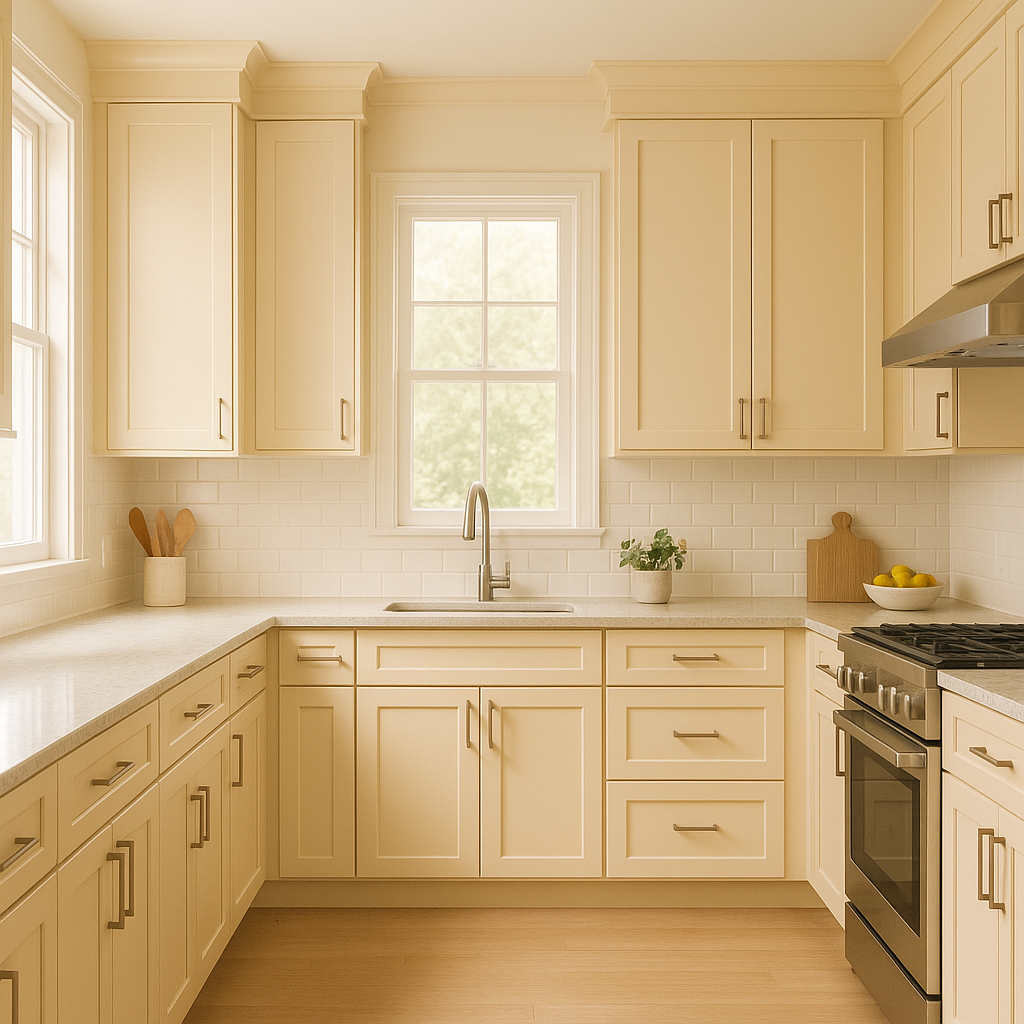
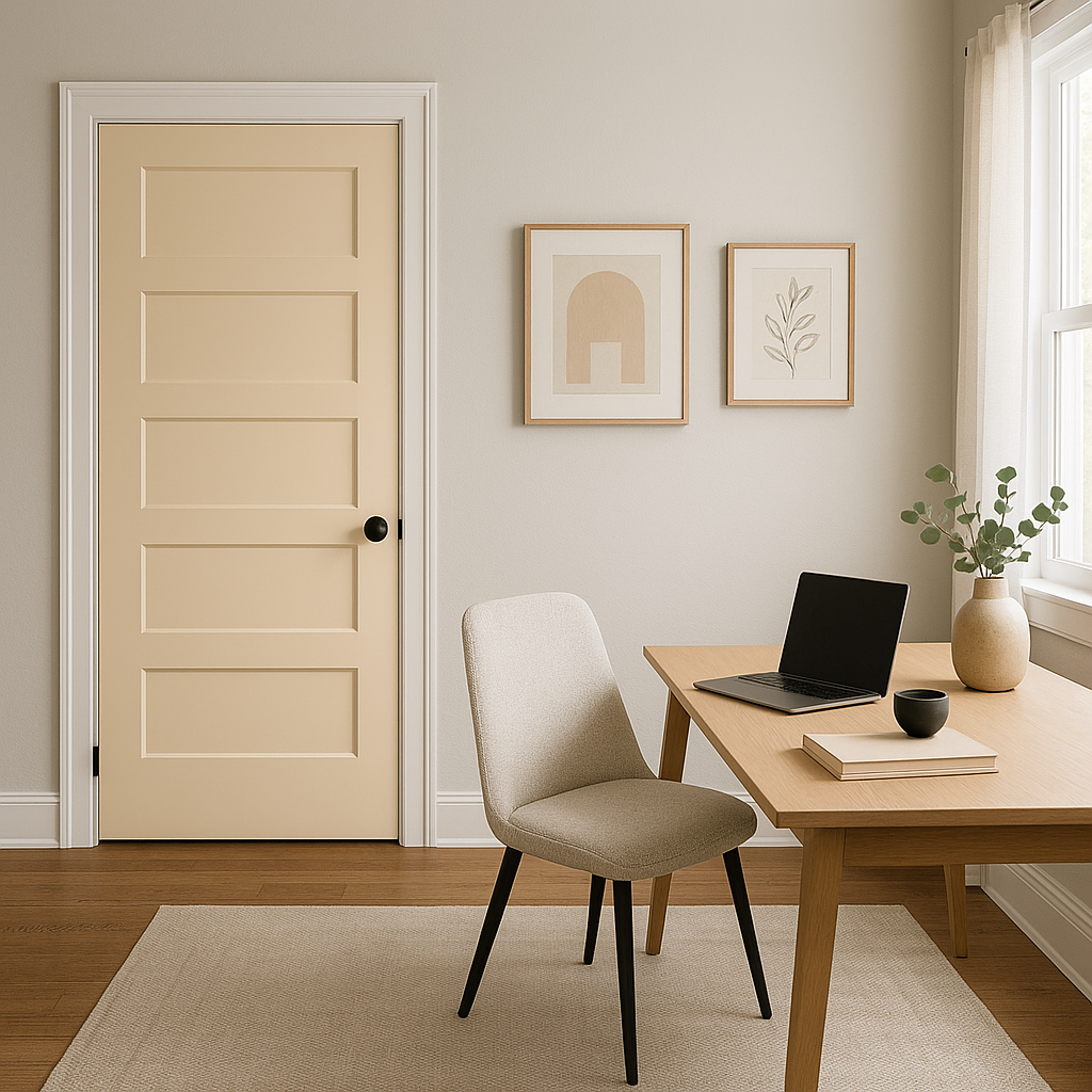
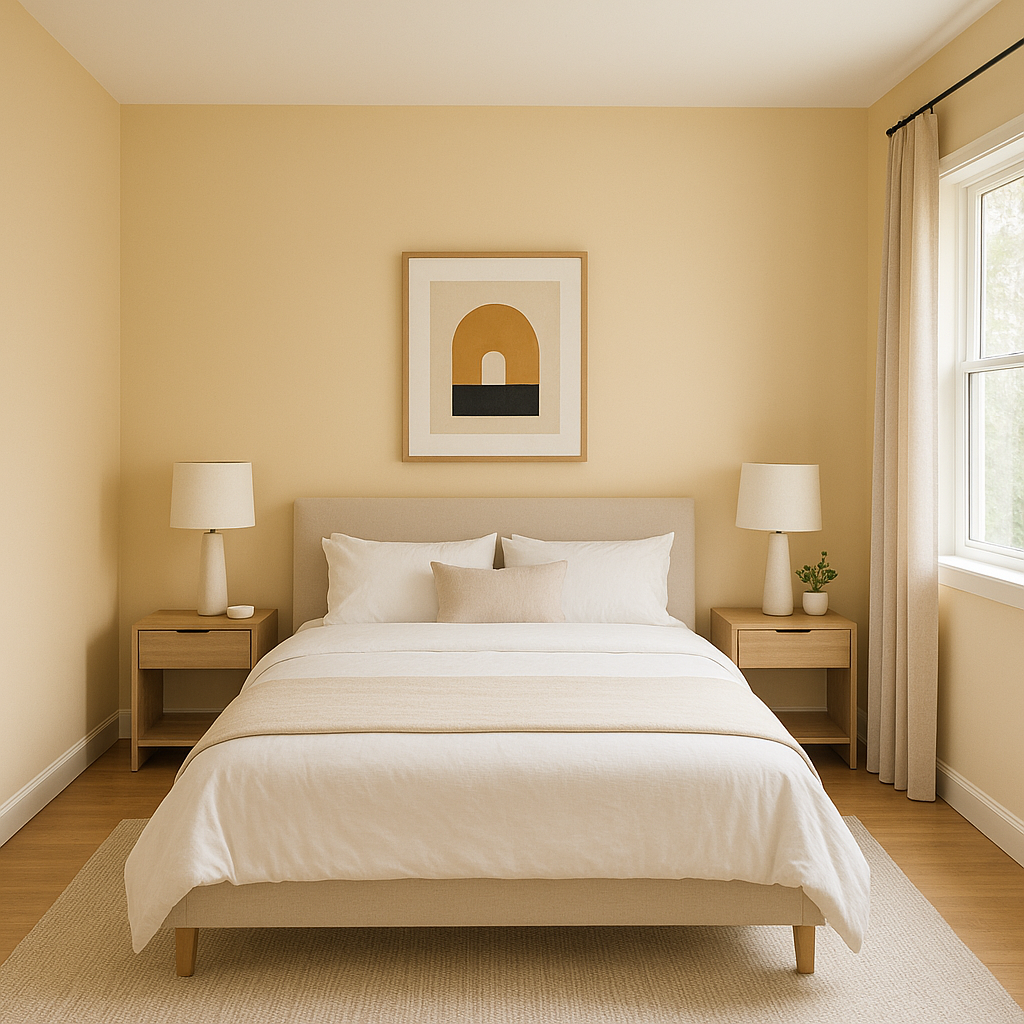
Benjamin Moore Porter is incredibly adaptable, making it suitable for nearly every room in your home. Here are some of the best applications for this versatile neutral:
As with any paint color, lighting plays a crucial role in how Porter appears in your space. In bright, natural light, the greige tones feel airy and light, while the green undertones add a hint of freshness. In lower light or artificial lighting, Porter can lean slightly warmer, creating a cozy and inviting ambiance. To ensure Porter works beautifully in your space, test it in different lighting conditions before committing to the color.
Porter’s versatility, understated elegance, and ability to complement a wide array of color palettes make it a standout choice for any design project. Whether you’re updating a single room or revamping your entire home, Porter provides a timeless foundation that will never go out of style. Its ability to harmonize with both warm and cool tones means it can adapt to your evolving décor preferences, ensuring it remains a favorite for years to come.
View Colors Only by Brand (No Imagery):
Sherwin-Williams
|
Benjamin-Moore
|
Behr
|
Valspar
Live on the Eastern Slope of Colorado and looking for a local painting professional, check out all our painting services and reach out for a free estimate.
Copyright © 2026 : Wild Fox Painting Inc. : 12435 Mead Way, Littleton, CO 80125


