Benjamin Moore Ashwood (1484) is a soft, understated neutral that exudes timeless elegance and versatility. This sophisticated hue is a blend of gentle beige and taupe, providing a warm and inviting backdrop for a variety of interior styles. Whether you're designing a cozy living room, a serene bedroom, or a polished office space, Ashwood's subtle charm makes it an excellent choice for creating a harmonious and welcoming atmosphere.
One of the standout features of Ashwood is its delicate undertones. This hue carries a balanced mix of warm beige and soft gray, giving it a taupe-like quality. Depending on the lighting and surrounding colors, Ashwood may lean slightly warmer or cooler, making it a highly adaptable shade. In north-facing rooms or spaces with cooler light, you may notice more of its gray undertones, while in south-facing rooms with warm natural light, the beige warmth will take center stage.
This chameleon-like quality allows Ashwood to complement a wide range of design aesthetics, from classic and traditional to modern and minimalist. It’s a color that feels neutral without being flat, adding a touch of depth and sophistication to your interiors.
Benjamin Moore Ashwood is incredibly versatile when it comes to pairing with other colors. Its neutral base allows it to harmonize beautifully with a variety of hues, whether you’re looking to create contrast or a tone-on-tone look.
To create a seamless, monochromatic palette, pair Ashwood with other soothing neutrals. Consider:
For a pop of color to enhance your space, Ashwood pairs well with bolder or richer hues. Consider:
The subtle elegance of Benjamin Moore Ashwood makes it suitable for a variety of spaces and applications. Its warm, neutral tone ensures it feels welcoming yet polished, making it an ideal choice for both residential and commercial interiors.
Ashwood sets the perfect stage for a cozy yet refined living room. Pair it with plush furnishings in cream and beige tones for a soft, layered look, or add statement pieces like a navy sofa or a bold area rug for contrast.
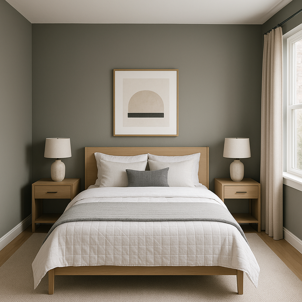
For a serene retreat, Ashwood provides a calming backdrop in bedrooms. Pair it with crisp white linens and natural wood accents for a peaceful, spa-like atmosphere.
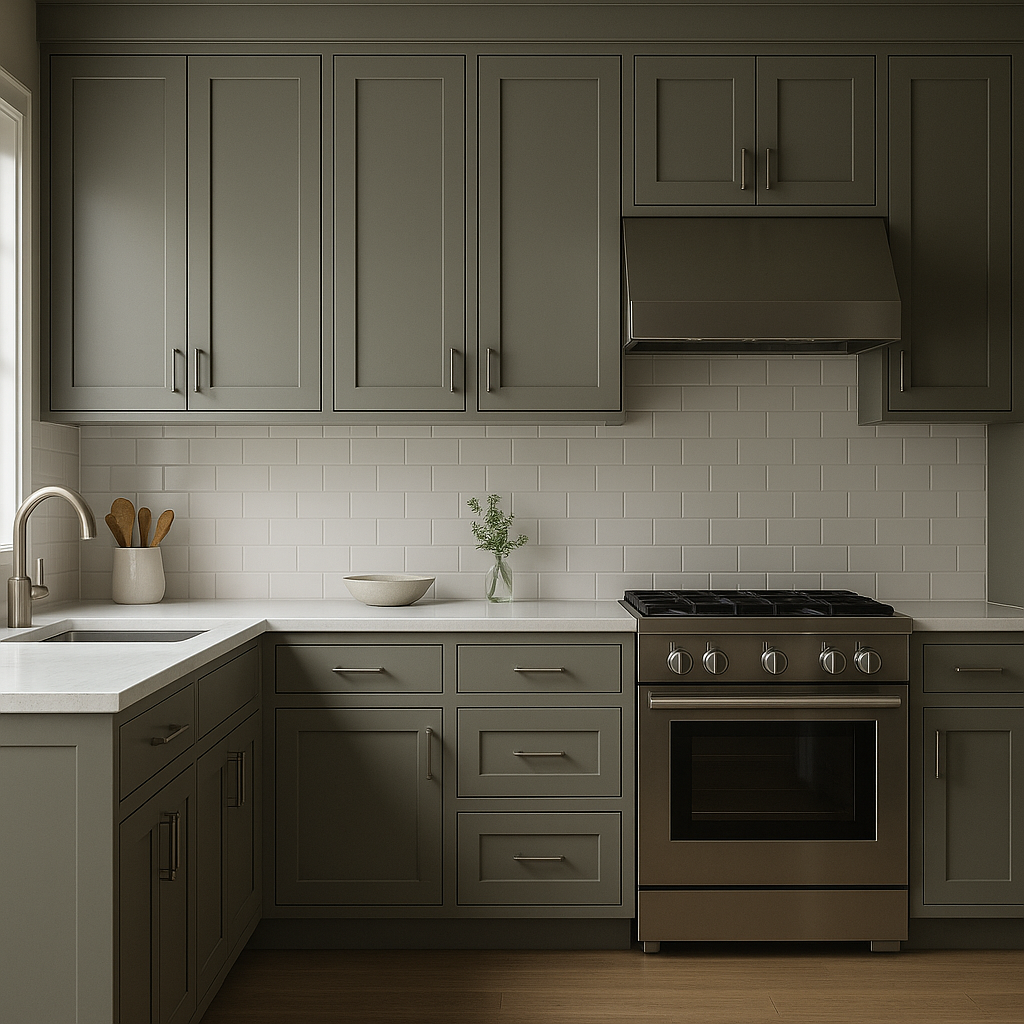
Ashwood works beautifully in kitchens and dining spaces, especially when paired with white cabinetry or marble countertops. Add metallic finishes like brushed gold or stainless steel for a modern touch.
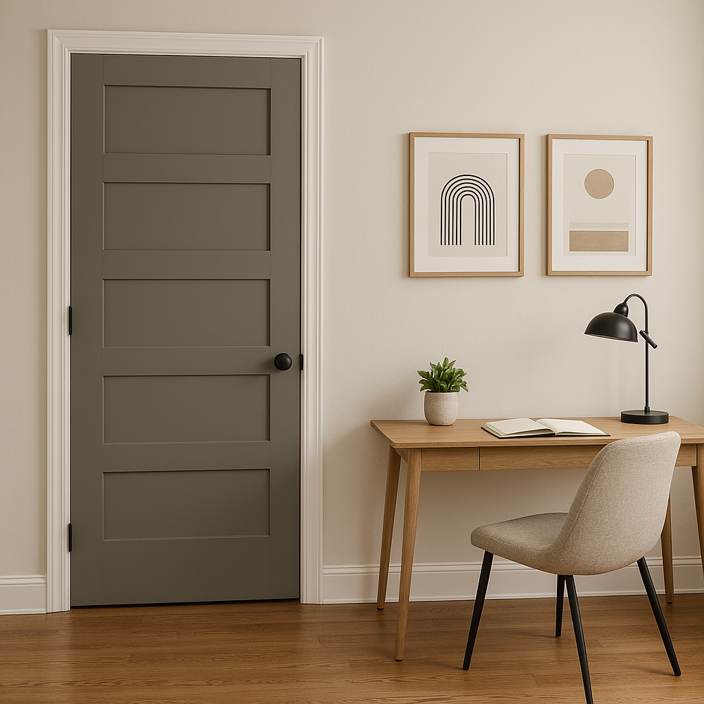
The neutral nature of Ashwood makes it a sophisticated choice for home offices or workspaces. It creates a clean, distraction-free environment while providing a hint of warmth.
As a transitional color, Ashwood is perfect for hallways and entryways, where it creates a smooth flow between different rooms and color schemes.
Benjamin Moore Ashwood (1484) is the epitome of understated elegance. Its warm taupe undertones, ability to adapt to different lighting conditions, and compatibility with a wide range of coordinating colors make it a top choice for designers and homeowners alike. Whether you're refreshing a single room or transforming your entire home, Ashwood provides a timeless, sophisticated foundation for your design vision.
View Colors Only by Brand (No Imagery):
Sherwin-Williams
|
Benjamin-Moore
|
Behr
|
Valspar
Live on the Eastern Slope of Colorado and looking for a local painting professional, check out all our painting services and reach out for a free estimate.
Copyright © 2026 : Wild Fox Painting Inc. : 12435 Mead Way, Littleton, CO 80125


