Benjamin Moore Sebring (1492) is a captivating shade that effortlessly blends sophistication and tranquility, making it a favorite choice for interiors that exude timeless charm. This soft blue-green color walks the line between earthy and airy, offering a serene backdrop that feels both contemporary and classic. Whether you're updating a single room or revitalizing your entire home, Sebring has the versatility to complement a variety of design aesthetics.
Sebring’s beauty lies in its subtle complexity. This hue leans toward a balanced mix of blue and green, with a slight gray undertone that tempers its vibrancy. The gray undertone ensures Sebring doesn’t feel overly bright or saturated, making it a calming and grounding choice. Because of its muted nature, it works well in both natural and artificial lighting, subtly shifting in tone throughout the day without losing its peaceful character.
Sebring’s versatility makes it easy to pair with a variety of colors, whether you’re aiming for contrast or cohesion. Here are some curated suggestions for coordinating colors:
Sebring’s calm and understated elegance makes it suitable for a wide range of spaces. Here’s how you can incorporate this versatile shade into your home:
Sebring creates a cozy yet refined atmosphere, making it a great choice for living rooms. Pair it with neutral furniture and natural textures like linen or jute for a relaxed, coastal-inspired look. Add a statement rug or throw pillows in complementary shades like navy or soft beige to tie the space together.
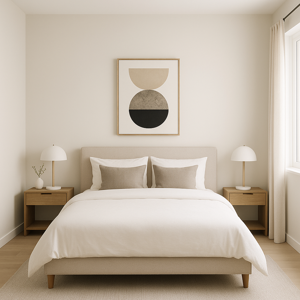
In bedrooms, Sebring fosters a tranquil retreat. It works beautifully as a wall color paired with crisp white bedding and light wood furniture. For extra depth, consider adding pops of metallic finishes—like brushed brass or matte black—in your lighting and hardware.
Sebring transforms bathrooms into spa-like sanctuaries. Its cool, refreshing tones work seamlessly with white subway tiles, marble countertops, or polished nickel fixtures. Add greenery, such as a small potted plant, to enhance the natural vibe.
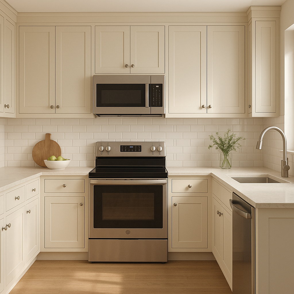
In kitchens, Sebring feels fresh and inviting. Use it on cabinetry for a modern farmhouse aesthetic, or as an accent wall to bring subtle color to a neutral space. Pair it with white quartz countertops and warm wood floors for a balanced, timeless look.
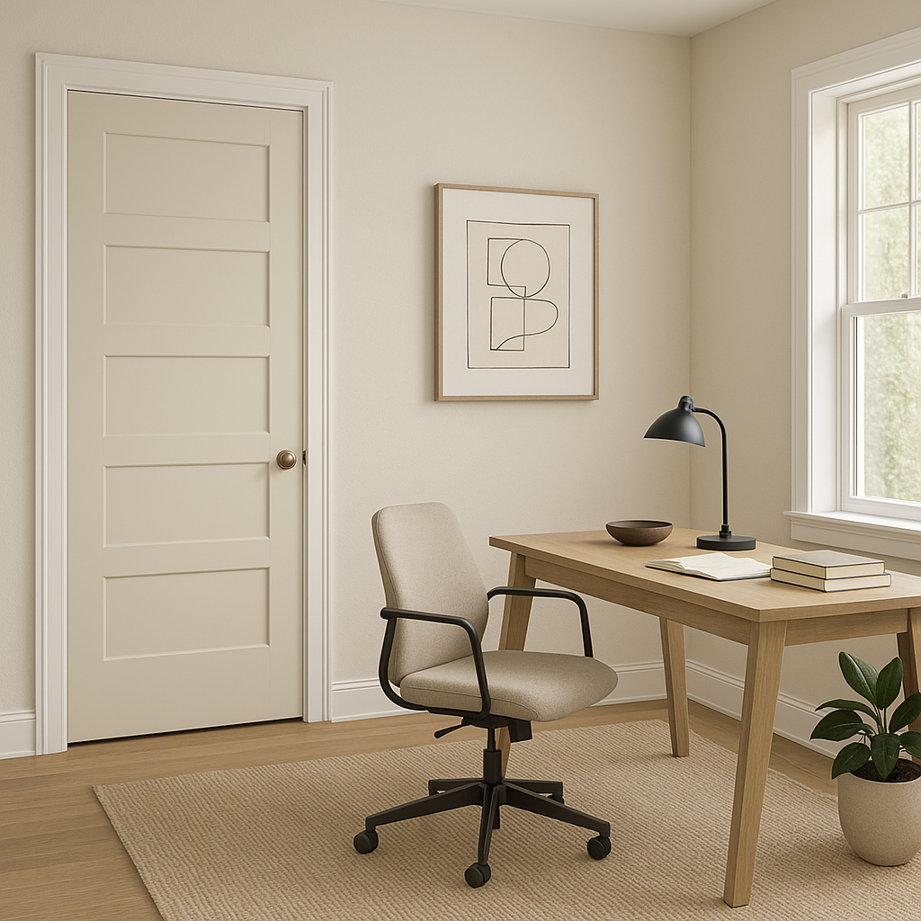
Sebring’s calming qualities make it an excellent choice for home offices. It promotes focus and relaxation, reducing stress while adding a touch of style. Pair it with clean-lined furniture and a mix of textures like leather and wood for a polished, professional feel.
Sebring (1492) is more than just a color—it’s an experience. Its balanced undertones and versatility make it adaptable to a wide range of styles, from minimalist and modern to cozy and traditional. Whether you’re looking to create a peaceful sanctuary or a polished space, Sebring provides the perfect canvas.
Transform your home with this serene blue-green hue and enjoy the timeless elegance it brings to every corner of your space.
View Colors Only by Brand (No Imagery):
Sherwin-Williams
|
Benjamin-Moore
|
Behr
|
Valspar
Live on the Eastern Slope of Colorado and looking for a local painting professional, check out all our painting services and reach out for a free estimate.
Copyright © 2026 : Wild Fox Painting Inc. : 12435 Mead Way, Littleton, CO 80125


