Benjamin Moore White (1499) is a timeless neutral paint color that brings an elegant simplicity to a variety of interior spaces. This shade is a true classic in every sense, offering a soft, creamy white tone that is neither stark nor overly warm. Its subtle sophistication allows it to blend seamlessly into both modern and traditional design aesthetics, making it a go-to choice for homeowners and designers alike. Whether you’re looking to create a serene retreat or a bright and inviting space, Benjamin Moore White (1499) delivers versatility and charm.
One of the standout features of Benjamin Moore White (1499) is its balanced undertones. This shade has a delicate mix of creamy and cool elements, making it a true neutral. The faint warmth ensures that it doesn’t feel sterile, while the soft coolness prevents it from leaning too yellow or beige. This balance of undertones makes it a universal favorite, perfect for spaces that require a harmonious backdrop.
Depending on the lighting conditions, Benjamin Moore White (1499) can take on slightly different characteristics. In bright, natural light, it feels crisp and clean, while in dim or artificial lighting, its creamy undertones add an inviting softness. This adaptability is one of the key reasons why it’s such a popular choice across homes and commercial environments.
Benjamin Moore White (1499) pairs beautifully with a wide array of colors, thanks to its neutral base. Here are some coordinating color suggestions:
Whether you’re working with muted tones or bold pops of color, Benjamin Moore White (1499) provides a foundation that enhances and complements surrounding hues.
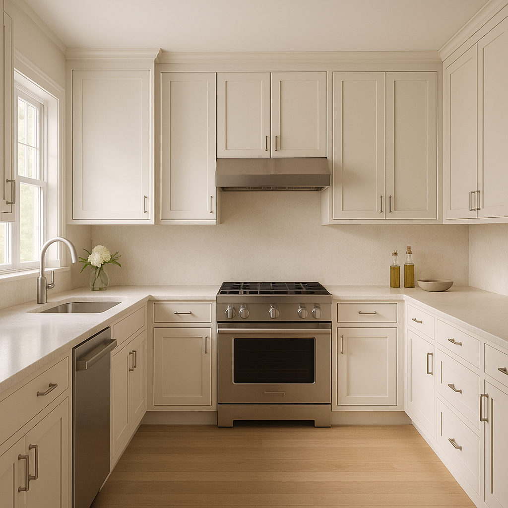
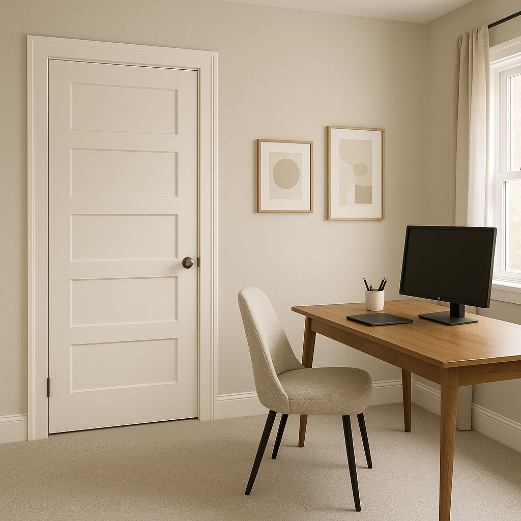
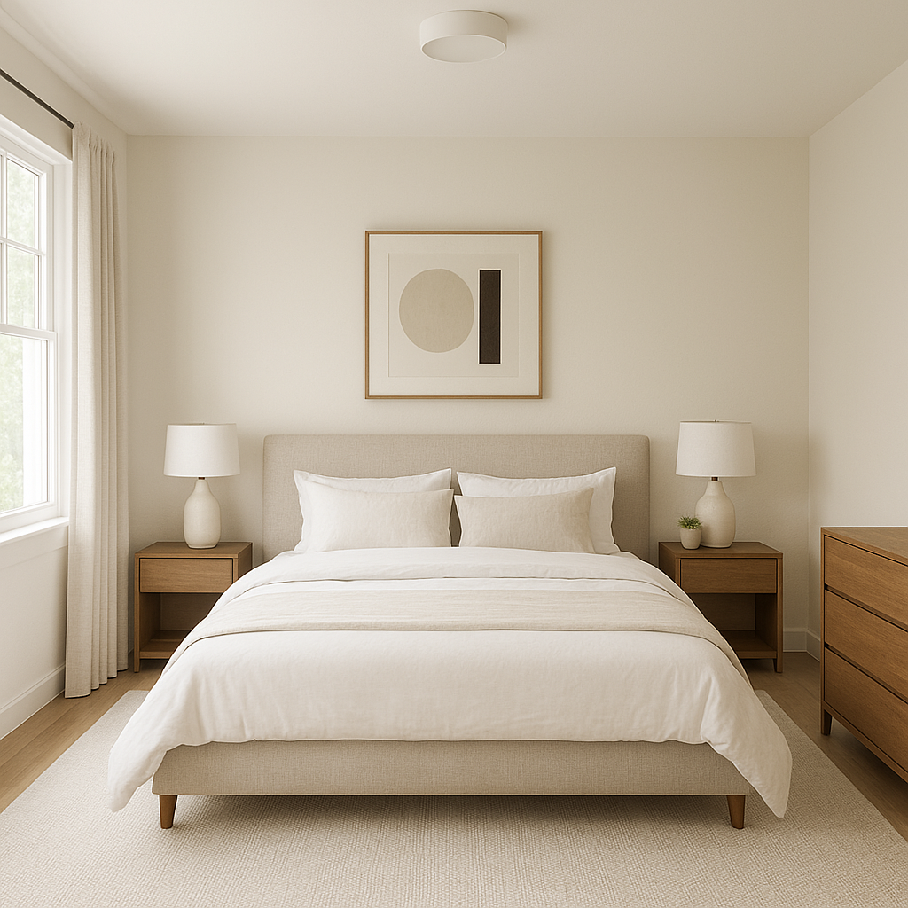
Benjamin Moore White (1499) is incredibly versatile and works beautifully across a range of applications. Here are some ideas to consider when incorporating this shade into your home or space:
One of the reasons Benjamin Moore White (1499) is so beloved is its ability to adapt to different design styles. It’s equally at home in:
Benjamin Moore White (1499) is a truly versatile paint color that brings balance, brightness, and beauty to any space. Whether used as a primary wall color, an accent shade, or a foundation for trim, its timeless appeal makes it a staple in interior design. Its ability to coordinate effortlessly with a variety of palettes ensures it will remain a favorite for years to come.
View Colors Only by Brand (No Imagery):
Sherwin-Williams
|
Benjamin-Moore
|
Behr
|
Valspar
Live on the Eastern Slope of Colorado and looking for a local painting professional, check out all our painting services and reach out for a free estimate.
Copyright © 2026 : Wild Fox Painting Inc. : 12435 Mead Way, Littleton, CO 80125


