Benjamin Moore Sweet (1500) is a soft, understated neutral that exudes tranquility and versatility. Its balanced mix of warm and cool tones makes it an exceptional choice for creating spaces that feel inviting, calm, and timeless. Sweet (1500) is part of Benjamin Moore’s Off-White Collection, a curated palette of sophisticated neutrals that lend themselves beautifully to both modern and traditional interiors.
Sweet (1500) is a light gray with subtle beige undertones, making it a “greige” hue that strikes the perfect balance between warm and cool. These undertones allow Sweet to adapt to various lighting conditions, appearing warmer in spaces with incandescent lighting and cooler in rooms with ample natural light. Its soft, muted quality prevents it from feeling stark or sterile, making it a comforting choice for homeowners who want a neutral color with dimension.
Benjamin Moore Sweet (1500) pairs seamlessly with a wide range of complementary colors. Its versatility allows it to act as a backdrop for both vibrant pops of color and other subdued tones. Here are some coordinating options:
Trim and Ceiling Colors: Pair Sweet with Benjamin Moore's White Dove (OC-17) or Chantilly Lace (OC-65) for crisp, clean trim and ceilings. These whites enhance the subtlety of Sweet’s undertones while maintaining a sophisticated, cohesive look.
Accent Colors: For a serene palette, complement Sweet with soft blues like Gray Cashmere (2138-60) or Sea Foam (2123-60). If you’re leaning toward warmer accents, try pairing it with earthy tones such as Revere Pewter (HC-172) or Kendall Charcoal (HC-166).
Bold Contrasts: Sweet also works beautifully with jewel tones and deeper hues. Consider pairing it with rich navy shades like Hale Navy (HC-154) or emerald greens to create dramatic contrast while maintaining balance.
Benjamin Moore Sweet (1500) is incredibly versatile, making it suitable for nearly any area of your home. Whether you’re designing a contemporary space or refreshing a traditional room, Sweet provides a neutral foundation that adapts to your style.
Sweet is an excellent choice for living spaces where comfort and elegance are key. Its gentle gray-beige tone sets the stage for furniture and décor in a variety of colors, allowing you to easily update your design over time. Pair it with textured neutrals or rich wood tones for a layered and inviting look.
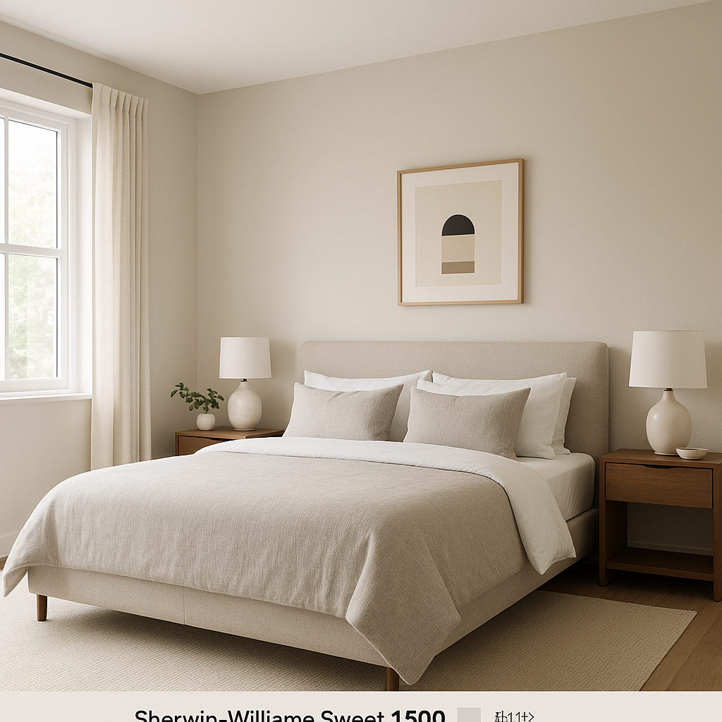
Create a restful retreat by using Sweet on bedroom walls. Its soft undertones are perfect for cultivating a serene atmosphere, especially when paired with cozy linens and soothing accent colors like lavender or powder blue.
Sweet shines in bathrooms, offering a clean yet warm aesthetic that works beautifully with crisp white tiles and chrome or brushed nickel fixtures. Add pops of color with towels and accessories to personalize the space.
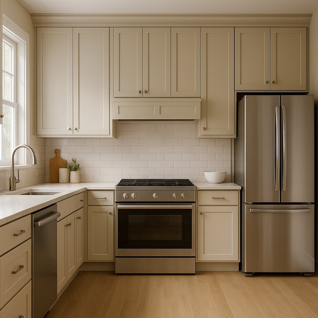
In the kitchen, Sweet (1500) serves as an excellent backdrop for cabinetry, countertops, and backsplashes. Pair it with white or light gray cabinets for a monochromatic look, or contrast it with darker hues like charcoal or navy for added drama.
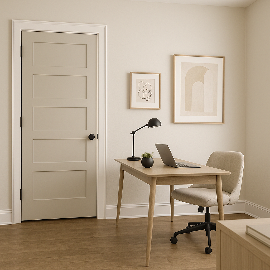
Sweet’s adaptability makes it a fantastic choice for transitional spaces such as hallways and entryways. It ties different rooms together effortlessly, providing a cohesive flow throughout your home.
Benjamin Moore Sweet (1500) is the epitome of understated elegance. Its ability to complement a wide array of colors and styles ensures it will remain timeless as trends evolve. Whether you’re designing a minimalist home or adding a touch of modern sophistication to a traditional space, Sweet delivers a neutral foundation that enhances every room. Its subtle warmth and soft gray undertones create a welcoming ambiance that makes your home feel effortlessly beautiful.
View Colors Only by Brand (No Imagery):
Sherwin-Williams
|
Benjamin-Moore
|
Behr
|
Valspar
Live on the Eastern Slope of Colorado and looking for a local painting professional, check out all our painting services and reach out for a free estimate.
Copyright © 2026 : Wild Fox Painting Inc. : 12435 Mead Way, Littleton, CO 80125


