Benjamin Moore Paris (1501) is a sophisticated and understated neutral that exudes timeless elegance. This soft, muted gray is a versatile choice for interior spaces, balancing warmth and coolness effortlessly. Its ability to adapt to various lighting conditions and design styles makes it a favorite among homeowners and interior designers alike. Whether you're aiming for a serene retreat or a polished contemporary space, Paris delivers a rich yet subtle aesthetic that feels both modern and classic.
Paris (1501) is a mid-tone gray with gentle green undertones, giving it a slightly earthy quality without overwhelming the overall hue. These green undertones lend the color a sense of depth and complexity, ensuring it doesn’t feel flat or sterile. The undertones are subtle enough to maintain neutrality, making Paris a refined choice for spaces where versatility is key. In cooler lighting conditions, the green undertones may become more pronounced, while warmer lighting will emphasize the gray's softer, warmer side.
Benjamin Moore Paris (1501) pairs beautifully with a range of complementary shades, allowing you to create harmonious color palettes that suit different moods and styles. Here are some coordinating colors to inspire your design:
Paris (1501) is incredibly versatile, making it suitable for a wide variety of spaces and design applications. Here are some of the best uses for this beautiful neutral:
Paris creates a calming backdrop in living rooms, allowing furniture, artwork, and textiles to stand out. Its understated elegance works well in modern spaces filled with sleek furniture or in traditional settings with ornate decor. Pair it with metallic accents like gold or brushed nickel for an elevated look.
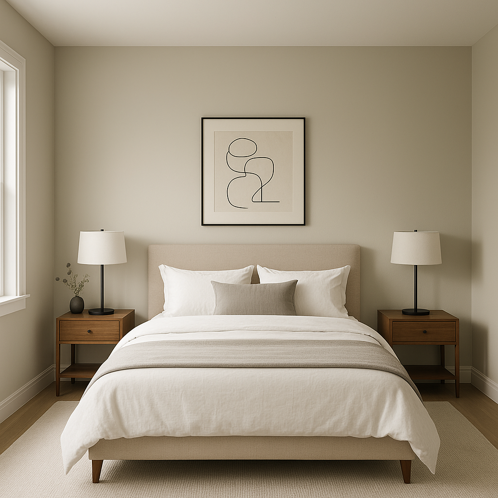
The soothing and balanced nature of Paris makes it an ideal choice for bedrooms. Its subtle green undertones evoke a sense of tranquility, helping you create a restful retreat. Layer it with soft linens in white or pale blue for a spa-like atmosphere.
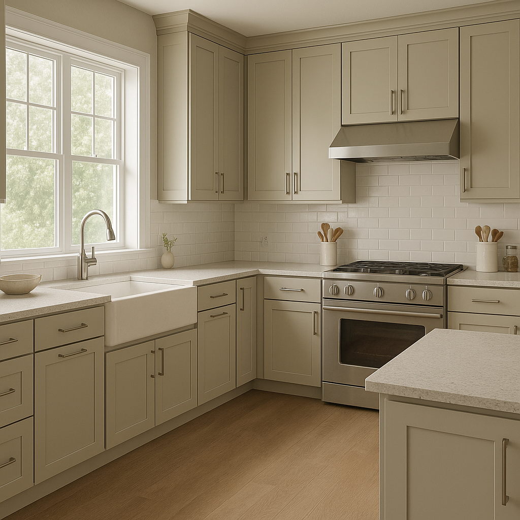
Paris is a refined choice for kitchens and dining areas, where it can complement cabinetry in white, charcoal, or even natural wood tones. The hint of green undertones pairs beautifully with organic materials like marble countertops or wooden dining tables, adding a subtle yet sophisticated touch.
This neutral gray is perfect for bathrooms, offering a clean and serene aesthetic. Pair it with white subway tiles, chrome fixtures, and lush greenery to create a spa-inspired oasis.
Paris promotes focus and calm, making it an excellent option for home offices. Its soft, neutral tone provides a productive environment while allowing you to incorporate bold or colorful accents.
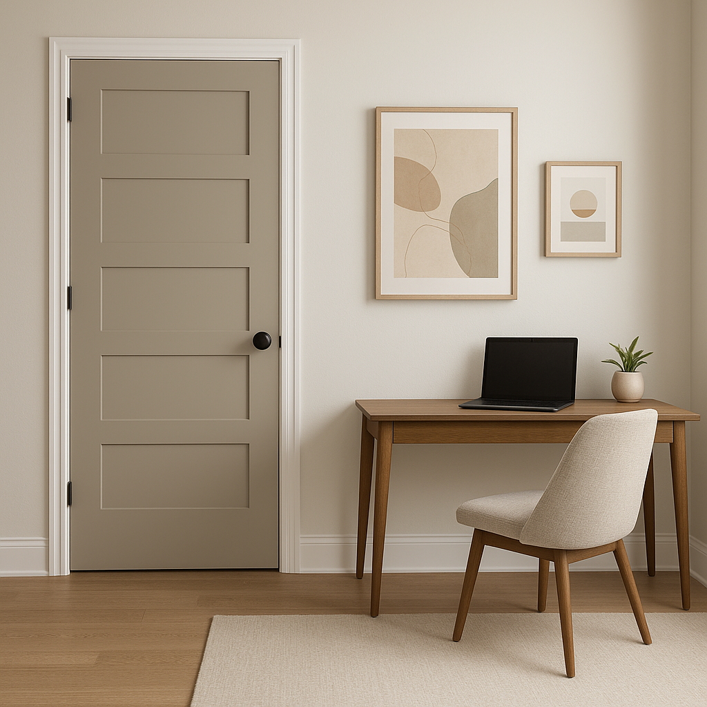
In transitional spaces like hallways or entryways, Paris serves as a welcoming and understated choice. Its adaptability ensures that it connects seamlessly to adjoining rooms with varied color palettes.
Lighting plays a crucial role in how Paris (1501) appears in your space. In rooms with ample natural light, Paris will lean toward its softer gray tones, creating a light and airy feel. In spaces with limited or artificial lighting, the green undertones may become more noticeable, lending the room a slightly earthy, grounded vibe. Be sure to test the color in your room under different lighting conditions to ensure it achieves the desired effect.
Benjamin Moore Paris (1501) is more than just a neutral gray—it’s a versatile canvas that can transform your space into a haven of timeless elegance. Whether you're designing a modern minimalist interior or a cozy traditional home, this beautiful shade adapts effortlessly, proving that understated colors can make a powerful impact.
View Colors Only by Brand (No Imagery):
Sherwin-Williams
|
Benjamin-Moore
|
Behr
|
Valspar
Live on the Eastern Slope of Colorado and looking for a local painting professional, check out all our painting services and reach out for a free estimate.
Copyright © 2026 : Wild Fox Painting Inc. : 12435 Mead Way, Littleton, CO 80125


