Benjamin Moore Texas (1503) is a sophisticated and versatile warm neutral that strikes a harmonious balance between beige and greige. Its understated elegance makes it a favorite among interior designers seeking a color that exudes warmth while remaining adaptable to various design styles, from transitional to modern farmhouse. Whether you're refreshing a living room, creating a serene bedroom retreat, or updating a home office, Texas (1503) offers a timeless foundation for any space.
The beauty of Benjamin Moore Texas lies in its subtle undertones. This shade leans slightly warm, with gentle notes of taupe and beige that prevent it from feeling overly yellow or golden. At the same time, faint gray undertones balance the warmth, ensuring the color remains neutral and sophisticated. These undertones make Texas (1503) a versatile choice for rooms with varying lighting conditions. In natural light, the color can appear slightly lighter and warmer, while in artificial or cooler lighting, its gray undertones become more pronounced.
Pairing Benjamin Moore Texas (1503) with complementary colors can enhance its charm while creating a cohesive design palette. Here are some coordinating colors to consider:
These coordinating colors allow you to tailor your space's mood, whether you're aiming for a light and airy feel or a more grounded, dramatic aesthetic.
Benjamin Moore Texas (1503) is as adaptable as it is inviting, making it an excellent choice for a variety of interior applications. Below are some ideas for incorporating this color into your home:
Texas (1503) is the perfect backdrop for creating a cozy yet polished living area. Pair it with natural textures like linen, wood, and jute rugs to highlight its warmth, or combine it with metallic accents like brass or brushed gold for a more glamorous look.
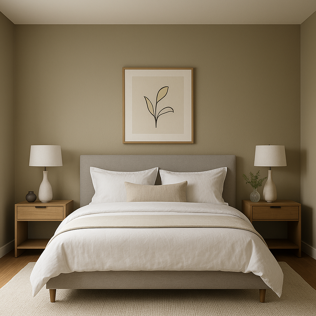
For a restful retreat, Texas (1503) works beautifully in bedrooms. Its calming undertones set the stage for relaxation, pairing well with soft textiles like plush duvets and layered curtains. Add pops of color with throw pillows or artwork in muted blues or greens for a serene atmosphere.
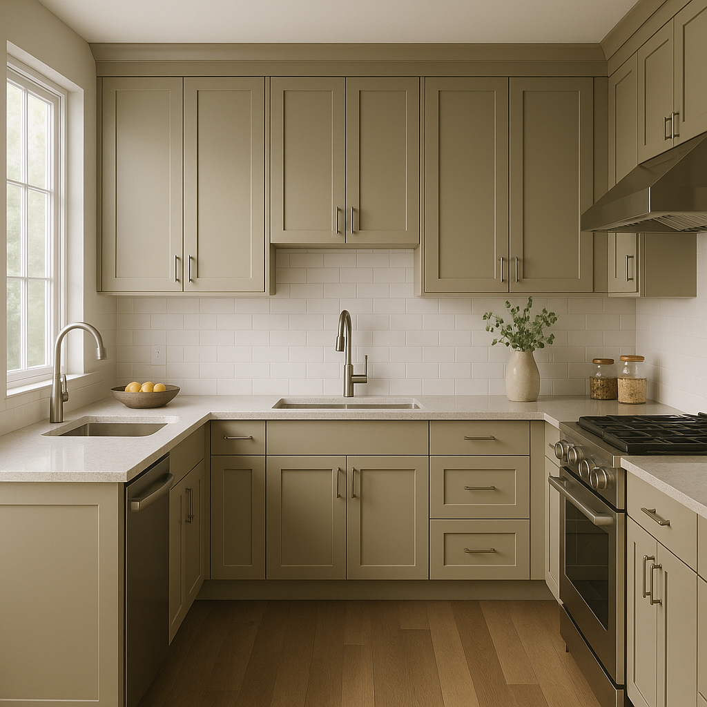
Warm neutrals like Texas (1503) are ideal for kitchens, especially when paired with crisp white cabinetry and subway tile backsplashes. Use darker accents, such as Chelsea Gray for island cabinetry or Hale Navy for barstools, to create visual interest.
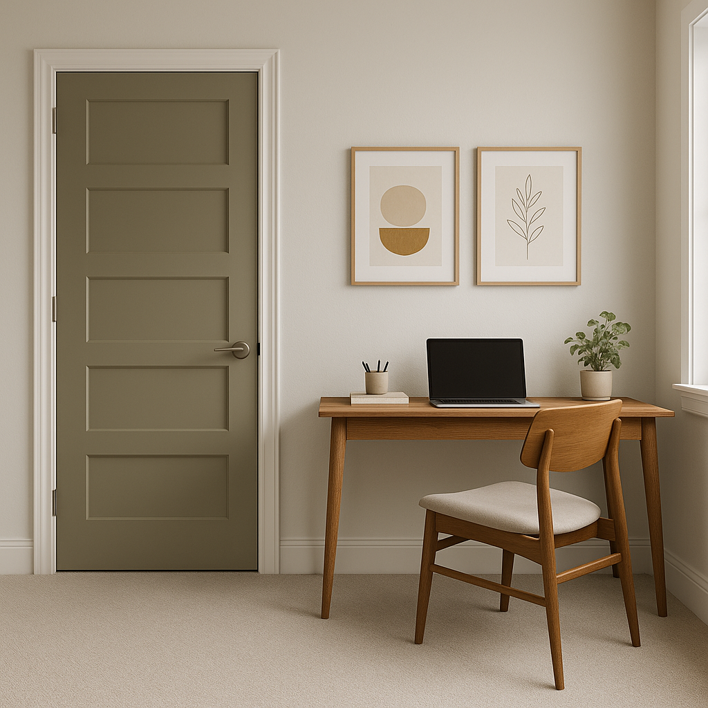
Texas (1503) encourages focus and calm, making it a great choice for a productive home office. Combine it with darker furniture tones and sleek black accents for a modern, professional vibe.
Create an inviting entrance with Texas (1503) as the main wall color. Its neutral tone allows you to experiment with bold accessories like patterned rugs, statement lighting, or even brightly colored artwork.
This warm neutral brings a spa-like quality to bathrooms, particularly when paired with marble countertops and polished chrome fixtures. Add greenery and soft towels for an elevated yet approachable look.
Texas (1503) is versatile, but like any paint color, lighting plays a significant role in how it appears. In spaces with ample natural light, the color may lean slightly warmer, while in rooms with cooler artificial lighting, its subtle gray undertones may become more evident. Testing a sample in your space at different times of day will help ensure it complements your room’s lighting conditions perfectly.
Benjamin Moore Texas (1503) is a timeless choice that adapts effortlessly to a wide range of design aesthetics. Its warm undertones create an inviting atmosphere, while its neutral base ensures it pairs beautifully with a variety of colors and finishes. Whether you’re designing a cozy family space or an elegant office, this shade is sure to bring balance, warmth, and understated sophistication to your home.
View Colors Only by Brand (No Imagery):
Sherwin-Williams
|
Benjamin-Moore
|
Behr
|
Valspar
Live on the Eastern Slope of Colorado and looking for a local painting professional, check out all our painting services and reach out for a free estimate.
Copyright © 2026 : Wild Fox Painting Inc. : 12435 Mead Way, Littleton, CO 80125


