Benjamin Moore Spring (1508) is a soft, refreshing green paint color that evokes the rejuvenating energy of nature. Its delicate hue is perfect for creating a serene and uplifting ambiance in any space. With a balanced blend of warm and cool tones, this versatile shade works beautifully in a variety of design styles, from traditional to contemporary. Spring (1508) invites the outdoors in, offering a subtle yet lively touch to your interiors.
Spring (1508) carries gentle yellow undertones, giving it a warm and sunny disposition. These undertones help the green feel natural and approachable, without veering too bold or overpowering. It’s a color that whispers sophistication while maintaining a cheerful vibrancy. The slight yellow influence ensures the hue remains grounded and adaptable, making it an excellent choice for spaces that need a hint of life and brightness.
Pairing Benjamin Moore Spring (1508) with complementary shades can elevate its charm and bring balance to your design. For a harmonious palette, consider:
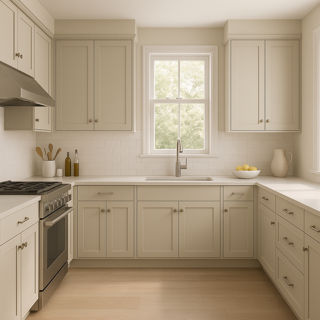
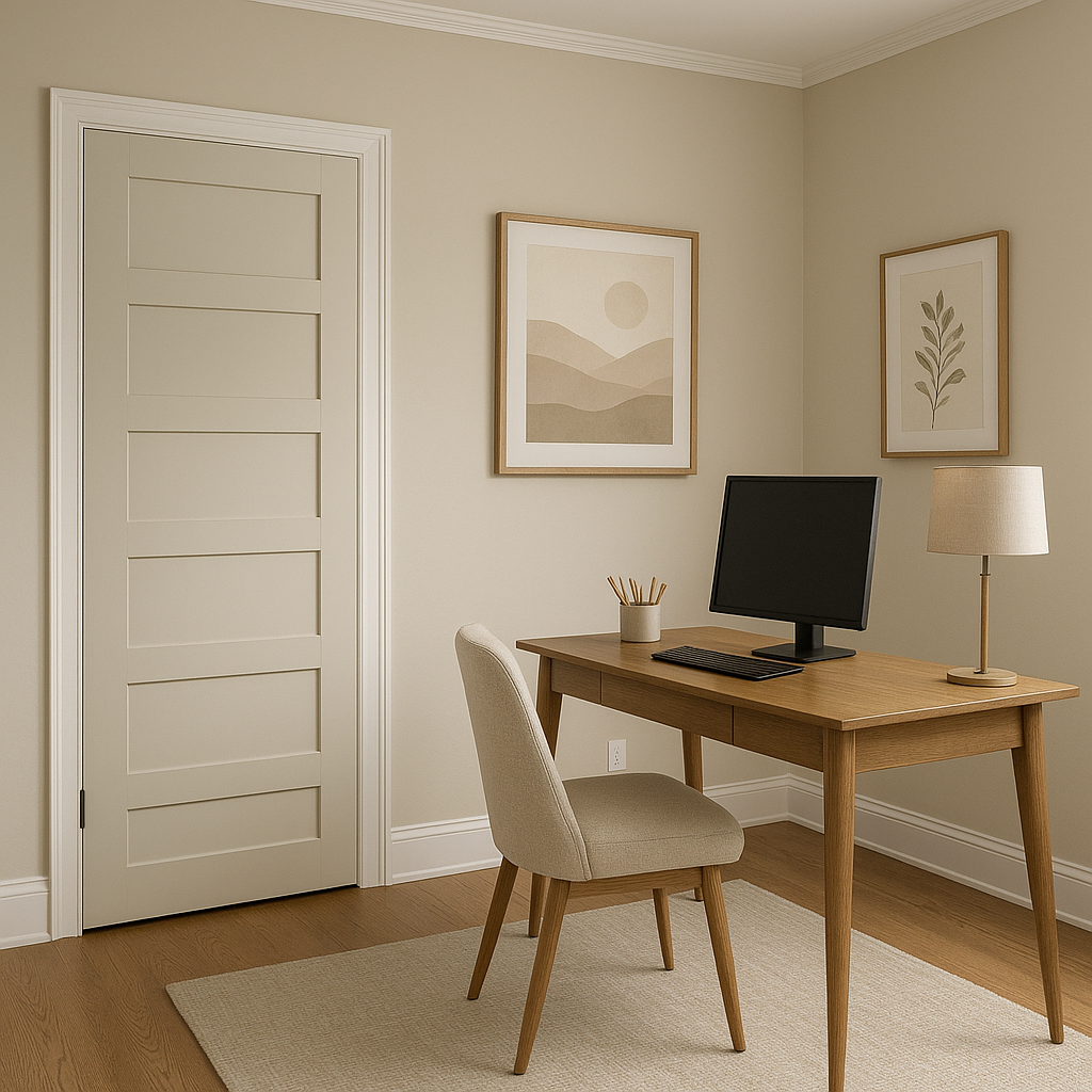
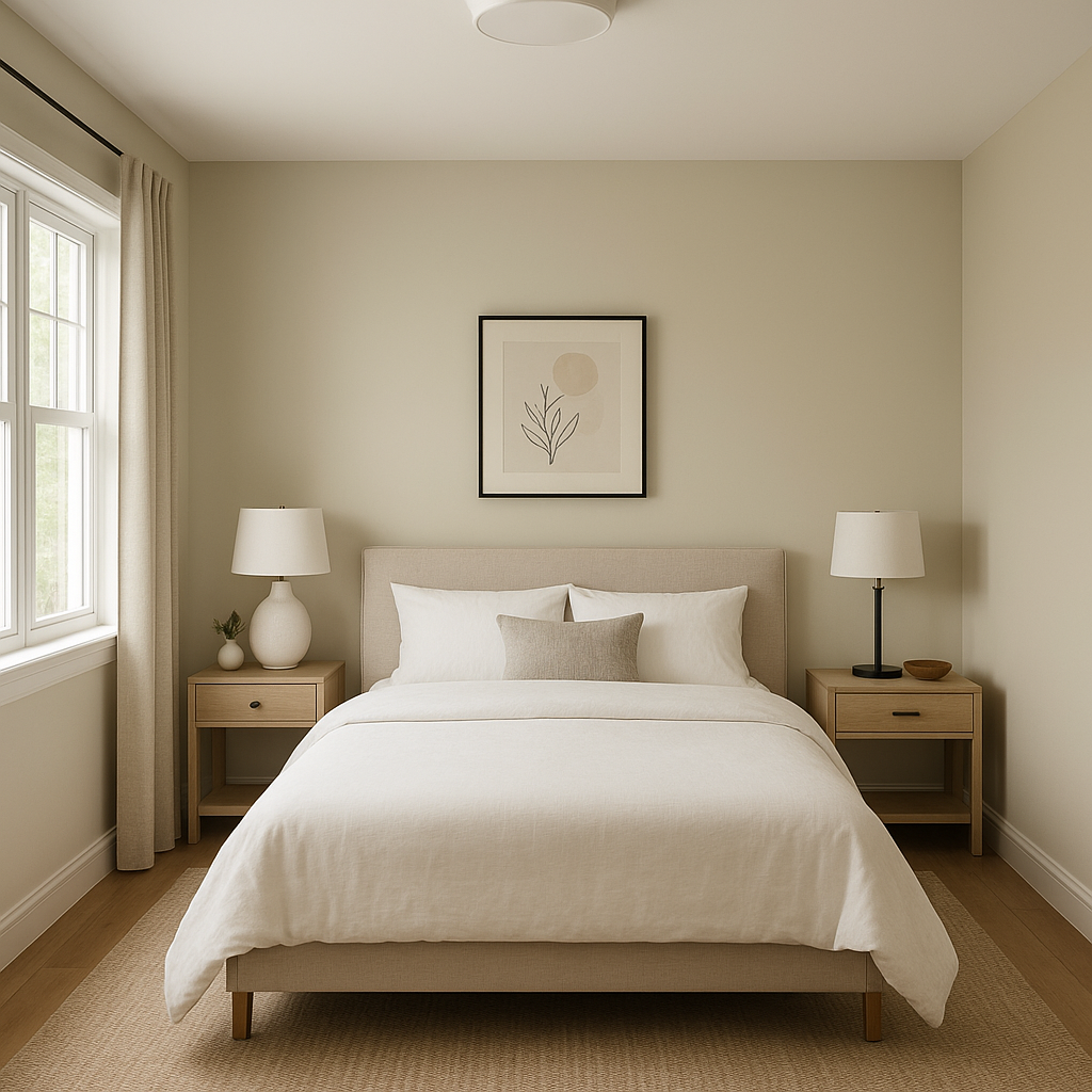
Spring (1508) is a versatile color that works exceptionally well in a variety of settings. Here are some popular applications:
Spring (1508) is ideal for homeowners and designers seeking a color that embodies renewal, harmony, and understated elegance. Its ability to adapt across various interior styles, along with its cheerful undertones, makes it a go-to choice for spaces needing a gentle touch of warmth and vitality. Whether used as a primary wall color or as an accent, Spring (1508) succeeds in elevating interiors with its natural, refreshing beauty.
Let Benjamin Moore Spring (1508) breathe life into your home, introducing a sense of renewal and comfort that resonates year-round.
View Colors Only by Brand (No Imagery):
Sherwin-Williams
|
Benjamin-Moore
|
Behr
|
Valspar
Live on the Eastern Slope of Colorado and looking for a local painting professional, check out all our painting services and reach out for a free estimate.
Copyright © 2026 : Wild Fox Painting Inc. : 12435 Mead Way, Littleton, CO 80125


