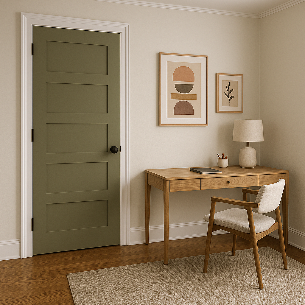
Benjamin Moore Pining 1512 is a timeless and refined shade of green that effortlessly bridges the gap between modern sophistication and natural serenity. This mid-tone green is characterized by its soft and muted quality, offering versatility that makes it a perfect choice for a variety of spaces. Whether you're looking to create a cozy retreat or add a touch of nature-inspired elegance to your home, Pining 1512 is a color that resonates with both balance and depth.
One of the standout features of Pining 1512 is its subtle undertones. This hue carries gentle gray undertones that give it a grounded and soothing quality, making it a more sophisticated alternative to brighter or more vibrant greens. The gray influence softens the green, ensuring it doesn’t overwhelm a space but rather complements it with an understated elegance.
At certain times of the day, the gray undertones may take center stage, giving the green a smoky, muted look. Under warmer lighting, however, the green's natural richness shines through, lending the room a cozy and inviting feel. This chameleon-like nature makes Pining 1512 a highly adaptable choice for both traditional and contemporary interiors.
Benjamin Moore Pining 1512 pairs beautifully with a wide range of colors, allowing you to create a harmonious color scheme tailored to your style. Here are some recommended coordinating colors to consider:
Creamy Whites and Off-Whites: Shades like Cloud White OC-130 or Simply White OC-117 work beautifully as trim or ceiling colors, creating a crisp, clean contrast that brightens the space.
Soft Greiges and Taupes: Colors like Revere Pewter HC-172 or Pale Oak OC-20 complement Pining 1512’s subtle gray undertones, resulting in a serene and cohesive palette.
Warm Neutrals: Add warmth with tones like Edgecomb Gray HC-173 or Abalone 2108-60. These hues enhance the green's natural softness and lend a grounded, earthy feel.
Darker Accent Colors: For a moodier, more dramatic look, consider pairing Pining 1512 with deeper hues like Kendall Charcoal HC-166 or Hale Navy HC-154. These rich tones add depth and contrast, making Pining 1512 pop.
Earthy Tones: Coordinate with warm, nature-inspired colors such as Terracotta Tile 2090-30 or Rustic Taupe 2110-50 for a palette rooted in organic beauty.
Pining 1512 is a flexible and versatile shade that works well in a variety of spaces, offering a tranquil and sophisticated vibe. Here are some ideas for incorporating this shade into your home:
Living Rooms: Create a warm and inviting space by using Pining 1512 on walls paired with light, neutral furnishings and natural wood accents. This shade evokes comfort and works well in both traditional and modern living rooms.
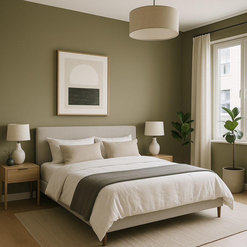
Bedrooms: The calming nature of Pining 1512 makes it an excellent choice for bedrooms. Pair it with soft linens in neutral tones and metallic accents for a serene, spa-like retreat.
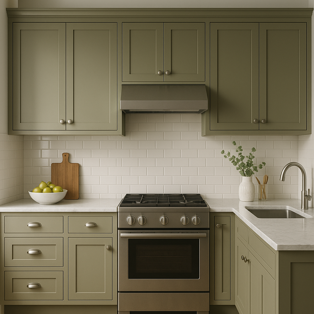
Kitchens and Dining Areas: For a fresh, organic look, use Pining 1512 in combination with white cabinetry and brass hardware. The green tone brings a natural element to the space while maintaining a polished feel.
Bathrooms: Pining 1512 works beautifully in bathrooms, especially when paired with white subway tiles and marble finishes. Its muted green tone adds a touch of sophistication and tranquility to small spaces.
**
View Colors Only by Brand (No Imagery):
Sherwin-Williams
|
Benjamin-Moore
|
Behr
|
Valspar
Live on the Eastern Slope of Colorado and looking for a local painting professional, check out all our painting services and reach out for a free estimate.
Copyright © 2026 : Wild Fox Painting Inc. : 12435 Mead Way, Littleton, CO 80125


