
Benjamin Moore Inner (1522) is a versatile and sophisticated neutral that exudes understated elegance. This soft taupe-gray hue strikes the perfect balance between warmth and coolness, making it an ideal choice for a variety of interior design styles. Whether you're looking to create a serene retreat, a polished modern space, or a cozy traditional room, Inner (1522) delivers a refined aesthetic that adapts effortlessly to its surroundings.
One of the standout features of Inner (1522) is its subtle taupe undertones. This complex hue leans more toward the warm side of the spectrum while maintaining a soft gray base. The delicate warmth of its undertones prevents the color from feeling too cold or stark, while the gray foundation adds sophistication and depth. The harmonious combination of taupe and gray gives Inner (1522) a timeless quality that complements both classic and contemporary interiors.
In natural light, Inner (1522) reveals its warm undertones, creating a cozy and inviting atmosphere. Under artificial or cooler lighting, the gray undertones become more pronounced, lending a slightly more modern and subdued feel. This color's chameleon-like quality makes it adaptable to different lighting conditions and settings.
When designing with Benjamin Moore Inner (1522), selecting coordinating colors is key to creating a cohesive and harmonious palette. Here are some excellent options to pair with this versatile neutral:
This color works beautifully with wood tones, from light oak to rich walnut, as well as metallic finishes like brushed brass, matte black, and polished nickel.
Benjamin Moore Inner (1522) is a versatile choice that can be used in virtually any room in your home. Its soft, neutral tone ensures it remains timeless and relevant, no matter how your design tastes evolve. Here are some of the best ways to incorporate this color into your space:
Inner (1522) creates a welcoming and tranquil backdrop for living spaces. Pair it with plush textiles, warm wood furniture, and layered lighting for a room that feels cozy yet refined. Consider using this shade on all walls for a seamless, enveloping effect, or pair it with a crisp white trim to highlight architectural details.
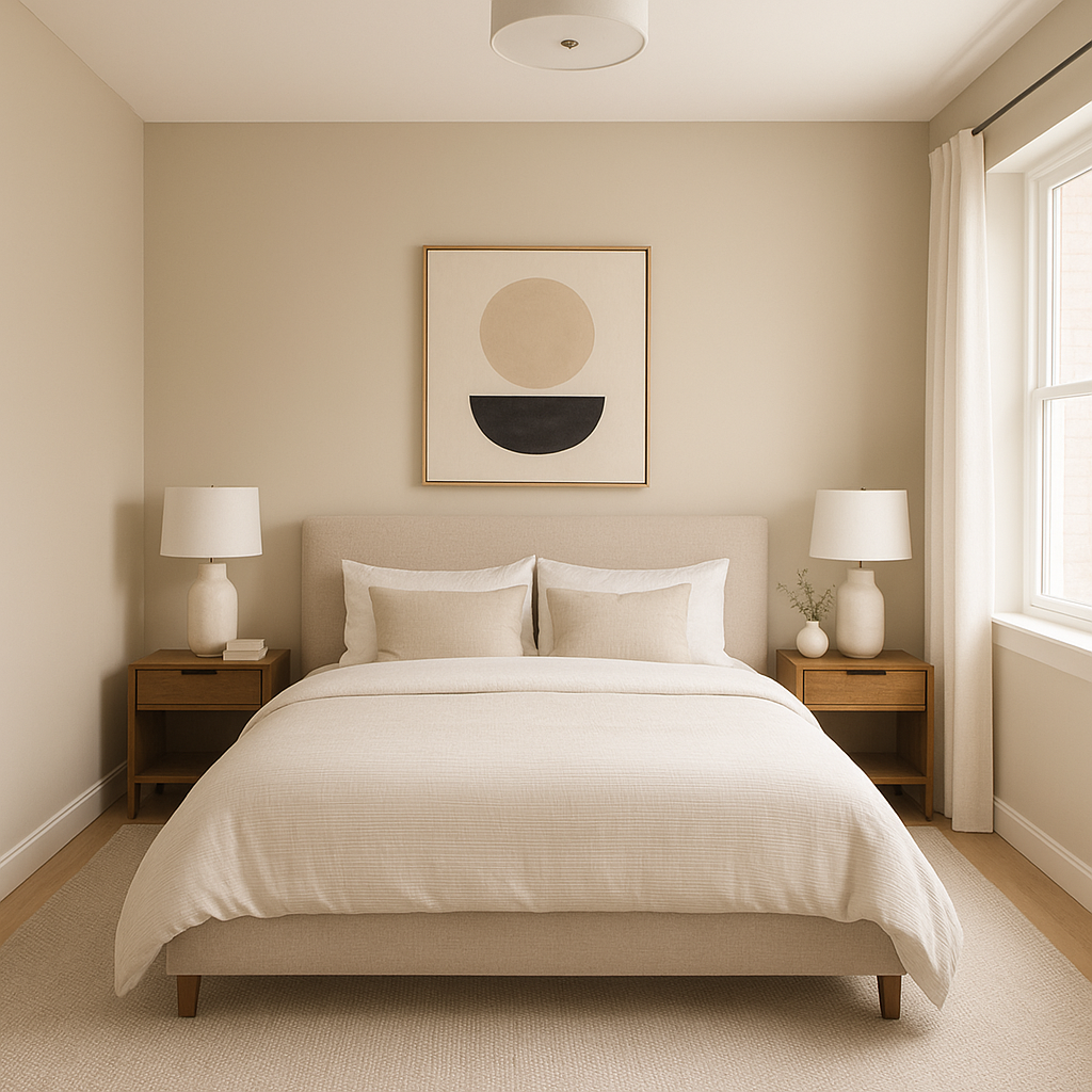
In bedrooms, Inner (1522) fosters a restful, serene environment. Its calming undertones make it an excellent choice for creating a retreat-like atmosphere. Pair it with soft, airy linens and muted accent colors, like blush pink or pale sage, for a soothing palette.
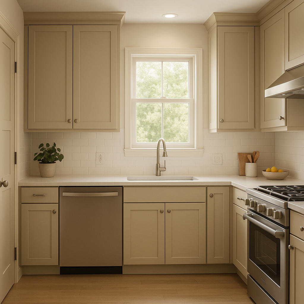
Inner (1522) is an elegant choice for kitchens and dining rooms. Its neutrality allows cabinetry, countertops, and decorative accents to shine. Pair it with white or gray cabinetry for a fresh, modern look, or add warmth with brass fixtures and natural wood finishes.
For home offices, Inner (1522) provides a sophisticated and professional backdrop. Its soft tone promotes focus and clarity while maintaining a warm, inviting feel. Add pops of darker, contrasting colors like charcoal or navy to create visual interest.
Inner (1522) is a wonderful option for bathrooms, especially when paired with white subway tiles, marble countertops, or chrome fixtures. The inherent warmth of its undertones brings a touch of comfort to otherwise stark spaces.
In transitional spaces like hallways and entryways, Inner (1522) serves as an elegant connector between rooms. Its neutral nature ensures it works harmoniously with adjoining colors, creating a smooth flow throughout your home.
Benjamin Moore Inner (1522) is more than just a neutral paint color; it’s a versatile design tool that enhances and elevates your space. Its taupe-gray undertones make it easy to pair with a variety of other colors, materials, and finishes, while its adaptability to lighting conditions ensures that it always looks chic and sophisticated. Whether you’re designing a modern, minimalist space or a traditional, cozy home, Inner (1522) is a timeless choice that delivers elegance and warmth.
View Colors Only by Brand (No Imagery):
Sherwin-Williams
|
Benjamin-Moore
|
Behr
|
Valspar
Live on the Eastern Slope of Colorado and looking for a local painting professional, check out all our painting services and reach out for a free estimate.
Copyright © 2026 : Wild Fox Painting Inc. : 12435 Mead Way, Littleton, CO 80125


