Benjamin Moore Going (1527) is an effortlessly chic and versatile neutral that exudes understated elegance. Falling within the beige family, this refined hue offers a soft, warm backdrop that complements a wide variety of design styles, from traditional to modern. Its adaptability, paired with its soothing undertones, makes it a favorite for homeowners and designers alike.
One of the most captivating aspects of Benjamin Moore Going (1527) is its delicate undertones. This shade leans towards a soft greige (gray-beige) with subtle warm notes that prevent it from feeling too cool or stark. The warmth in its undertone carries a hint of creamy beige, which ensures the color feels inviting and cozy, without overpowering a space.
The balanced undertones of Going make it a perfect choice if you're seeking a neutral that works seamlessly with both warm and cool palettes. Its versatility allows it to adapt to different lighting conditions, creating a warm glow in natural light and a more grounded, earthy tone in artificial lighting.
Benjamin Moore Going (1527) serves as a true team player when it comes to coordinating colors. Its neutral base allows it to pair beautifully with a wide range of hues. Here are some of the best options to consider:
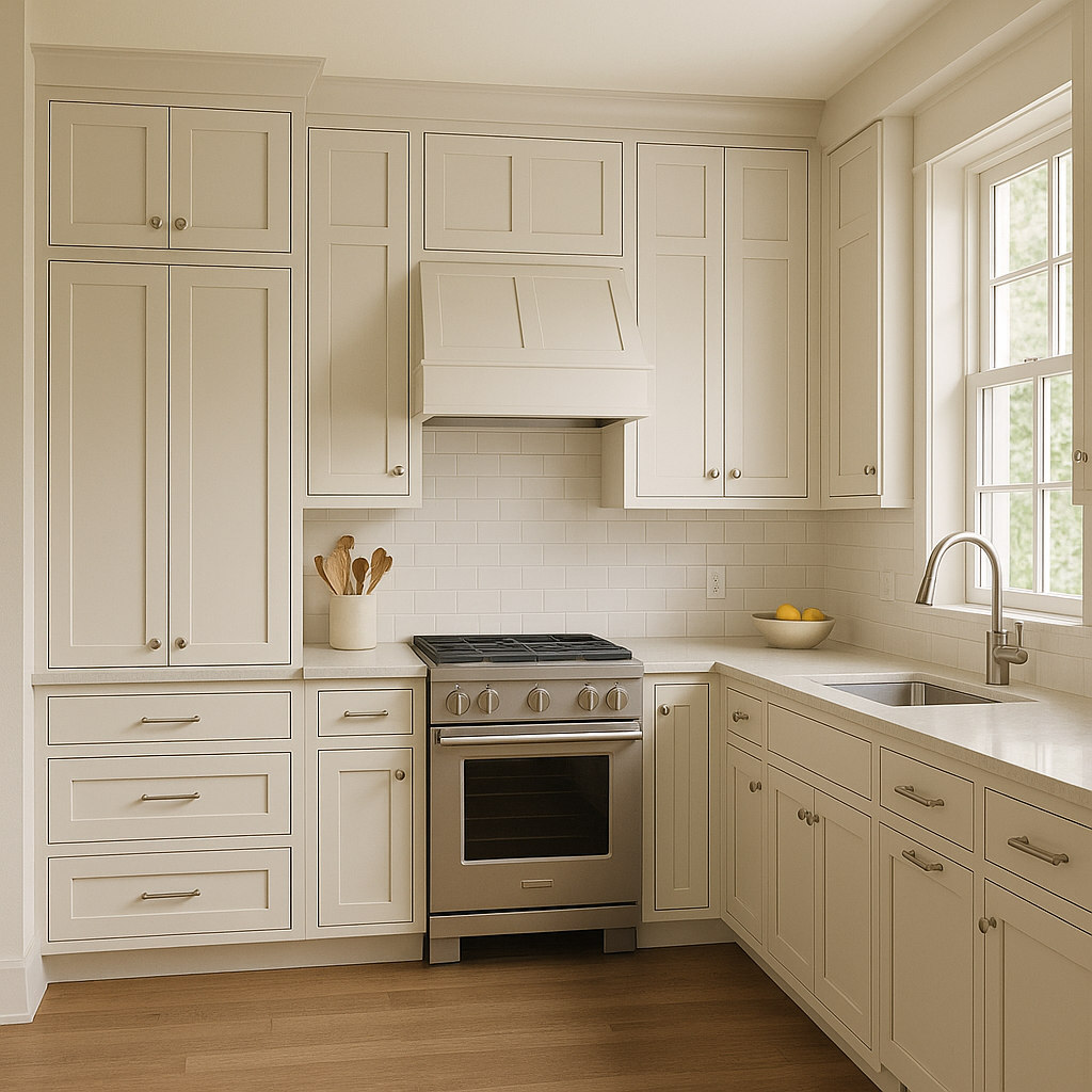
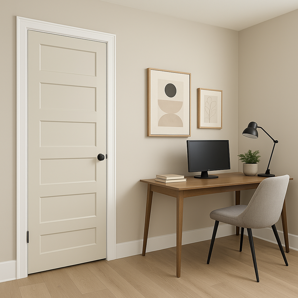
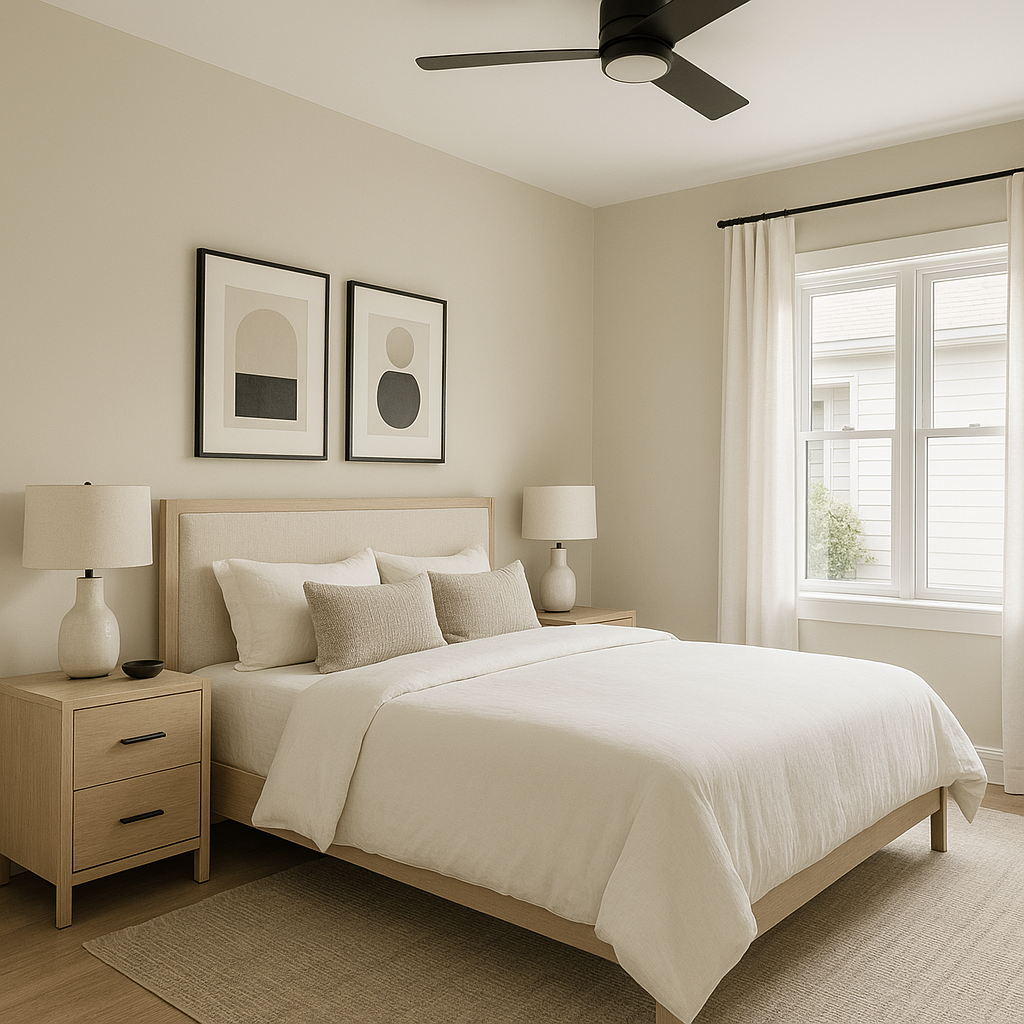
Thanks to its versatility, Benjamin Moore Going (1527) can be used in nearly every corner of your home. Its neutral warmth creates a welcoming atmosphere, making it an excellent choice for a variety of spaces:
Benjamin Moore Going (1527) stands out as a go-to neutral for its balance of warmth, sophistication, and versatility. Whether you're aiming to refresh a single room or tie together an entire home, this timeless shade adapts effortlessly to various styles and color schemes. Its soft undertones make it a perfect choice for creating a cozy, inviting atmosphere that feels both current and enduring.
When paired with coordinating colors and thoughtfully integrated into your design plan, Benjamin Moore Going (1527) can transform your space into a haven of elegance and comfort.
View Colors Only by Brand (No Imagery):
Sherwin-Williams
|
Benjamin-Moore
|
Behr
|
Valspar
Live on the Eastern Slope of Colorado and looking for a local painting professional, check out all our painting services and reach out for a free estimate.
Copyright © 2026 : Wild Fox Painting Inc. : 12435 Mead Way, Littleton, CO 80125


