

Benjamin Moore Seattle (1535) is a versatile and elegant gray paint color that brings understated sophistication to any space. This soft, balanced gray exudes a calm, grounded ambiance, making it a popular choice among homeowners and designers alike. Its muted character works beautifully across a variety of design styles, from modern minimalism to traditional interiors.
Seattle (1535) is a medium-toned gray with subtle undertones that give it depth and complexity. While it primarily reads as a true gray, it carries faint hints of blue and green undertones. These cool undertones add a touch of softness and serenity, preventing it from feeling overly stark or cold. Depending on the lighting conditions and surrounding decor, Seattle may lean slightly cooler or warmer, making it adaptable to various environments.
Pairing Seattle with complementary colors is key to creating a harmonious and cohesive look. Its neutral base makes it a versatile backdrop for a variety of palettes. Here are some coordinating color suggestions:
Seattle’s versatility makes it suitable for a wide variety of applications throughout the home. Whether you're looking to create a serene retreat or an elegant entertaining area, this gray can elevate your space effortlessly.
Seattle serves as an excellent backdrop for living rooms, offering a neutral canvas to showcase furniture, artwork, and accessories. Pair it with plush textiles and metallic accents for a luxurious yet inviting ambiance.
Create a restful retreat by using Seattle in bedrooms. Its soothing undertones contribute to a tranquil atmosphere, especially when paired with soft linens in white or pastel hues. Add depth by incorporating darker accent colors like charcoal or navy.
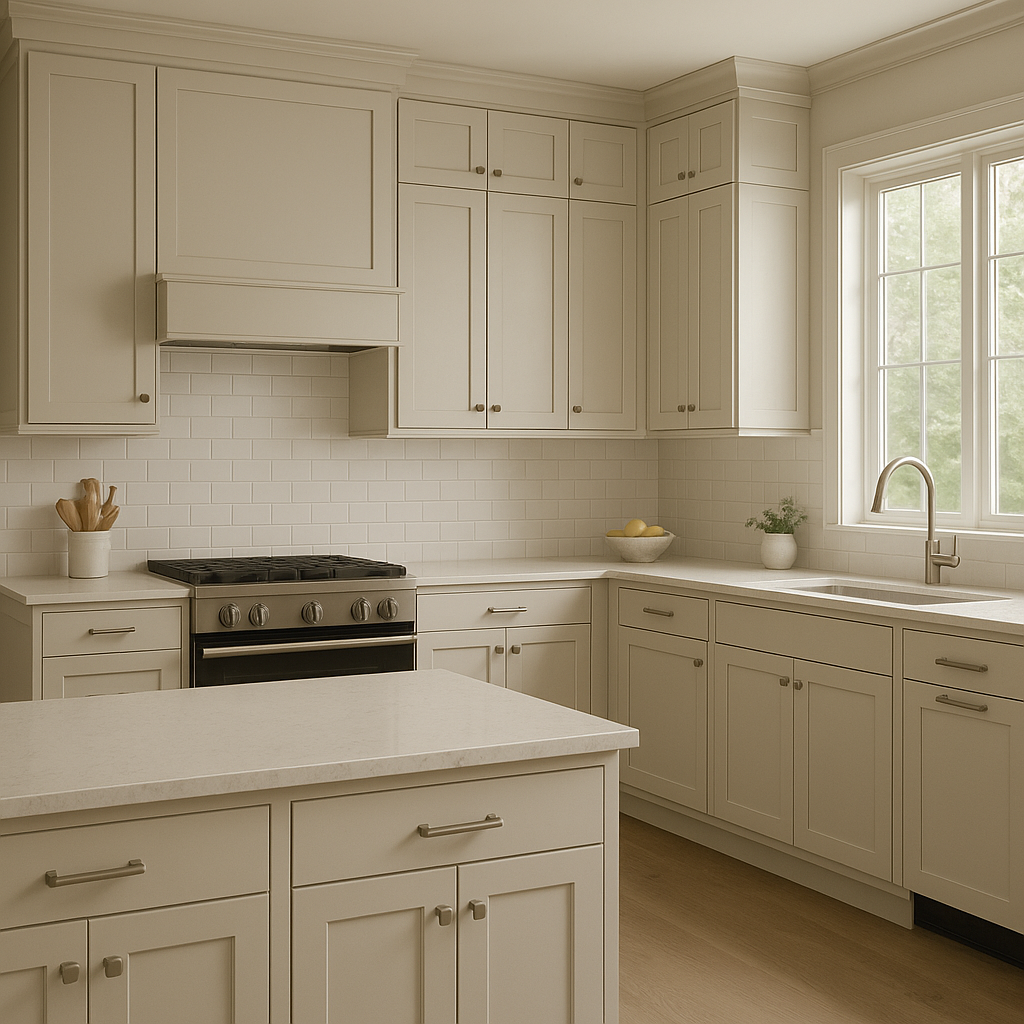
Seattle is a sophisticated choice for kitchen walls or cabinetry. Pair it with white countertops and subway tile backsplashes for a timeless look, or team it up with matte black fixtures for a modern edge.
The cool undertones of Seattle make it particularly well-suited for bathrooms. Use it on walls alongside crisp white trim for a spa-like feel. Add natural wood accents to balance the coolness and create a serene, organic vibe.
Enhance focus and productivity by using Seattle in your home office. Its understated elegance fosters a calm, distraction-free environment while providing a polished backdrop for bookshelves and desk accessories.
Benjamin Moore Seattle (1535) is highly sensitive to lighting conditions, which can influence how the undertones appear. In spaces with natural light, Seattle may lean cooler, revealing more of its blue and green undertones. In artificial or warmer lighting, it softens and may read as a slightly warmer gray. Be sure to test the color in your space to see how it interacts with the lighting throughout the day.
Seattle’s timeless appeal lies in its ability to adapt to a variety of styles, color schemes, and lighting conditions. Whether used as the main wall color or as an accent, it offers depth and subtle sophistication without overwhelming the space. Its flexibility makes it a dependable choice for those seeking a refined and versatile gray that can anchor their design vision.
Transform your interiors with Benjamin Moore Seattle (1535) and discover its ability to create spaces that are both calming and chic. From cozy bedrooms to contemporary kitchens, this neutral gray is ready to elevate your home with understated elegance.
View Colors Only by Brand (No Imagery):
Sherwin-Williams
|
Benjamin-Moore
|
Behr
|
Valspar
Live on the Eastern Slope of Colorado and looking for a local painting professional, check out all our painting services and reach out for a free estimate.
Copyright © 2026 : Wild Fox Painting Inc. : 12435 Mead Way, Littleton, CO 80125


