Benjamin Moore Himalayan (1542) is a versatile gray that exudes elegance and tranquility, making it a popular choice among interior designers and homeowners alike. This medium-to-light gray strikes a beautiful balance between warmth and coolness, offering subtle undertones that adapt to various lighting conditions and design styles. Whether you're seeking a neutral backdrop or a color that complements bold accents, Himalayan is a timeless choice that enhances any space.
Himalayan (1542) is a soft gray with delicate taupe undertones, giving it a warm and inviting character. These undertones prevent it from feeling too cold or sterile, making it ideal for creating cozy yet sophisticated environments. In spaces with ample natural light, the taupe undertones are more pronounced, while in darker areas, the gray reads slightly cooler. This color harmonizes beautifully with both warm and cool palettes, making it an adaptable neutral for any design scheme.
Pairing Himalayan with complementary hues can elevate your space and create a cohesive look. Here are some coordinating colors that work seamlessly with this shade:
These coordinating colors can be used to craft a harmonious space while highlighting the subtle beauty of Himalayan.
Himalayan (1542) is incredibly versatile and works well in a variety of spaces and applications. Here are some ideas on where and how to use this classic gray:
Create a sophisticated living room by using Himalayan on the walls. Pair it with plush furniture in neutral tones like cream or beige, and add metallic or wood accents to enhance its warmth. Consider incorporating textured throws and rugs to bring depth and comfort to the space.
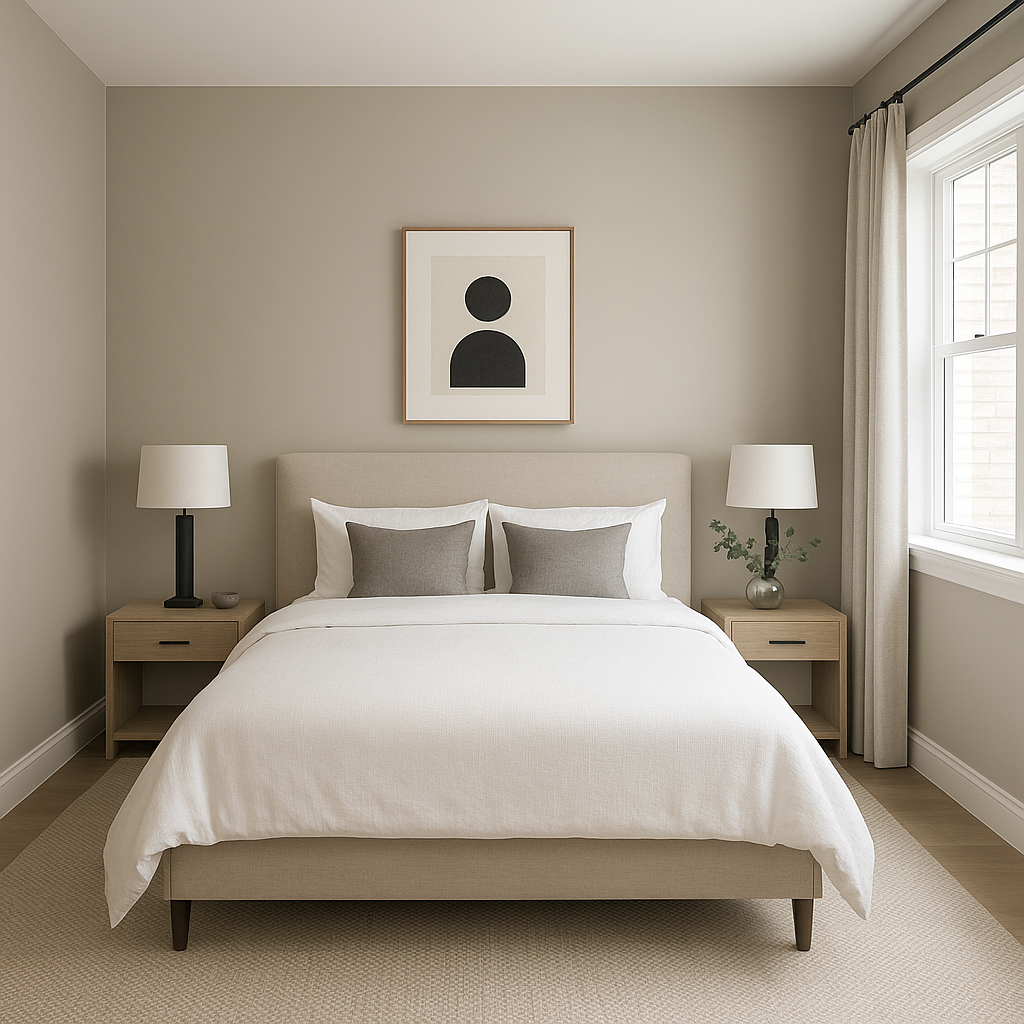
Himalayan is perfect for bedrooms due to its serene and calming nature. Use it as the main wall color and complement it with crisp white bedding and soft pastel accents. This combination creates a peaceful retreat ideal for relaxation.
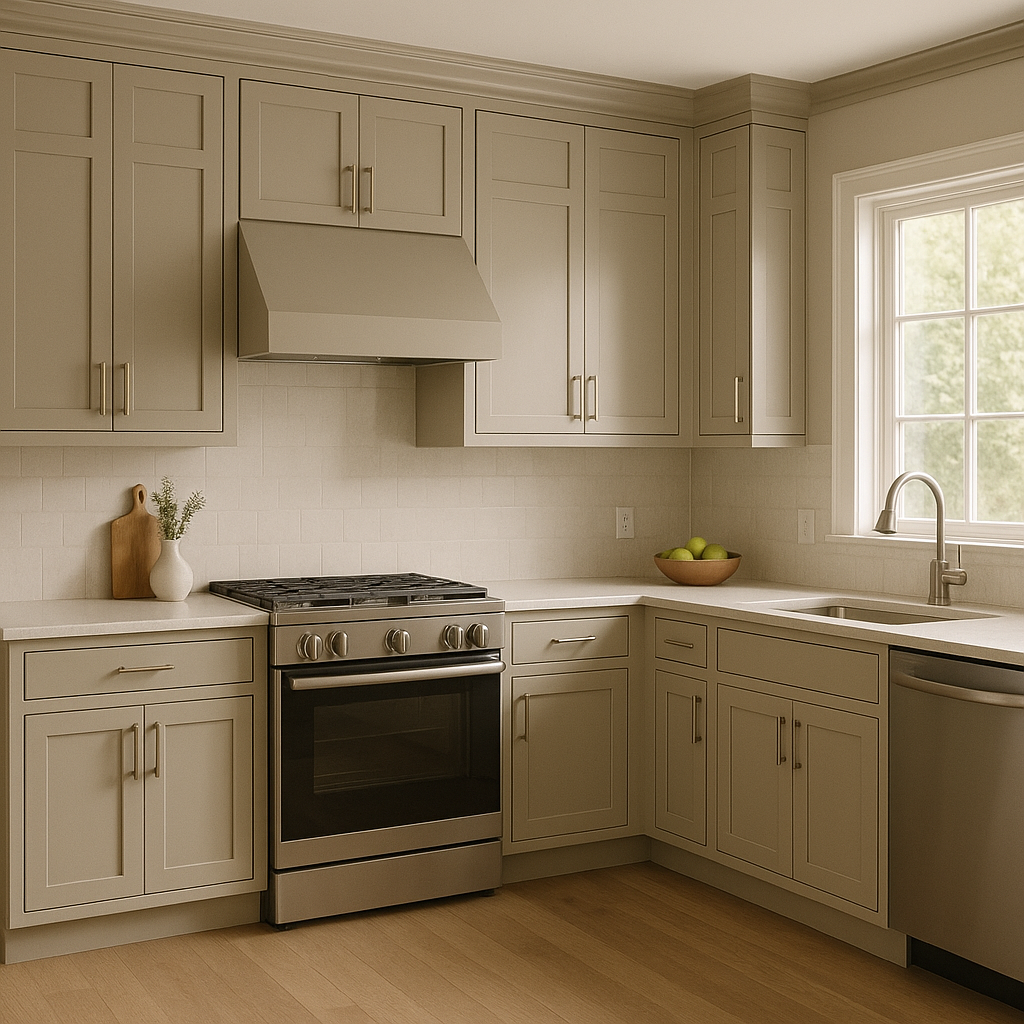
For a modern and timeless kitchen, paint the walls or cabinets in Himalayan. Pair it with white countertops and backsplash tiles for a clean look, or opt for brushed nickel hardware to emphasize the color's sophistication.
Himalayan is an excellent choice for bathrooms, creating a spa-like atmosphere. Combine it with cool marble finishes or warm wood tones to suit your personal style. Add greenery or soft lighting to enhance the serene vibe.
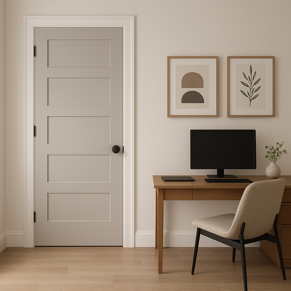
In home offices, Himalayan can help foster focus and productivity. Pair it with darker accent walls, such as deep greens or blues, and natural wood furniture for a balanced and inspiring workspace.
Lighting plays a crucial role in how Himalayan appears in your space. In rooms with abundant natural light, the color leans warmer due to its taupe undertones, creating a welcoming ambiance. In spaces with cooler artificial lighting or limited sunlight, it may appear slightly cooler, emphasizing its gray base. Testing Himalayan in your space under different lighting conditions is recommended to ensure it achieves the desired effect.
Himalayan (1542) is a sophisticated gray that effortlessly bridges the gap between warm and cool tones. With its soft taupe undertones, it adapts beautifully to various design styles, from modern minimalism to rustic elegance. Its versatility makes it a dependable choice for both small and large spaces, ensuring your interiors feel timeless and inviting. Whether you're refreshing a single room or designing an entire home, Benjamin Moore Himalayan (1542) offers understated beauty that will endure through changing trends.
View Colors Only by Brand (No Imagery):
Sherwin-Williams
|
Benjamin-Moore
|
Behr
|
Valspar
Live on the Eastern Slope of Colorado and looking for a local painting professional, check out all our painting services and reach out for a free estimate.
Copyright © 2026 : Wild Fox Painting Inc. : 12435 Mead Way, Littleton, CO 80125


