Benjamin Moore Waynesboro Taupe (1544) is a warm, versatile neutral that effortlessly bridges the gap between classic and contemporary design. With its rich depth and understated elegance, this taupe paint color brings a sophisticated yet approachable ambiance to any room. Whether you’re crafting a cozy retreat or a polished living space, Waynesboro Taupe offers the perfect backdrop for a variety of styles and aesthetics.
Waynesboro Taupe features a refined mix of warm brown and gray undertones, giving it a balanced, earthy feel. These undertones prevent the color from skewing too beige or overly cool, making it an ideal choice for homeowners and designers seeking a neutral with more personality. The subtle gray influence ensures that Waynesboro Taupe maintains a modern edge, while the warmth of the brown undertones creates an inviting, grounded atmosphere. This duality allows the color to adapt beautifully to different lighting conditions, shifting between a slightly cooler tone in brighter spaces and a warmer appearance in dimmer areas.
One of the standout qualities of Waynesboro Taupe is its versatility, enabling seamless coordination with a wide variety of colors. Here are some complementary hues to consider:
Waynesboro Taupe’s adaptability makes it suitable for a wide range of applications throughout the home. Here are some ideas for incorporating this timeless hue into your design:
The warm, inviting nature of Waynesboro Taupe makes it an excellent choice for living rooms and family areas. Pair it with soft whites for trim and ceilings to create a cozy yet refined atmosphere. Add layered textures like plush rugs and linen curtains to enhance the warmth of the color.
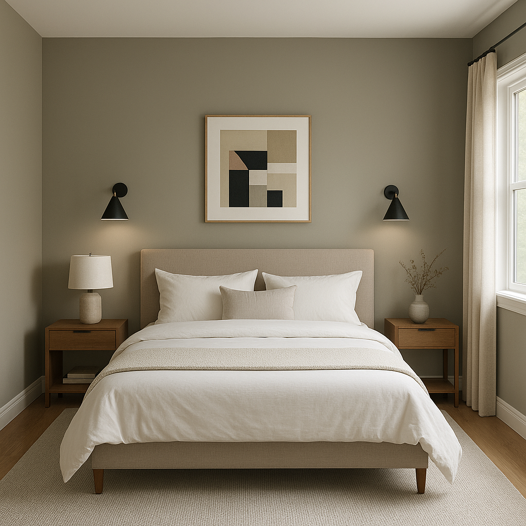
Waynesboro Taupe’s calming undertones make it ideal for creating a relaxing retreat in bedrooms. Combine it with muted blues or greens for a serene palette, or opt for darker accents like Hale Navy for a dramatic yet restful vibe.
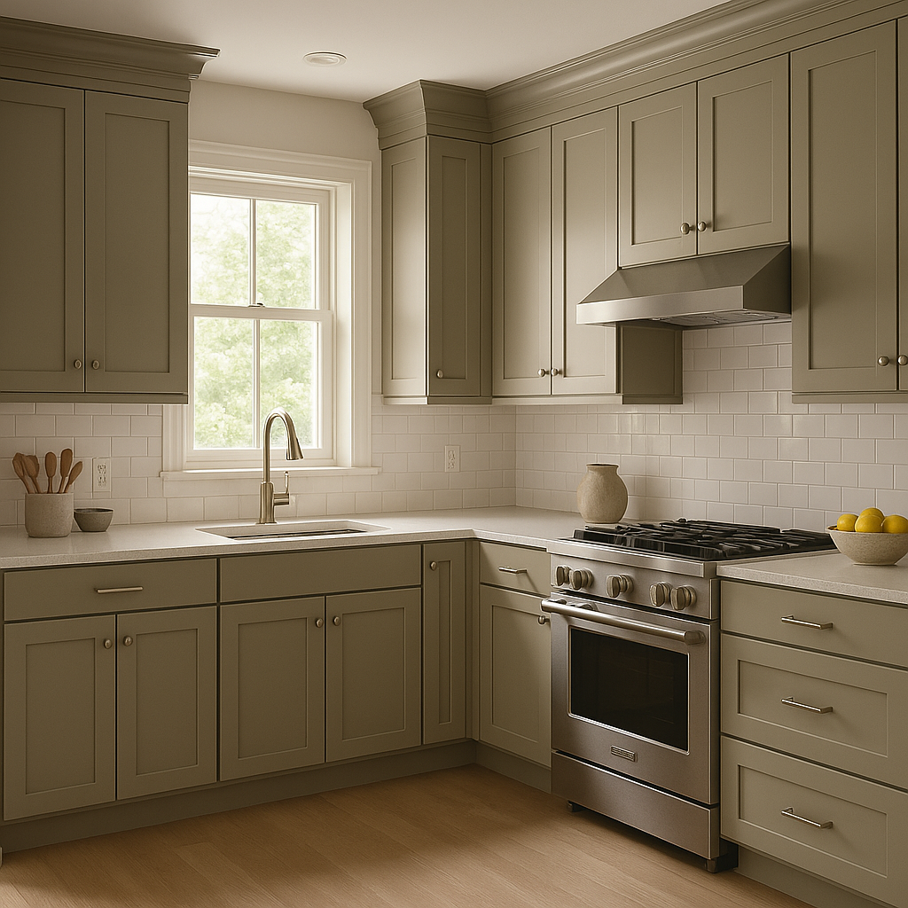
In kitchens and dining rooms, Waynesboro Taupe pairs beautifully with natural wood tones and crisp white cabinetry. Add metallic accents, such as brushed nickel or brass, to elevate the space and lend a sophisticated touch to the neutral backdrop.
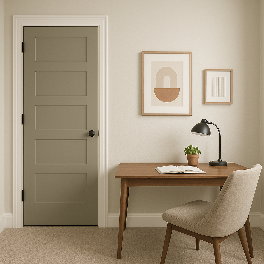
For a functional yet stylish home office, Waynesboro Taupe provides a professional and grounded feel. Pair it with Kendall Charcoal for furniture or shelving accents to create a cohesive, productive workspace.
Waynesboro Taupe’s rich warmth is perfect for bathrooms, where it can add a spa-like ambiance. Pair it with soft whites and earthy greens for a relaxing, nature-inspired space.
Waynesboro Taupe’s undertones react differently depending on the lighting in a room. In spaces with abundant natural light, the gray undertones become more prominent, offering a cooler, modern feel. Conversely, in areas with artificial or warmer lighting, the brown undertones take center stage, creating a cozier and more traditional vibe.
Benjamin Moore Waynesboro Taupe (1544) is more than just a neutral—it’s a timeless, versatile color that adapts beautifully to any style, space, or lighting condition. Its balanced undertones, wide range of coordinating options, and ability to create both warmth and sophistication make it a go-to choice for interior designers and homeowners alike. Whether used as the main color in a room or as part of a layered palette, Waynesboro Taupe is sure to elevate your space with its understated charm.
View Colors Only by Brand (No Imagery):
Sherwin-Williams
|
Benjamin-Moore
|
Behr
|
Valspar
Live on the Eastern Slope of Colorado and looking for a local painting professional, check out all our painting services and reach out for a free estimate.
Copyright © 2026 : Wild Fox Painting Inc. : 12435 Mead Way, Littleton, CO 80125


