Benjamin Moore Healing (1562) is a sophisticated and serene medium gray that brings an understated elegance to any space. With its balanced presence and gentle warmth, this color is perfect for creating inviting rooms that exude tranquility. Whether used as a main wall color or as part of an accent palette, Healing is versatile enough to complement a range of design styles, from modern and minimalist to classic and traditional.
Healing (1562) is a soft gray with subtle beige undertones, making it part of the ever-popular greige family. These warm undertones give the color a soothing and welcoming feel, preventing it from appearing too cool or sterile. The beige influence ensures that Healing is adaptable to both warm and cool color schemes, making it a perfect choice for spaces where balance and harmony are key.
In certain lighting conditions, Healing may lean slightly warmer, especially in rooms with ample natural light, while appearing cooler in dimmer spaces. This chameleon-like behavior adds depth and complexity to the shade, ensuring it feels dynamic yet grounded.
Benjamin Moore Healing (1562) pairs beautifully with a wide range of coordinating colors, allowing you to design spaces that feel cohesive and intentional. Below are some suggested complementary hues:
Healing (1562) is an incredibly versatile gray, making it ideal for a variety of applications in residential and commercial spaces. Below are some ways to incorporate this calming color into your interiors:
Healing lends itself beautifully to living rooms and family rooms, where its warm undertones create a cozy and inviting atmosphere. Pair it with plush textiles such as creamy whites, taupes, and soft blues for a comfortable yet refined aesthetic. Add metallic accents like brushed nickel or antique brass to enhance the sophistication of the space.
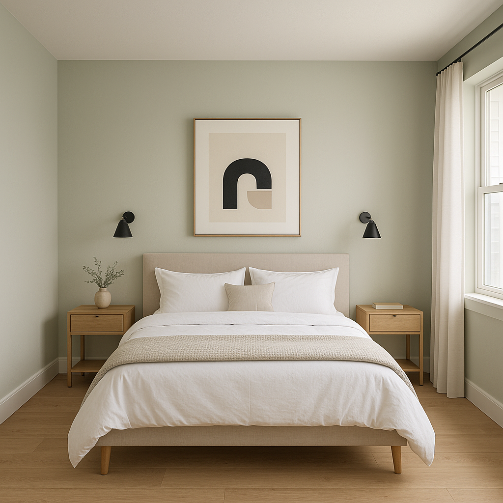
This tranquil shade works wonderfully in bedrooms, setting the stage for restful evenings. Use Healing as the base wall color and complement it with soft bedding in coordinating hues like ivory, pale green, or dusty lavender. Incorporate natural materials such as wood or rattan to emphasize its warm undertones and create a serene retreat.
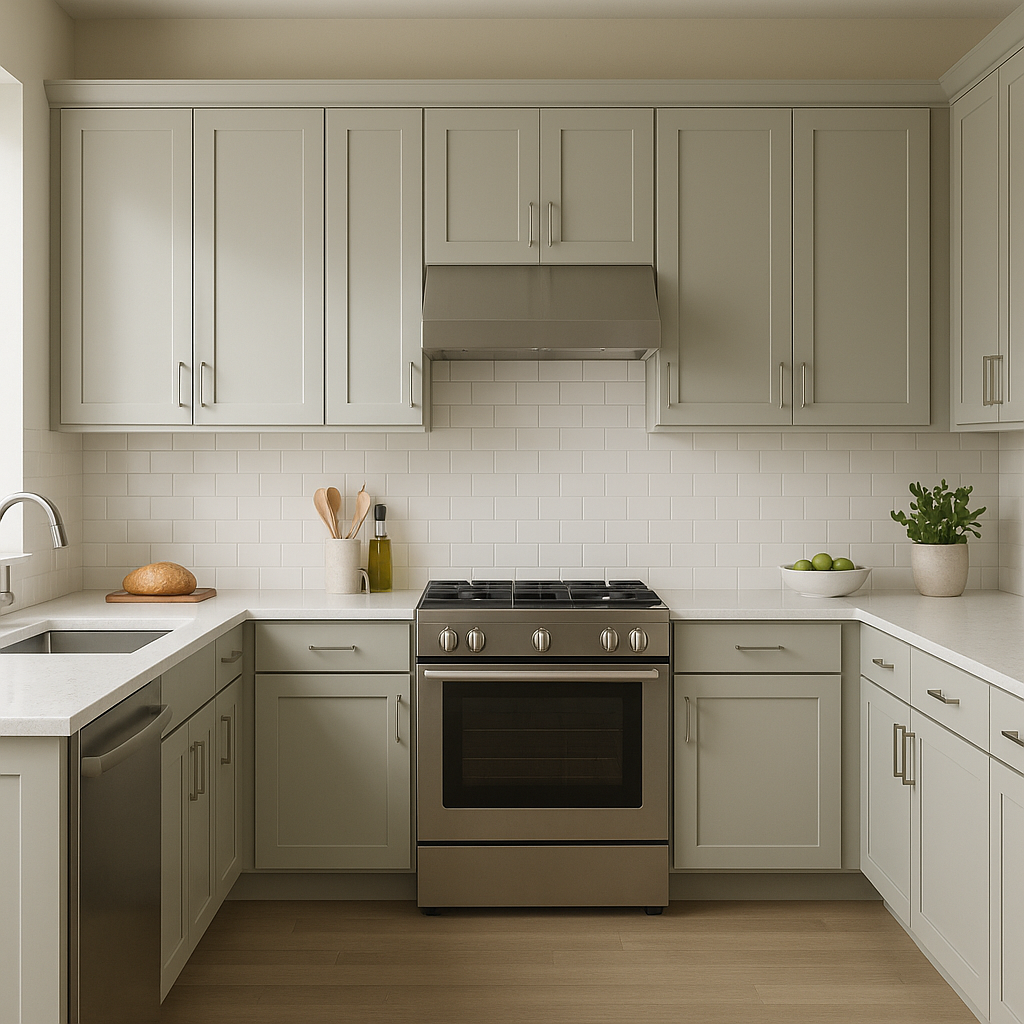
Healing brings understated elegance to kitchens and dining rooms, especially when paired with crisp white cabinetry or darker wood finishes. Use it as a backdrop for stainless steel appliances or pendant lighting with warm metals. For dining areas, consider adding pops of bold color like navy or burgundy in your table linens or artwork to create visual interest.
For a spa-like bathroom vibe, Healing is a perfect choice. Its neutral tone pairs seamlessly with marble tiles, brushed nickel hardware, and soft whites. Enhance the calming effect by incorporating natural elements like greenery or wooden accents.
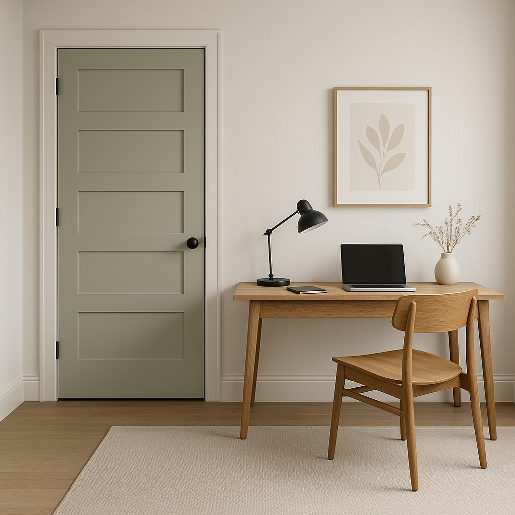
Healing fosters focus and calm, making it a great choice for a home office. Pair it with darker accent furniture, such as black or espresso finishes, to create a professional yet inviting environment. Consider adding a gallery wall with white frames to introduce contrast and personality.
Healing can also be used as an exterior paint color, particularly for siding or trim. Its warm undertones ensure it feels approachable and timeless, especially when paired with whites like White Dove for trim or darker shades like Iron Mountain for shutters.
Benjamin Moore Healing (1562) stands out as a sophisticated and versatile gray that balances warmth and neutrality. Its adaptable undertones and ability to pair well with a variety of colors make it suitable for virtually any space. Whether you’re looking to create a calming oasis or a polished, professional interior, Healing provides the perfect foundation for a timeless design.
View Colors Only by Brand (No Imagery):
Sherwin-Williams
|
Benjamin-Moore
|
Behr
|
Valspar
Live on the Eastern Slope of Colorado and looking for a local painting professional, check out all our painting services and reach out for a free estimate.
Copyright © 2026 : Wild Fox Painting Inc. : 12435 Mead Way, Littleton, CO 80125


