Benjamin Moore Quarry (1568) is a versatile and timeless shade that evokes a sense of refined elegance. This mid-tone gray, with its balanced depth and understated sophistication, is a favorite among designers for creating spaces that are both serene and stylish. Quarry’s ability to adapt to various design styles makes it a go-to choice for anyone looking to achieve a harmonious and grounded aesthetic.
Quarry (1568) is a true neutral gray, but it carries subtle undertones that make it unique. It leans slightly cool, with delicate hints of blue and soft green undertones. These undertones prevent it from feeling overly stark or cold, ensuring that it retains a welcoming and tranquil quality. The subtle green undertone, in particular, adds an organic and natural vibe, making it an excellent choice for spaces that aim to feel connected to nature.
Its undertones may shift slightly depending on the lighting in your space. In rooms with abundant natural light, Quarry appears lighter and more neutral, while in spaces with warmer artificial lighting, its cooler undertones become more pronounced, lending it a moody and cozy character.
Benjamin Moore Quarry (1568) pairs beautifully with a variety of colors, making it easy to create a cohesive and polished color palette. Some of the best coordinating colors include:
By incorporating these coordinating hues, you can tailor Quarry to suit a variety of moods and styles, from modern minimalism to classic elegance.
Quarry (1568) is incredibly versatile and works well in numerous settings, whether you’re designing a cozy home office, a sophisticated living room, or a luxurious bedroom retreat. Here are a few popular uses for this stunning neutral:
Quarry’s balanced gray tone makes it a perfect backdrop for living rooms. It creates a serene and neutral canvas that allows furniture, artwork, and textiles to take center stage. Pair it with plush textures and soft lighting to enhance the cozy ambiance.
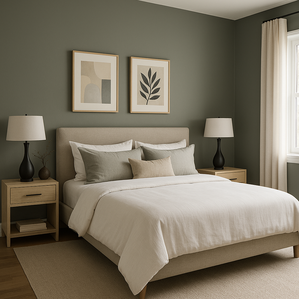
As a calming and tranquil gray, Quarry is an excellent choice for bedrooms. Its cool undertones promote relaxation, making it easy to unwind. Pair it with coordinating soft whites or muted blues for a peaceful, dreamy retreat.
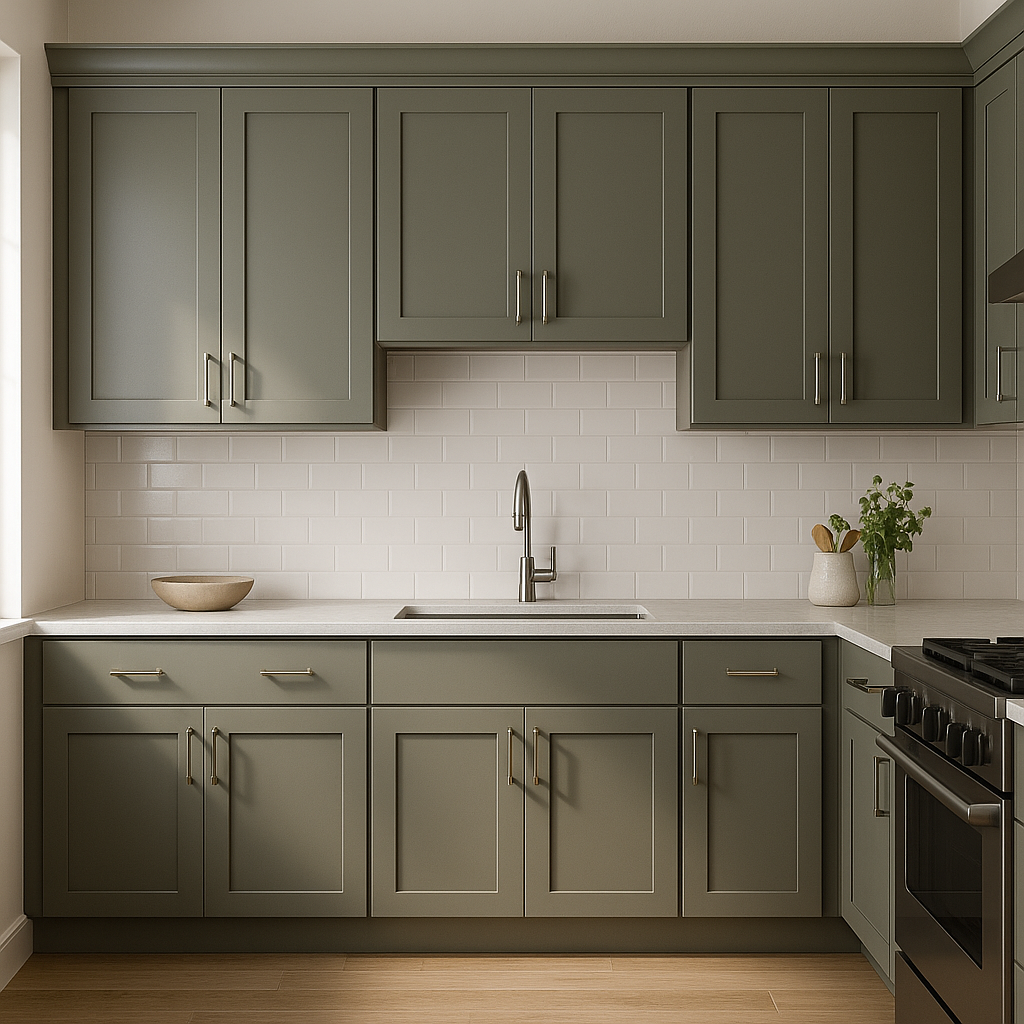
Quarry’s clean and modern feel is ideal for kitchens and bathrooms. Use it on cabinetry for a chic, contemporary look, or on walls to complement white subway tiles and stainless steel appliances. Its cool undertones also work beautifully with stone and marble finishes.
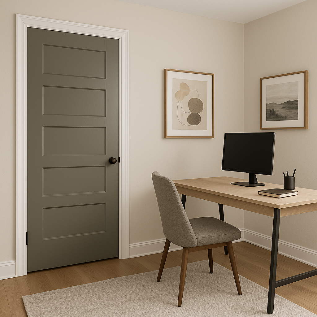
If you’re designing a productive yet serene home office, Quarry’s grounded gray tone helps to minimize distractions while maintaining a professional and polished aesthetic. Pair it with Hale Navy accents for a bold, inspiring workspace.
Quarry (1568) can also be used as an accent color to add depth and interest to a room. Whether behind a statement piece of furniture or as a feature wall, Quarry’s subtle sophistication elevates any space.
Benjamin Moore Quarry (1568) is the epitome of versatility and style. Its ability to adapt to different lighting conditions and pair seamlessly with a variety of colors makes it a designer favorite. Whether you’re creating a modern, minimalist space or a cozy, traditional setting, Quarry’s understated elegance ensures it will stand the test of time.
By thoughtfully incorporating Quarry into your home, you can achieve a look that is both polished and inviting, elevating your space with a touch of timeless sophistication.
View Colors Only by Brand (No Imagery):
Sherwin-Williams
|
Benjamin-Moore
|
Behr
|
Valspar
Live on the Eastern Slope of Colorado and looking for a local painting professional, check out all our painting services and reach out for a free estimate.
Copyright © 2026 : Wild Fox Painting Inc. : 12435 Mead Way, Littleton, CO 80125


