
Benjamin Moore Night (1569) is a rich, dramatic charcoal that exudes elegance and depth. This color is ideal for creating moody, sophisticated spaces with a modern edge. Its dark, neutral tone makes it versatile, while its subtle undertones allow it to complement a range of design styles, from industrial chic to timeless traditional. Whether you're looking to craft a cozy bedroom retreat or a bold, modern living space, Night (1569) offers the perfect canvas for your creativity.
At first glance, Night (1569) may appear as a straightforward dark gray, but upon closer inspection, it reveals intriguing undertones of blue and green. These cool undertones lend the color a sense of depth and complexity, preventing it from feeling flat or overly heavy. The blue tones add a hint of cool sophistication, while the green undertones provide balance, making it a grounding and comfortable choice for all seasons.
Because of its undertones, Night can shift slightly in appearance depending on the lighting. In spaces with abundant natural light, the blue undertones may become more pronounced, creating a crisp and refined look. In dimmer, artificial lighting, the green undertones may emerge subtly, adding warmth and richness.
The versatility of Benjamin Moore Night (1569) makes it easy to pair with a variety of coordinating colors. Whether you're building a monochromatic palette or seeking bold contrasts, this shade adapts beautifully. Here are some suggestions:
For a tonal and harmonious look, pair Night with lighter grays or soft charcoals. Consider Benjamin Moore's Balboa Mist (OC-27) or Stonington Gray (HC-170) for a gradient effect that feels refined and timeless.
To create a striking contrast, pair Night with bright whites like Chantilly Lace (OC-65) or Decorator’s White (OC-149). This combination is perfect for trim, ceilings, or millwork in spaces where you want the dark walls to stand out dramatically.
To emphasize the green undertones in Night, complement it with warm, earthy tones like Horizon Gray (2141-50) or Sandy Hook Gray (HC-108). These colors work beautifully for a nature-inspired palette.
For a playful, modern twist, use vibrant accents like Caliente (AF-290), a rich red, or Golden Honey (297), a warm amber. These pops of color can inject energy into the room and create a dynamic focal point.
Benjamin Moore Night (1569) is a bold and confident choice that lends itself to a variety of applications in residential and commercial spaces. Here are some of the best ways to incorporate this color into your design:
Night is a perfect choice for an accent wall, creating a focal point in any room. Use it in living rooms, dining areas, or bedrooms to add drama and depth. Its dark tone contrasts beautifully against lighter walls and furnishings.
For a cozy, cocoon-like atmosphere, paint all the walls in a bedroom with Night. Pair it with soft bedding in neutral tones and metallic accents for a luxe, hotel-style retreat.
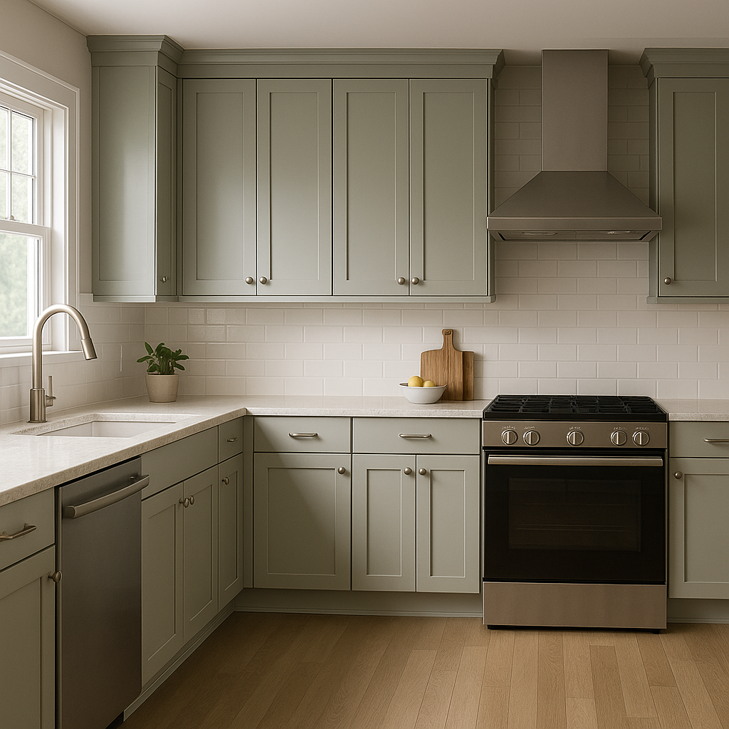
Night is a stunning color for kitchen cabinetry. Its deep hue adds a contemporary, high-end feel, especially when paired with marble countertops, brass hardware, or subway tile backsplashes. It also works well for islands, providing a grounded centerpiece in open-concept kitchens.
Transform your bathroom into a spa-like sanctuary by using Night on the walls or vanity. Pair it with white fixtures and soft gray tiles for a serene, modern aesthetic.
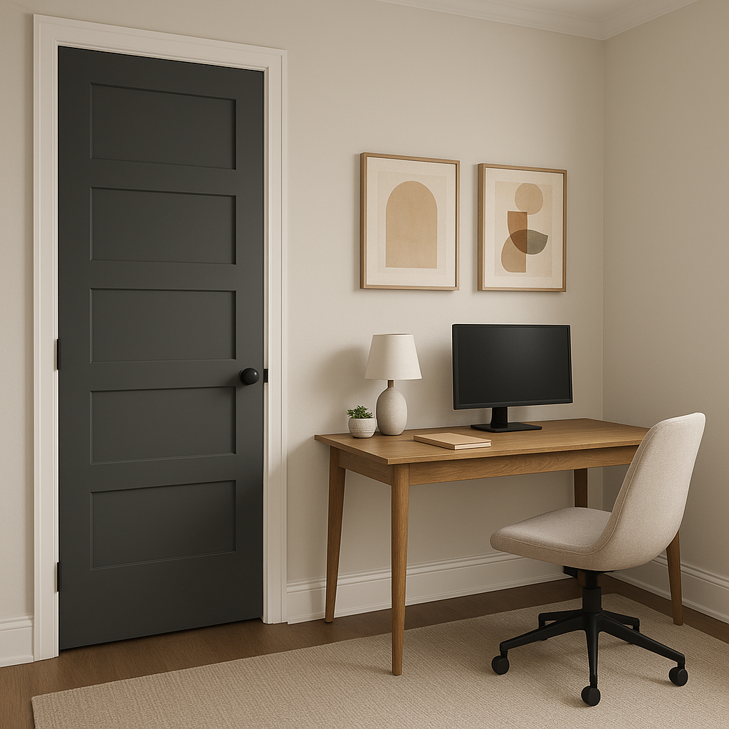
Night is a sophisticated choice for exteriors, whether as the main color for siding or as an accent on shutters or a front door. Its deep tone pairs beautifully with natural wood and stone, creating a polished and timeless curb appeal.
Because of its depth and undertones, lighting plays an important role in how Night (1569) is perceived. For spaces with limited natural light, consider using warm artificial lighting to balance the cool undertones and prevent the space from feeling too stark. In well-lit rooms, Night’s richness will shine, showcasing its blue-green complexity.
Benjamin Moore Night (1569) is an exceptional shade for those seeking a bold, versatile charcoal that blends sophistication with modernity. Its complex undertones, wide range of coordinating colors, and ability to adapt to various lighting conditions make it a timeless choice for any space.
View Colors Only by Brand (No Imagery):
Sherwin-Williams
|
Benjamin-Moore
|
Behr
|
Valspar
Live on the Eastern Slope of Colorado and looking for a local painting professional, check out all our painting services and reach out for a free estimate.
Copyright © 2026 : Wild Fox Painting Inc. : 12435 Mead Way, Littleton, CO 80125


