Benjamin Moore Imperial (1571) is a sophisticated, medium-toned gray that exudes timeless elegance and versatility. Perfect for both modern and traditional spaces, this chic hue is a favorite among interior designers for its ability to adapt seamlessly to various design styles. Whether you're creating a serene retreat or a polished living area, Imperial (1571) delivers a balanced and harmonious aesthetic.
Imperial (1571) boasts subtle blue undertones that lend it a cool and calming feel. These undertones make it a great choice for spaces that require a soothing ambiance. While the blue undertones are noticeable, they are not overpowering, allowing Imperial (1571) to maintain its neutral gray character. This balance makes it suitable for a wide range of lighting conditions, as it shifts gracefully between a cooler gray in natural daylight and a slightly warmer appearance under artificial lighting.
Imperial (1571) pairs beautifully with a variety of colors, making it an ideal foundation for layered palettes. Here are some coordinating colors to consider:
Imperial (1571) is incredibly versatile and works well across various applications. Here are some ways to use it effectively:
Create a polished and inviting living space by using Imperial (1571) on walls. Pair it with neutral furniture and metallic accents to add sophistication and charm.
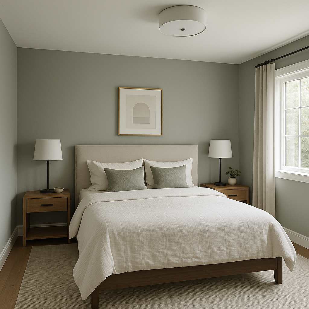
Its calming blue undertones make Imperial (1571) an excellent choice for bedrooms. Layer soft textiles, such as plush bedding in creams and blues, for a serene sanctuary.
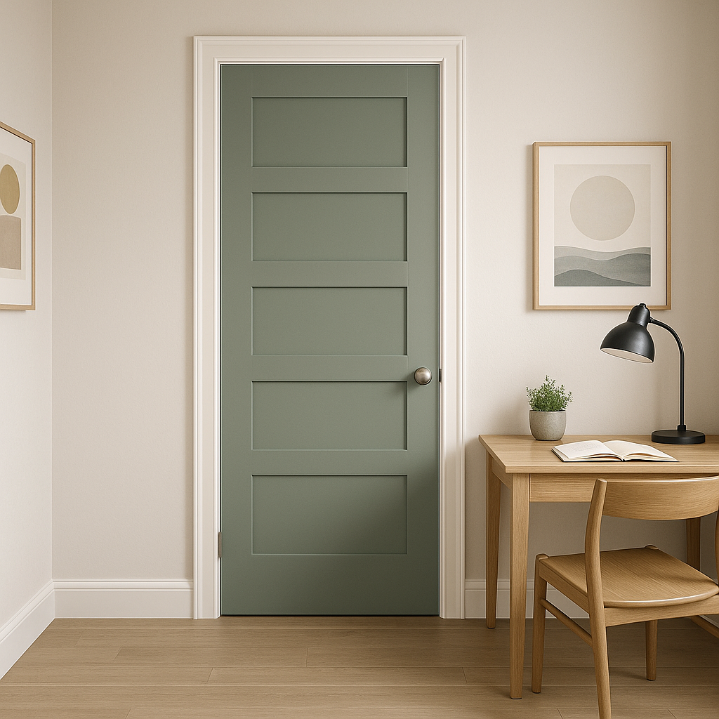
Imperial (1571) fosters focus and productivity, making it ideal for home offices. Pair it with minimalist furniture and plenty of natural light to create a functional yet stylish work environment.
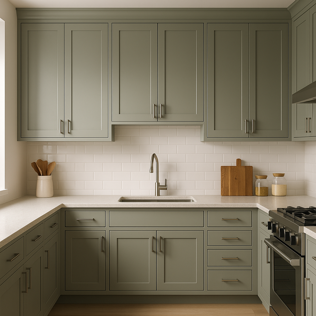
Use Imperial (1571) on cabinetry or as a wall color to bring modernity and elegance to your kitchen. Pair it with white countertops and brushed nickel hardware for a fresh, contemporary look.
Imperial (1571) shines as an exterior paint color. Its refined gray tone works beautifully on siding or shutters, especially when paired with white trim for a classic curb appeal.
Imperial (1571) is the embodiment of understated elegance. Its ability to complement a variety of color palettes and its adaptability to different design styles make it a dependable choice for any project. Whether you're refreshing a single room or transforming an entire home, Imperial (1571) offers a timeless backdrop that elevates your space with subtle sophistication.
View Colors Only by Brand (No Imagery):
Sherwin-Williams
|
Benjamin-Moore
|
Behr
|
Valspar
Live on the Eastern Slope of Colorado and looking for a local painting professional, check out all our painting services and reach out for a free estimate.
Copyright © 2026 : Wild Fox Painting Inc. : 12435 Mead Way, Littleton, CO 80125


