Benjamin Moore Raindance (1572) is a captivating medium blue that evokes a sense of tranquility and understated elegance. With its versatile appeal, this hue is perfect for creating spaces that feel both grounded and refreshing. Whether you're designing a coastal-inspired retreat or imbuing a modern room with a pop of color, Raindance offers a timeless quality that transcends trends.
Raindance features a soft gray undertone, which lends a subtle muted effect to its blue base. These cool undertones ensure the color never feels overly vibrant or harsh, making it ideal for spaces that require a relaxed and soothing atmosphere. The gray infusion also allows Raindance to harmonize beautifully with a wide range of neutral and complementary shades, giving it remarkable versatility.
To build a harmonious color scheme with Benjamin Moore Raindance, consider pairing it with the following coordinating colors:
Neutral Pairings:
Accent Colors:
Bold Contrasts:
Raindance thrives in a variety of settings, thanks to its calming yet sophisticated presence. Here are some creative ways to incorporate this hue into your home:
Raindance is an excellent choice for living areas where relaxation is key. Use it as the main wall color and pair it with soft whites for trim, plush neutral furniture, and textural accents like woven baskets or wood tones. The cool undertones of Raindance will create a serene ambiance perfect for unwinding after a long day.
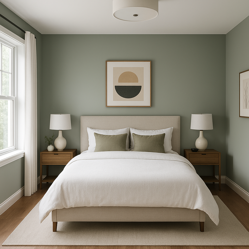
In bedrooms, Raindance can transform the space into a peaceful sanctuary. Pair it with light gray linens, warm metallic accents like brushed brass or antique gold, and natural wood furniture for a cozy yet modern look. This shade is particularly effective in spaces with ample natural light, as it subtly shifts in tone throughout the day.
Raindance is a stellar choice for bathrooms, offering a spa-like vibe when paired with crisp white tiles and chrome or nickel fixtures. Add textured towels in complementary colors, such as soft grays or muted blues, to further enhance the soothing aesthetic. For powder rooms, Raindance can make a bold statement on all walls, balanced with white trim and accessories.
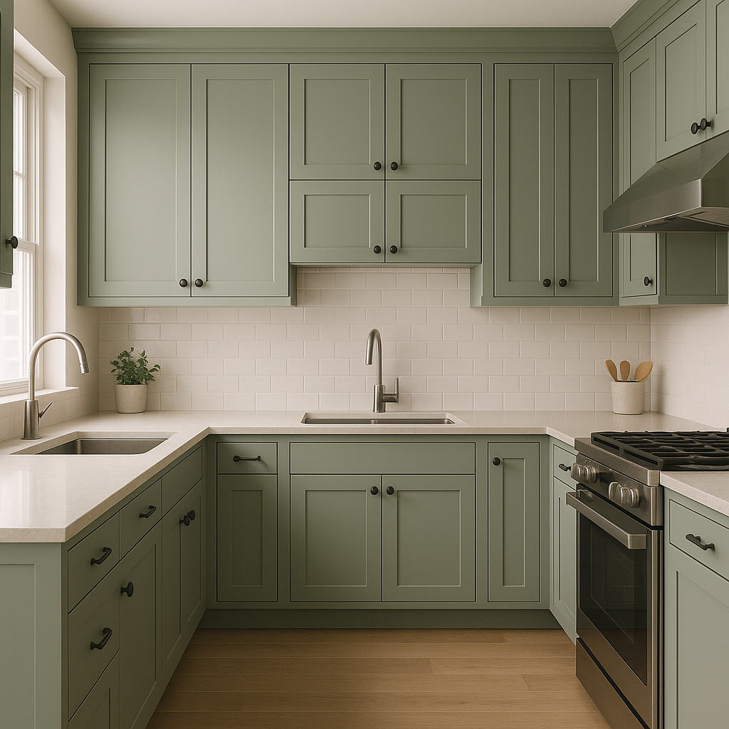
For kitchens, Raindance works beautifully as a cabinet color, especially when paired with marble countertops and a bright white backsplash. Its cool undertones contrast elegantly with warm wood flooring or brass fixtures, creating a balanced and inviting space. Alternatively, use Raindance as a feature wall color to add depth to a neutral kitchen palette.
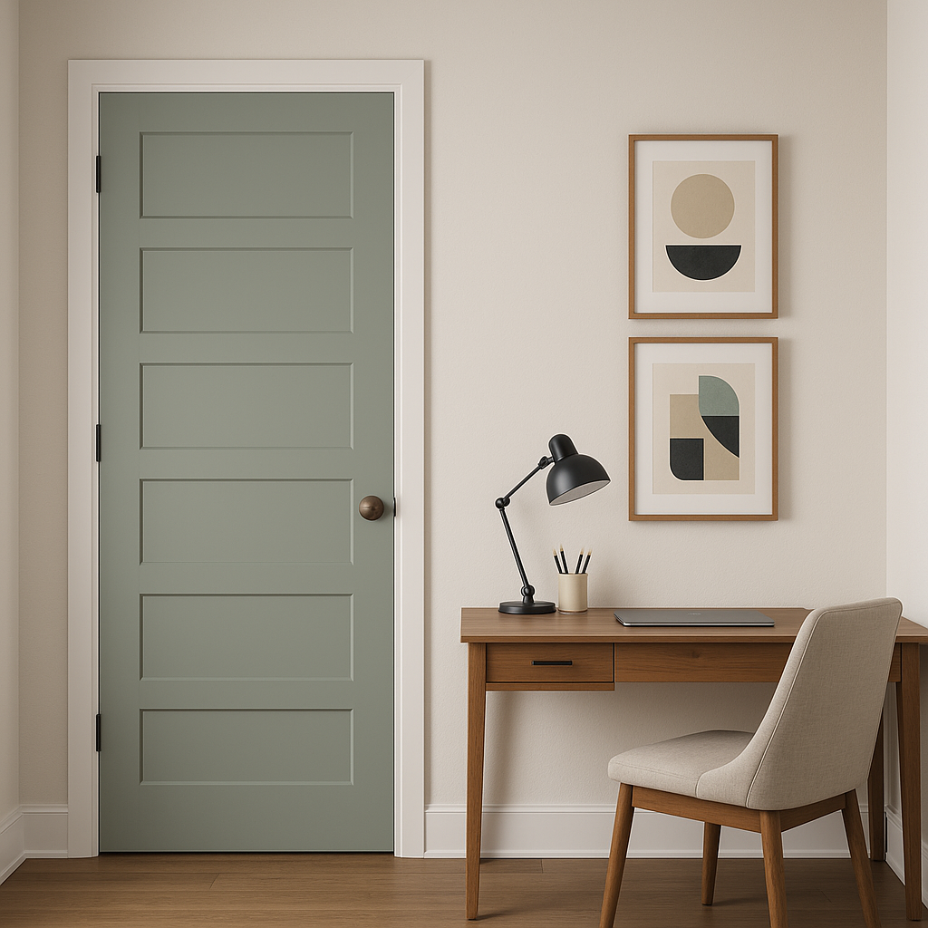
If you're looking to introduce Raindance without committing to an entire room, consider using it on an accent wall, built-in shelving, or painted furniture. Its rich blue tone can add visual interest while allowing other colors in the room to shine.
The beauty of Raindance lies in its ability to adapt to different styles and spaces. Its tranquil nature makes it ideal for creating restful environments, while its subtle sophistication ensures it can hold its own in more dynamic designs. Whether you're going for a coastal, modern, or classic aesthetic, Raindance is a versatile choice that will elevate your space with its serene charm.
With its soothing gray undertones, coordinating color possibilities, and wide range of applications, Benjamin Moore Raindance (1572) is a color that invites creativity and inspires timeless design.
View Colors Only by Brand (No Imagery):
Sherwin-Williams
|
Benjamin-Moore
|
Behr
|
Valspar
Live on the Eastern Slope of Colorado and looking for a local painting professional, check out all our painting services and reach out for a free estimate.
Copyright © 2026 : Wild Fox Painting Inc. : 12435 Mead Way, Littleton, CO 80125


