Benjamin Moore Arctic 1577 is a crisp, cool, and versatile shade of light gray that effortlessly blends sophistication with tranquility. Its understated elegance makes it a popular choice for homeowners and designers seeking a neutral color that works well across various styles and spaces. Whether you’re refreshing a single room or designing an entire home, Arctic 1577 is a timeless hue that adds a sense of calm and refinement to any environment.
Arctic 1577 is a light gray with subtle blue undertones, which give it a refreshing and airy feel. The blue tones help it maintain a cool temperature, making it ideal for spaces where you want to evoke a serene and relaxing atmosphere. Depending on the lighting in your space, Arctic 1577 may appear slightly more silvery or take on a faint blue cast, giving it a dynamic quality without feeling overwhelming.
This balance of gray and blue undertones makes Arctic 1577 a chameleon-like color that adapts to its surroundings while maintaining its calming essence.
Arctic 1577 pairs beautifully with a wide range of colors, from bold accents to complementary neutrals. Its understated hue makes it an ideal backdrop for creating harmonious palettes. Consider these coordinating colors to enhance the beauty of Arctic 1577:
Neutrals:
Pair Arctic 1577 with warm whites like Benjamin Moore Chantilly Lace (OC-65) or Simply White (OC-117) for a crisp, modern look. These soft whites amplify the brightness of Arctic 1577 without competing for attention.
Blues:
Highlight the subtle blue undertones by pairing it with deeper blues, such as Hale Navy (HC-154) or Van Deusen Blue (HC-156). This creates a monochromatic color scheme that feels cohesive and sophisticated.
Earthy Tones:
Add warmth and depth with earthy tones like Pashmina (AF-100) or Revere Pewter (HC-172). This combination balances the coolness of Arctic 1577 and creates a grounded, inviting vibe.
Bold Accents:
Introduce pops of color with jewel tones like Kendall Charcoal (HC-166) or a rich green like Essex Green (HC-188). These dramatic accents contrast beautifully with Arctic 1577's light and airy feel.
Arctic 1577’s versatility makes it suitable for a variety of applications throughout your home. Its neutral cool tone works well in both modern and traditional spaces, offering endless possibilities for creativity.
Living Rooms:
Use Arctic 1577 on the walls to create a serene and stylish living room. Pair it with plush furnishings in soft textures, metallic accents, and layered lighting to achieve a cozy yet sophisticated ambiance.
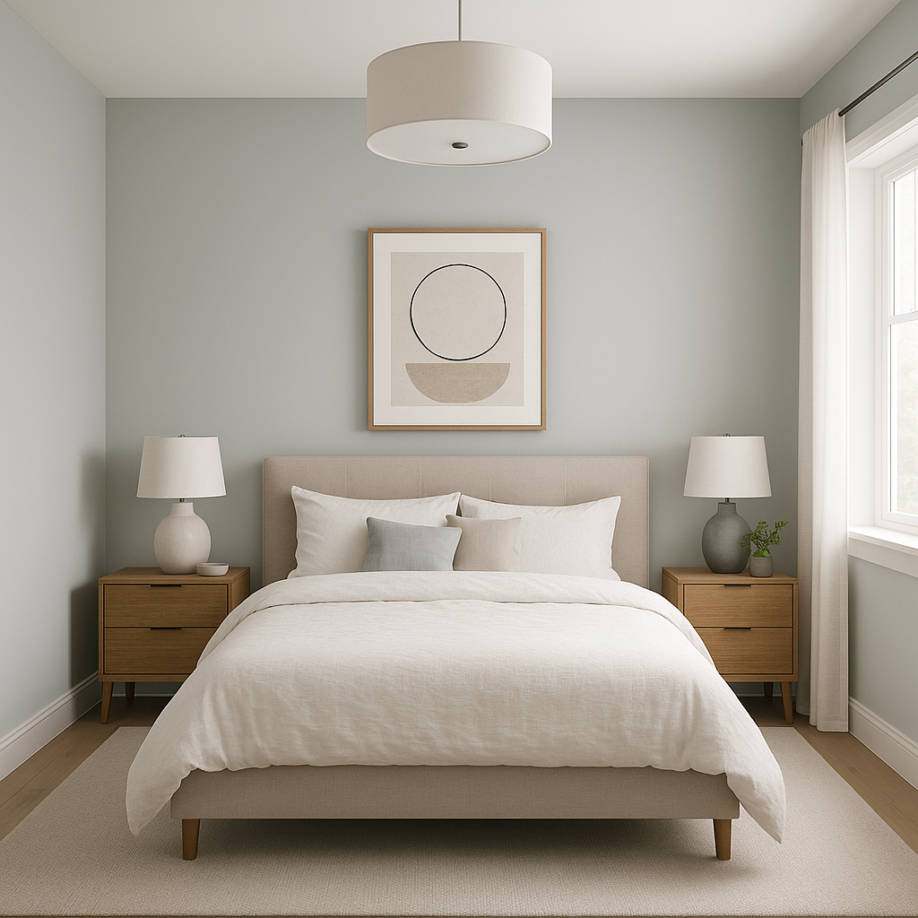
Bedrooms:
The calming blue undertones of Arctic 1577 make it a perfect choice for bedrooms. Combine it with white bedding, natural wood furniture, and soft pastel accents to create a tranquil retreat.
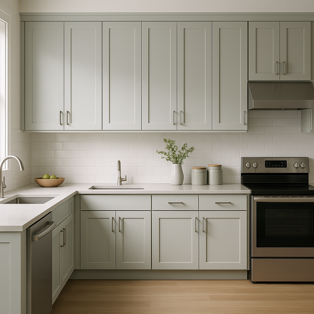
Kitchens:
Opt for Arctic 1577 on cabinets or walls to establish a sleek, modern kitchen aesthetic. Pair it with brushed nickel hardware and a white subway tile backsplash for a timeless design.
Bathrooms:
The cool, refreshing feel of Arctic 1577 is ideal for bathrooms. Use it on walls or cabinetry to evoke a spa-like atmosphere.
View Colors Only by Brand (No Imagery):
Sherwin-Williams
|
Benjamin-Moore
|
Behr
|
Valspar
Live on the Eastern Slope of Colorado and looking for a local painting professional, check out all our painting services and reach out for a free estimate.
Copyright © 2026 : Wild Fox Painting Inc. : 12435 Mead Way, Littleton, CO 80125


