Benjamin Moore Pineapple (158) is a vibrant and sunny shade of yellow that instantly evokes feelings of happiness, warmth, and optimism. Its fresh, citrusy undertone makes it an inviting and uplifting choice for interiors, while its versatility allows it to shine in a variety of design styles, from traditional to contemporary. Whether you're looking to bring energy into a space or add a playful pop of color, Pineapple is a fantastic option.
Pineapple (158) is a true yellow with a subtle hint of orange undertones, giving it a golden, sun-kissed quality. These citrusy undertones prevent the color from feeling overly bright or harsh, instead creating a soft yet lively ambiance. The undertones also lend Pineapple a natural warmth, making it an excellent choice for spaces that need a cheerful boost without feeling overwhelming.
Benjamin Moore Pineapple pairs beautifully with a variety of colors, allowing you to create a cohesive and harmonious color palette. Here are some suggestions for coordinating colors:
Pineapple (158) is a versatile shade that works beautifully in a variety of spaces, bringing energy and charm wherever it's used. Here are some design ideas for incorporating this joyful hue:
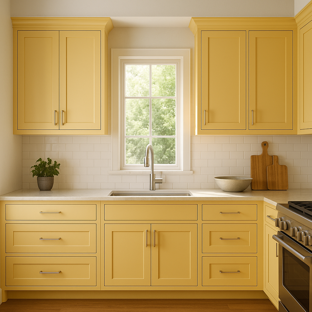
Yellow is often associated with energy and appetite, making Pineapple an excellent choice for kitchens and dining spaces. Use it on walls to create a sunny, welcoming environment, or feature it on cabinetry for a bold, eye-catching statement. Pair with white countertops and stainless steel appliances for a modern look, or add wood finishes for a cozy, farmhouse feel.
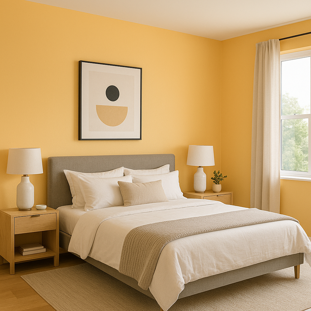
Brighten up your living room with Pineapple as a feature wall color or as an accent through furniture and décor. Its warmth will make the space feel inviting, especially when paired with soft neutrals or muted grays. Add textured throw pillows and natural fiber rugs for a layered, sophisticated aesthetic.
Pineapple's cheerful and playful nature makes it a fantastic choice for children's spaces. Use it as the main wall color or combine it with whimsical patterns and bold accent colors for a vibrant, energetic environment.
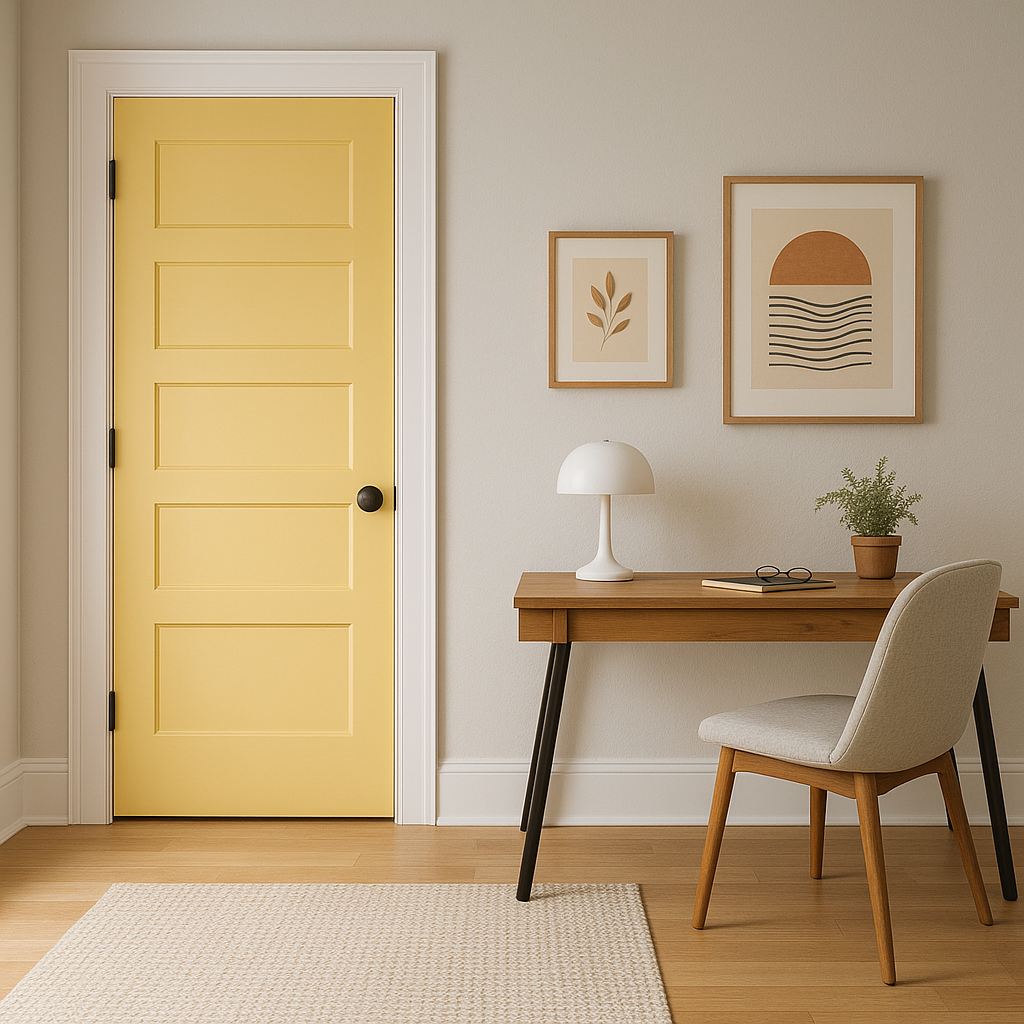
Create a welcoming first impression by using Pineapple in entryways or hallways. Its sunny disposition will greet guests with warmth and positivity. Pair it with crisp white trim to keep the space feeling fresh and open.
If you’re hesitant to commit to Pineapple on your walls, consider incorporating it through furniture, artwork, or accessories. A Pineapple-colored armchair, vase, or throw blanket can add a delightful pop of color to any room.
To make the most of Benjamin Moore Pineapple (158), consider the amount of natural light in the space. In rooms with abundant sunlight, the color will take on a luminous golden glow. In darker spaces, it may appear slightly more subdued but still brings warmth and brightness. Complement its vibrancy with natural textures like wood, rattan, or linen to create a balanced, inviting look.
Benjamin Moore Pineapple (158) is a joyous and radiant hue that can transform any space into a sunny retreat. With its citrusy undertones, wide range of coordinating colors, and versatile applications, it’s a fantastic choice for adding warmth, energy, and personality to your home.
View Colors Only by Brand (No Imagery):
Sherwin-Williams
|
Benjamin-Moore
|
Behr
|
Valspar
Live on the Eastern Slope of Colorado and looking for a local painting professional, check out all our painting services and reach out for a free estimate.
Copyright © 2026 : Wild Fox Painting Inc. : 12435 Mead Way, Littleton, CO 80125


