Benjamin Moore Paper (1590) is a soft, understated gray that blends sophistication with adaptability, making it a go-to choice for contemporary interiors and classic spaces alike. This elegant shade offers a serene backdrop that works seamlessly across various design styles, from minimalist modern to transitional and even coastal aesthetics.
At first glance, Paper (1590) appears as a light gray with subtle warmth, creating an inviting yet refined atmosphere. Its undertones lean towards a gentle beige, giving it a greige quality that prevents the color from feeling too cool or stark. This balance makes it an excellent choice for spaces where you want a neutral that feels neither overly icy nor overly creamy.
The beige undertones in Paper (1590) lend a softness to its overall appearance, ensuring it complements a wide range of materials, including natural wood, stone, and metal finishes. These subtle undertones also make it highly versatile, adapting beautifully to changing light conditions throughout the day—whether illuminated by natural sunlight or artificial lighting.
Benjamin Moore Paper (1590) pairs effortlessly with a variety of complementary hues, allowing you to craft a tailored palette that reflects your personal style. Here are some suggestions for coordinating colors:
These coordinating colors allow for flexibility in creating either tonal monochromatic designs or bold, high-contrast looks, depending on your desired aesthetic.
The versatility of Paper (1590) makes it a popular choice for a variety of applications throughout the home:
In living spaces, Paper (1590) provides a calming foundation that enhances natural light while allowing furniture, artwork, and décor to take center stage. Pair it with plush textiles like velvet or linen for a cozy yet polished look.
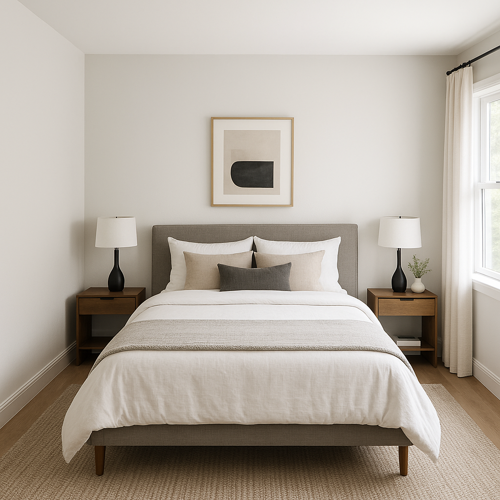
The soothing qualities of Paper (1590) make it ideal for bedrooms, where its soft neutrality encourages relaxation and tranquility. Layer with warm whites, taupes, and soft blues for a serene sleeping environment.
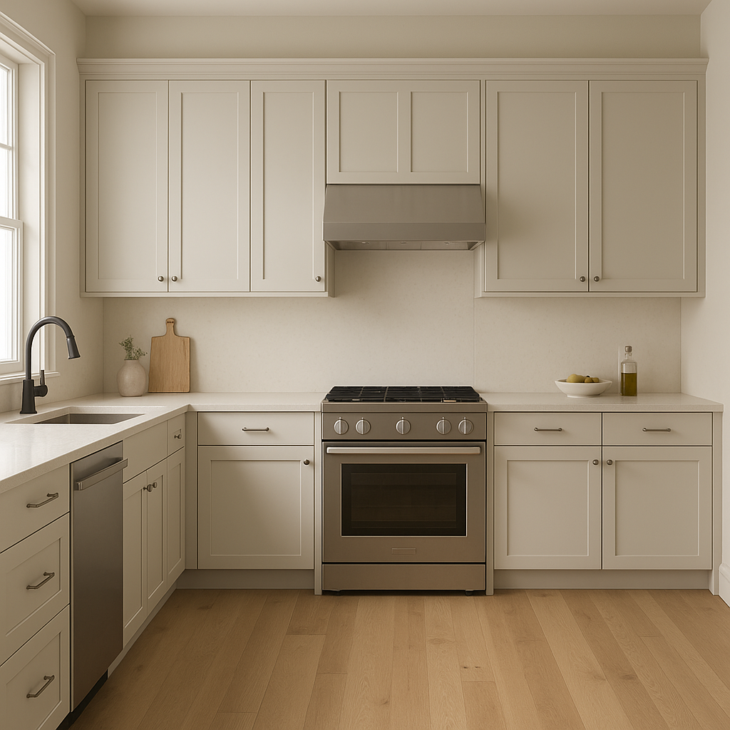
Paper (1590)’s understated elegance works wonderfully in kitchens and bathrooms, especially when paired with crisp white cabinetry, marble countertops, or brushed nickel hardware. Its ability to complement both cool and warm elements ensures these spaces feel cohesive and timeless.
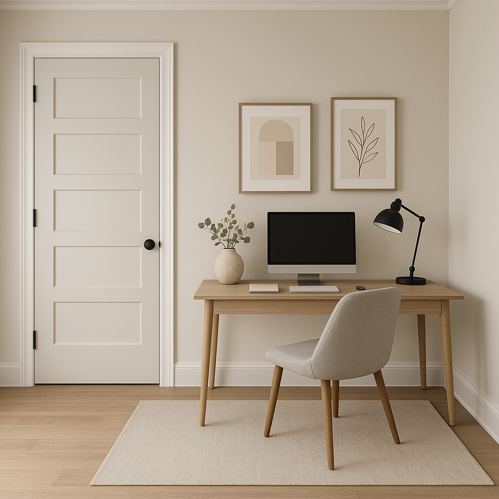
For home offices, Paper (1590) fosters concentration and productivity while maintaining a sense of calm. Pair it with darker, grounding colors like Hale Navy or charcoal accents for a more dramatic, professional vibe.
As a neutral gray, Paper (1590) is an excellent choice for hallways and entryways, where it can seamlessly connect adjoining rooms with different color schemes. Its ability to adapt to varying light conditions ensures these transitional spaces feel polished and cohesive.
Benjamin Moore Paper (1590) stands out for its ability to create a harmonious balance between warmth and coolness. Its subtle beige undertones make it approachable and versatile, while its gray base ensures it remains contemporary and on-trend. Whether you’re revamping a single room or planning a whole-home color scheme, Paper (1590) offers endless possibilities to elevate your interior design.
Embrace the timeless charm of Benjamin Moore Paper (1590) and watch how it transforms your space into a sophisticated sanctuary.
View Colors Only by Brand (No Imagery):
Sherwin-Williams
|
Benjamin-Moore
|
Behr
|
Valspar
Live on the Eastern Slope of Colorado and looking for a local painting professional, check out all our painting services and reach out for a free estimate.
Copyright © 2026 : Wild Fox Painting Inc. : 12435 Mead Way, Littleton, CO 80125


