Benjamin Moore Blue (1592) is a sophisticated, muted blue that effortlessly blends tranquility with understated refinement. With its soft and calming presence, this versatile hue is ideal for creating serene spaces while exuding a sense of timeless elegance. Whether you're designing a cozy reading nook, a chic bedroom retreat, or a modern living room, Blue (1592) delivers a balanced aesthetic that works across an array of interior styles.
One of the defining features of Benjamin Moore Blue (1592) is its subtle gray undertones. These undertones give the color its muted quality, softening its vibrancy and making it an ideal choice for spaces where bold, saturated blues might feel overwhelming. The gray undertones lend a grounding effect, ensuring that the color feels sophisticated rather than stark. Depending on the lighting, Blue (1592) may appear cooler or slightly warmer, making it adaptable to different moods and environments.
To enhance the beauty of Benjamin Moore Blue (1592), pair it with complementary or contrasting hues. Here are some suggestions for coordinating colors:
Neutral Pairings:
Blue (1592) pairs beautifully with warm neutrals such as Benjamin Moore White Dove (OC-17) or Benjamin Moore Edgecomb Gray (HC-173). These shades emphasize the calmness of the blue while maintaining a balanced and cohesive look.
Darker Accents:
For added drama and contrast, consider pairing Blue (1592) with deeper hues like Benjamin Moore Hale Navy (HC-154) or Benjamin Moore Kendall Charcoal (HC-166). These darker tones create a dynamic interplay that enhances the blue's softness.
Soft Complementary Colors:
Infuse subtle warmth into your palette by introducing blush tones like Benjamin Moore Pale Oak (OC-20) or muted greens such as Benjamin Moore Saybrook Sage (HC-114). These shades work harmoniously with Blue (1592) and add depth without overwhelming the space.
Crisp Whites:
Crisp whites, such as Benjamin Moore Chantilly Lace (OC-65), provide a clean and fresh contrast that highlights the understated elegance of Blue (1592). This combination is perfect for creating a light, airy atmosphere.
Benjamin Moore Blue (1592) is a versatile shade that works in a variety of spaces, lending a sense of calm and sophistication to your overall design. Here are some ideas for incorporating this color into your interior:
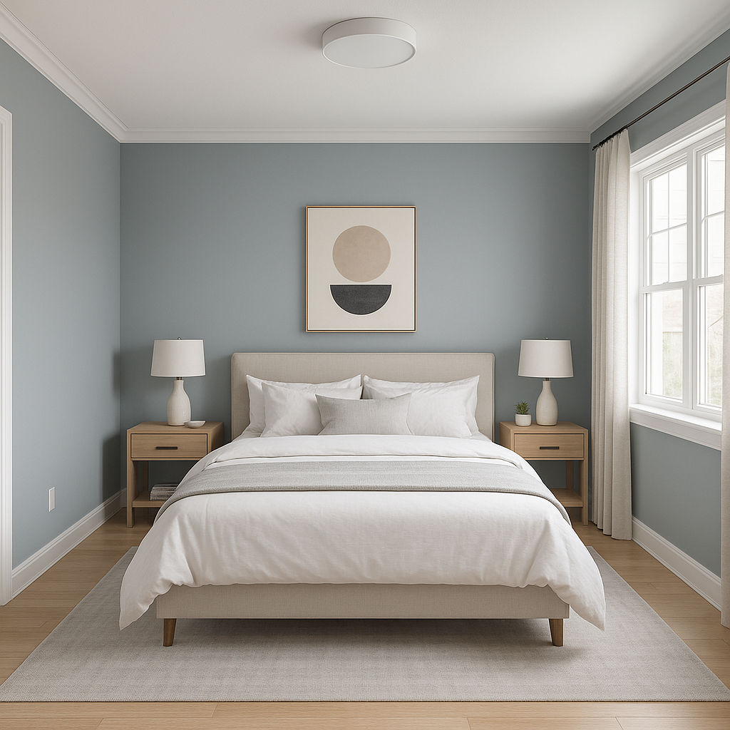
Bedrooms:
With its tranquil and soothing qualities, Blue (1592) is an excellent choice for bedrooms. Pair it with plush bedding in neutral tones and soft textures to create a serene retreat perfect for relaxation.
Living Rooms:
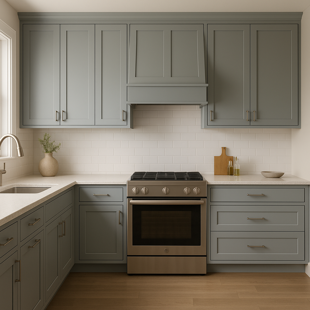
For living spaces, Blue (1592) can serve as a grounding backdrop for furniture and decor. Combine it with warm woods, metallic accents, and neutral upholstery for a modern yet inviting atmosphere.
Bathrooms:
Evoke a spa-like ambiance in your bathroom by using Blue (1592) on walls or cabinetry. Pair it with sleek chrome fixtures and crisp white tiles for a clean, polished look.
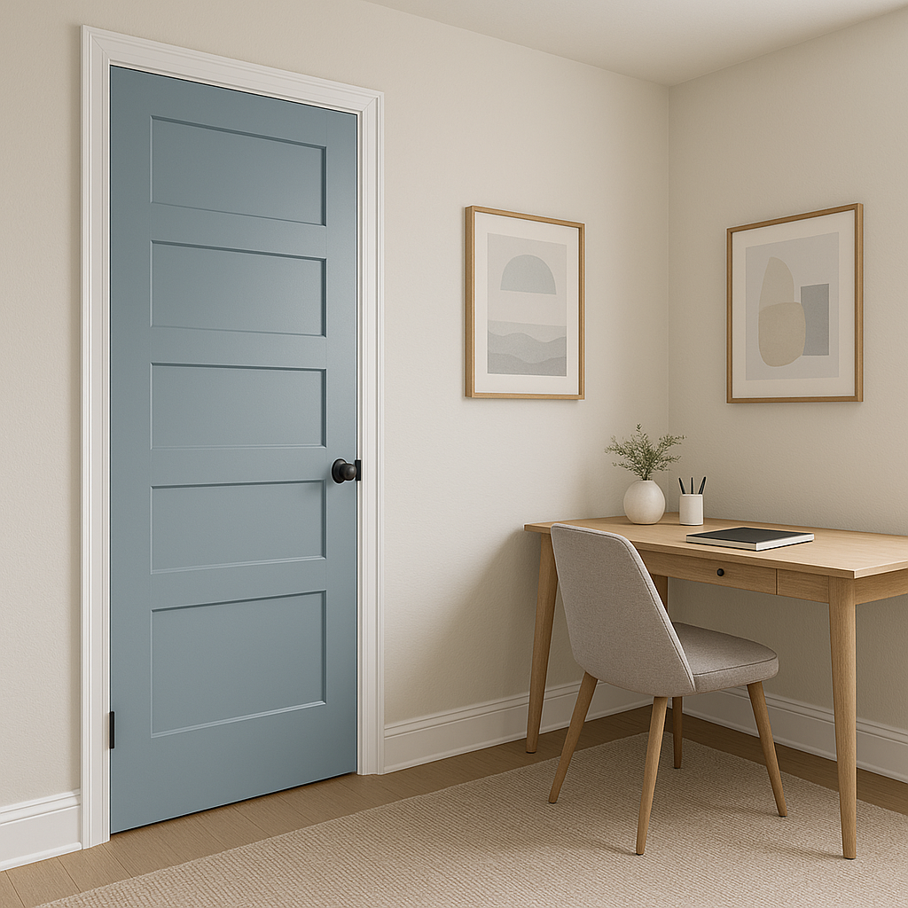
Home Office:
Blue (1592) fosters focus and calm, making it an ideal choice for a productive yet stylish home office. Incorporate natural wood furniture and greenery to complete the look.
Accent Walls:
Use Blue (1592) as an accent wall to add depth and character to any space. Pair it with lighter tones to create a balanced visual rhythm.
Benjamin Moore Blue (1592) adapts beautifully to different lighting conditions. In natural light, its gray undertones shine through, creating a cooler and more subdued blue. In artificial lighting, especially warm-toned bulbs, the color may take on a slightly cozier and softer appearance. To ensure it complements your space perfectly, test Blue (1592) in various lighting scenarios before committing.
Benjamin Moore Blue (1592) is the epitome of understated elegance, offering a muted yet versatile blue that can transform any space into a haven of tranquility. Its adaptability, paired with its timeless appeal, makes it a favorite among interior designers and homeowners alike. From calming retreats to sophisticated living areas, Blue (1592) is truly a design staple that stands the test of time.
View Colors Only by Brand (No Imagery):
Sherwin-Williams
|
Benjamin-Moore
|
Behr
|
Valspar
Live on the Eastern Slope of Colorado and looking for a local painting professional, check out all our painting services and reach out for a free estimate.
Copyright © 2026 : Wild Fox Painting Inc. : 12435 Mead Way, Littleton, CO 80125


