Benjamin Moore Soft (160) is a gentle and understated neutral that exudes quiet sophistication. As part of Benjamin Moore’s expansive palette, this shade is perfect for creating a serene atmosphere in a wide variety of spaces. Its balanced character makes it incredibly versatile, allowing it to harmonize beautifully with both classic and contemporary interiors.
Soft (160) is a muted taupe-gray that leans slightly warm, giving it a cozy and approachable feel. While it appears predominantly neutral, its subtle undertones of beige add depth and softness, preventing it from feeling flat or overly cool. These warm undertones make it a welcoming choice that complements a variety of other hues without overpowering them.
The beauty of Soft (160) lies in its ability to adapt to lighting conditions. In spaces with natural daylight, Soft (160) can appear lighter and more airy, while in rooms with artificial or low lighting, its warmer undertones become more pronounced, giving it a gentle cocoon-like quality.
Benjamin Moore Soft (160) works wonderfully as a foundational color, pairing effortlessly with a wide range of complementary shades. Whether you’re looking to create contrast or a monochromatic scheme, here are some coordinating colors to consider:
Deep Charcoals and Blacks: Pair Soft (160) with deep shades like Benjamin Moore’s Wrought Iron (2124-10) or Black Ink (2127-20) for a striking and modern contrast. This combination works well in contemporary living rooms or offices.
Earthy Greens: Bring in Benjamin Moore’s October Mist (1495) or Silken Pine (2144-50) to add an organic, earthy touch. These soft greens pair beautifully with Soft (160) to create a tranquil and grounded ambiance in bedrooms or reading nooks.
Creamy Whites: Lighter shades such as White Dove (OC-17) or Simply White (OC-117) provide a crisp, clean balance that complements Soft (160) without overshadowing its subtle warmth. This pairing is ideal for molding, trim, or ceilings in spaces where you want the walls to feel cozy but refined.
Muted Blues: For a cool yet harmonious palette, consider pairing Soft (160) with Van Deusen Blue (HC-156) or Boothbay Gray (HC-165). These tones add a touch of calm sophistication, making them ideal for bathrooms or coastal-inspired spaces.
Soft (160) is a versatile neutral that works well throughout the home, from walls to cabinetry, and even furniture. Its ability to complement a range of design styles makes it a popular choice for homeowners and designers alike. Here are some of the best ways to use this shade:
Living Rooms: Create a warm and inviting living space by using Soft (160) on walls. Pair it with plush furniture in complementary tones like cream or beige, and add accents in darker contrasting colors for depth.
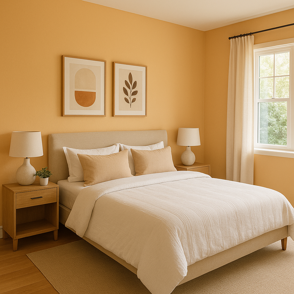
Bedrooms: Soft (160) is an ideal choice for bedrooms, offering a restful and calming backdrop. Layer textures like linen bedding and soft rugs in coordinating neutrals to amplify the sense of relaxation.
Bathrooms: For a spa-like retreat, use Soft (160) alongside whites and muted blues. Its subtle warmth ensures the space remains cozy, while its versatility allows it to pair beautifully with natural stone or tile.
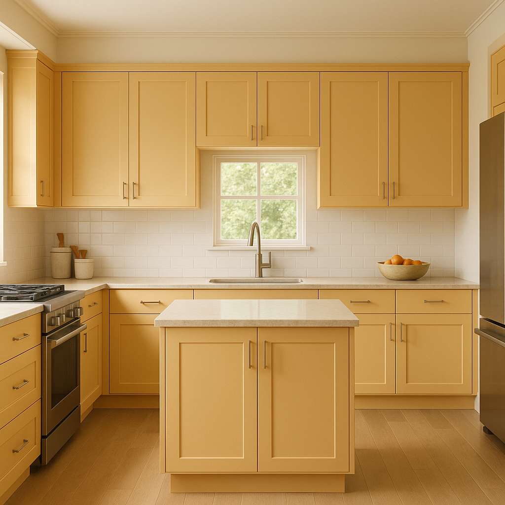
Kitchens: Soft (160) can be used as a wall color or cabinet finish in kitchens. Pair it with brushed nickel or matte black hardware for a sleek yet timeless look.
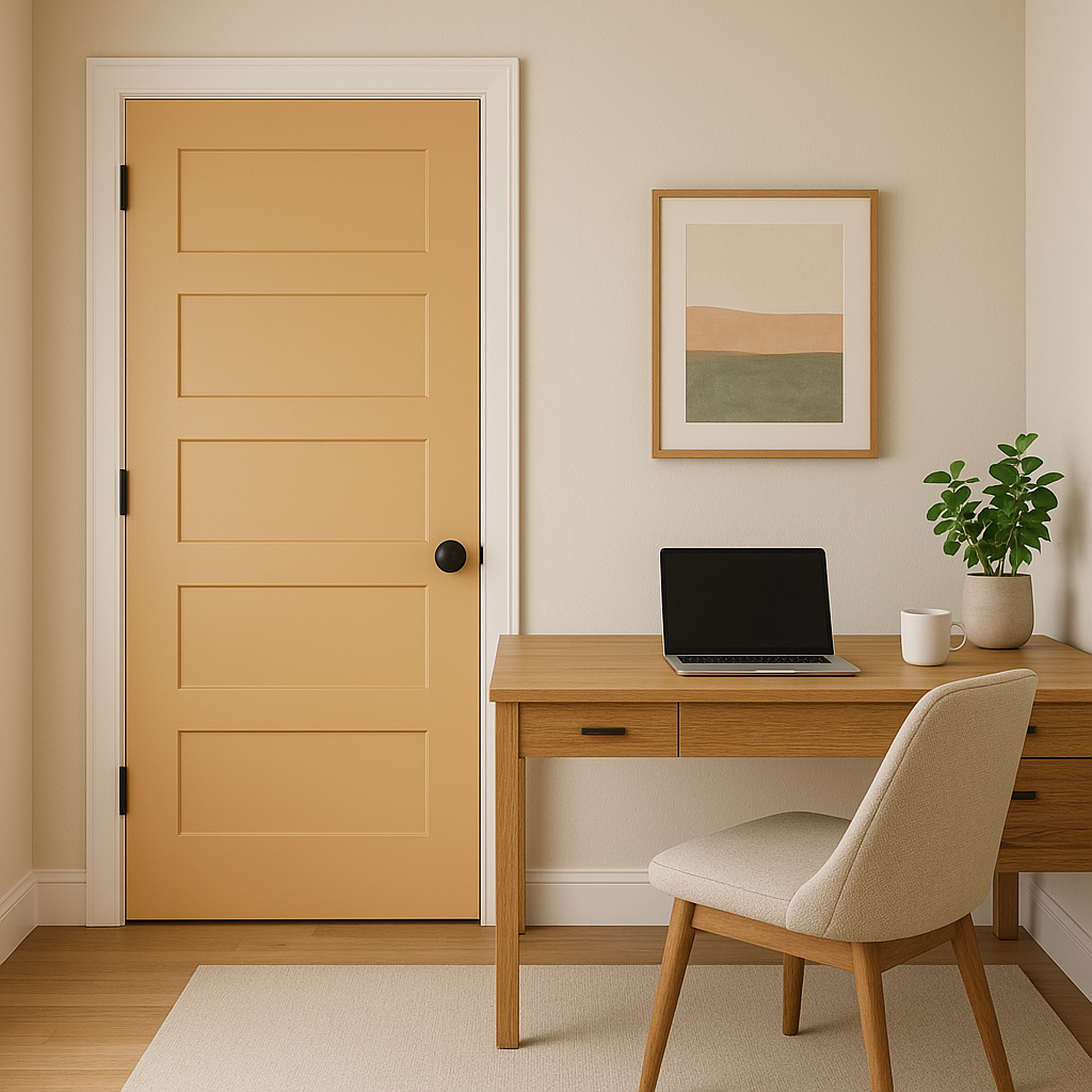
Offices and Study Areas: This shade’s muted elegance makes it a perfect choice for creating focus and calm in workspaces. Pair it with dark woods and metallic accents for a professional yet welcoming atmosphere.
Benjamin Moore Soft (160) is a neutral that transcends fleeting trends, offering a timeless canvas for your design vision. Its subtle taupe-gray tones and versatile undertones make it a perfect choice for homeowners seeking a color that is both sophisticated and adaptable. Whether you’re revamping a single room or designing an entire home, Soft (160) provides a graceful foundation that complements a wide variety of palettes and styles.
With its versatility, timeless appeal, and ability to create serene spaces, Benjamin Moore Soft (160) is an excellent choice for anyone looking to elevate their interiors with understated elegance.
View Colors Only by Brand (No Imagery):
Sherwin-Williams
|
Benjamin-Moore
|
Behr
|
Valspar
Live on the Eastern Slope of Colorado and looking for a local painting professional, check out all our painting services and reach out for a free estimate.
Copyright © 2026 : Wild Fox Painting Inc. : 12435 Mead Way, Littleton, CO 80125


