Benjamin Moore Winter 1605 is a sophisticated medium gray that strikes a perfect balance between warmth and coolness. This elegant shade has a subtle depth that makes it a go-to choice for creating serene and refined spaces. Whether you're designing a modern minimalist retreat or a classic, timeless interior, Winter 1605 has the versatility to suit a wide range of styles and environments.
One of Winter 1605's most appealing characteristics is its complex undertones. This gray carries a soft blue undertone, lending it a cool, calming effect without feeling overly cold or stark. The hint of blue gives the color a contemporary edge while maintaining a timeless appeal. In certain lighting, you may also notice a faint touch of green, which adds to its layered complexity and adaptability.
The lighting in your space will play a significant role in how Winter 1605 appears:
Winter 1605’s versatility shines when paired with complementary colors that bring out its full potential. Here are some coordinating hues to consider:
For those drawn to bolder designs, consider pairing Winter 1605 with jewel tones like emerald green or rich burgundy for a striking yet balanced look.
Benjamin Moore Winter 1605 is an incredibly versatile color that works beautifully in various spaces and design styles. Its adaptability to different lighting and color schemes makes it a top choice for both residential and commercial interiors.
Create a cozy, inviting living room by using Winter 1605 on the walls with soft neutral furniture and warm wood accents. Add pops of color through textiles or artwork to personalize the space.
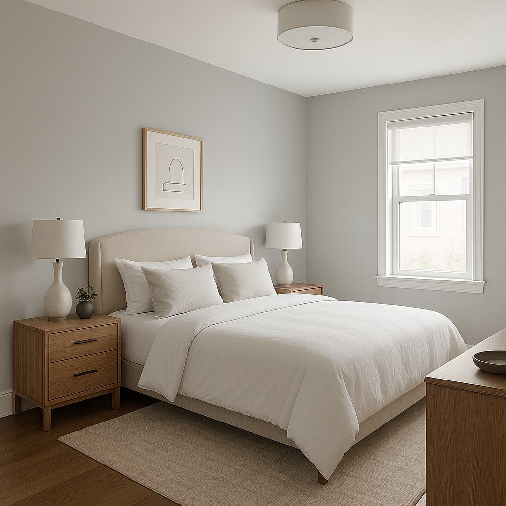
Transform your bedroom into a calming retreat with Winter 1605 as the main wall color. Pair it with crisp white bedding and soft blue or green accents for a tranquil, spa-like atmosphere.
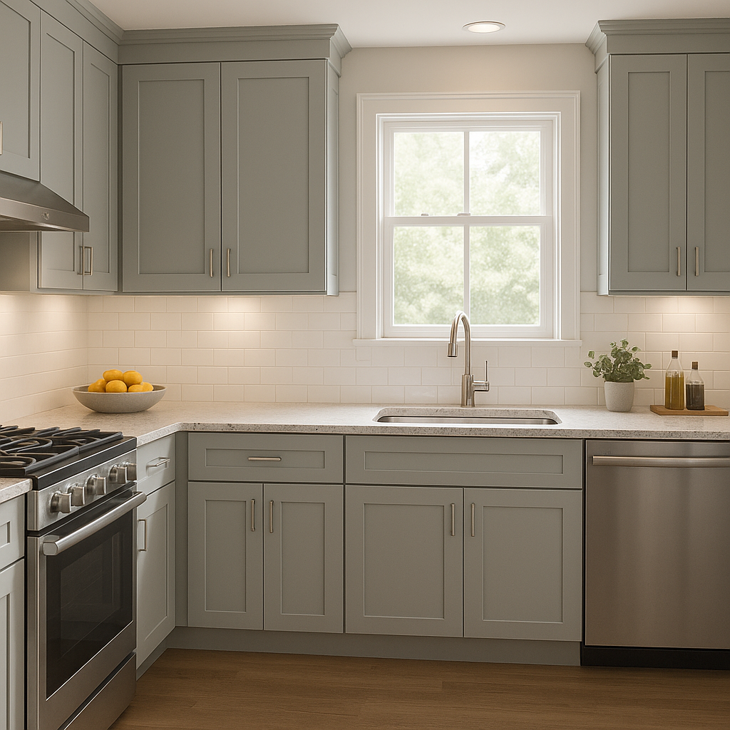
Winter 1605 is a sophisticated choice for kitchen cabinetry or walls. Pair it with marble countertops, stainless steel appliances, and warm brass or matte black hardware for a timeless yet modern aesthetic.
The cool undertones of Winter 1605 make it an excellent choice for bathrooms. It pairs beautifully with white tiles, chrome fixtures, and pale blue or green accents to create a fresh, serene space.
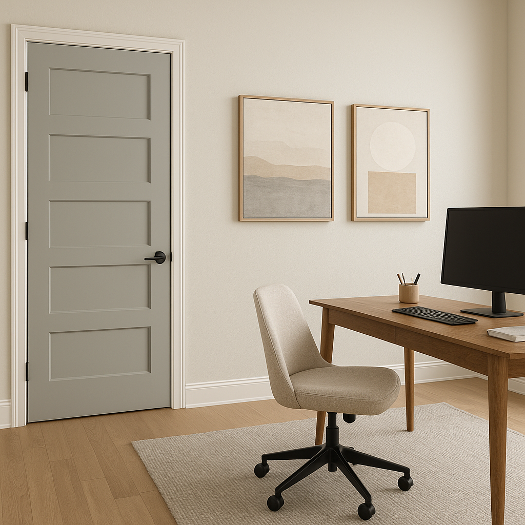
In a home office, Winter 1605 fosters focus and productivity. Its balanced undertones provide a neutral backdrop that complements both natural and task lighting,
View Colors Only by Brand (No Imagery):
Sherwin-Williams
|
Benjamin-Moore
|
Behr
|
Valspar
Live on the Eastern Slope of Colorado and looking for a local painting professional, check out all our painting services and reach out for a free estimate.
Copyright © 2026 : Wild Fox Painting Inc. : 12435 Mead Way, Littleton, CO 80125


