
Benjamin Moore French (1610) is an exquisite gray that exudes understated sophistication and versatility. This mid-tone gray offers a refined balance between warmth and coolness, making it a beloved choice for a wide range of interior design styles, from classic to contemporary. Its ability to adapt to various lighting conditions and pair seamlessly with different color palettes makes it a staple in the world of interior design.
French (1610) carries a harmonious mix of subtle undertones that add depth and character to its appearance. This gray leans slightly toward the cool side, with faint blue undertones that impart a serene, calming quality to the color. However, it also has a whisper of warmth, thanks to its soft taupe influence. These undertones create a balanced hue that avoids looking too stark or overly cold, making it perfect for spaces seeking a neutral yet inviting ambiance.
Benjamin Moore French (1610) is remarkably versatile and pairs beautifully with a wide array of coordinating colors. Whether you're aiming for a monochromatic look or a striking contrast, here are some ideas for complementary hues:
Neutral Pairings
Bold Contrasts
Warm Accents
Nature-Inspired Greens
French (1610) is a versatile color that works well in both residential and commercial spaces. Its neutral yet dynamic quality makes it suitable for various applications:
This warm-leaning gray is perfect for creating cozy, inviting living spaces. Pair it with soft whites and natural wood tones for a modern farmhouse aesthetic, or layer it with bold navy blues for a sophisticated, coastal-inspired vibe.
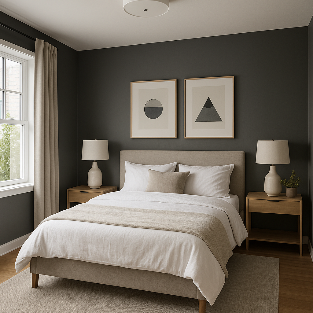
The calming undertones of French make it an excellent choice for bedrooms. Its mild coolness promotes relaxation, while its subtle warmth ensures the space feels welcoming. Pair it with plush textiles in blush pinks, creamy whites, or muted greens for a restful retreat.
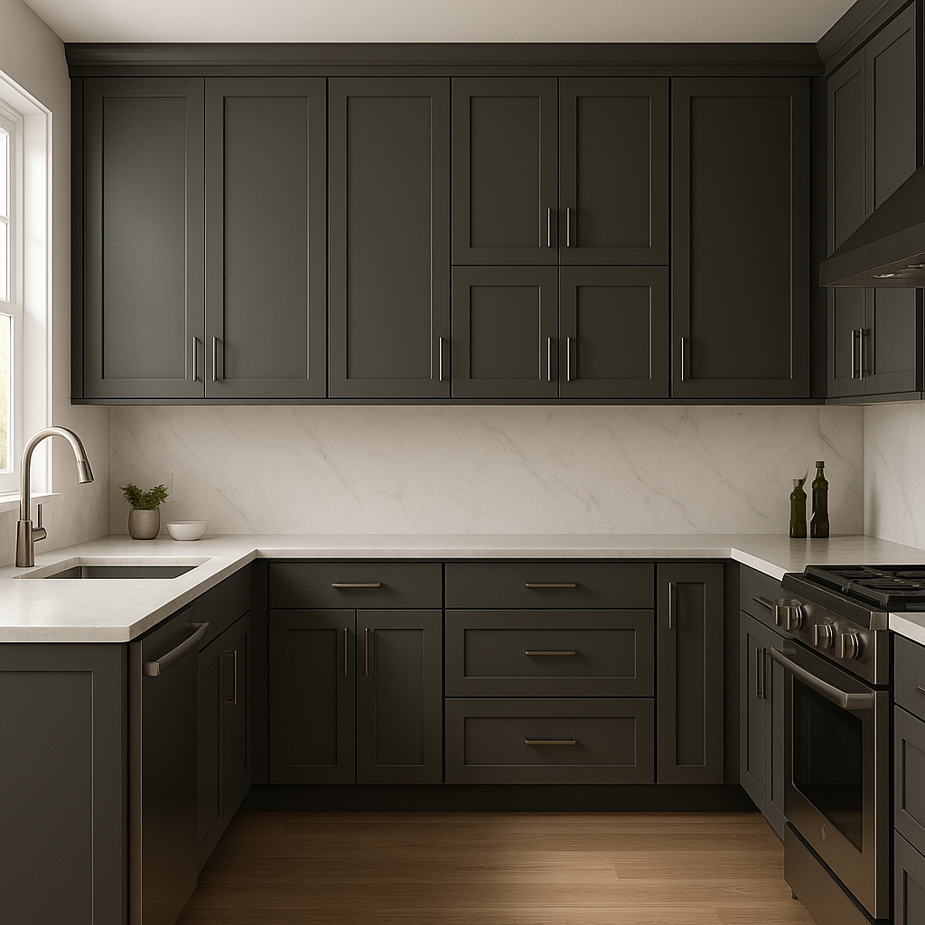
French (1610) brings understated elegance to kitchen cabinetry or walls. Pair it with brushed gold hardware, marble countertops, and a crisp white backsplash for a high-end, timeless look.
With its balanced undertones, French fosters a focused yet serene atmosphere, making it perfect for home offices. Pair it with deep greens or charcoal tones for a sophisticated workspace.
French’s soft taupe influence adds a spa-like tranquility to bathrooms. Pair it with white subway tiles, natural stone accents, and soft gray towels for a serene sanctuary.
As with all grays, lighting plays a crucial role in how Benjamin Moore French (1610) reads in a space. In natural light, the blue undertones may become slightly more pronounced, giving the color a cooler feel during the day. In artificial light, particularly warm lighting, its faint taupe undertones emerge, creating a cozy, inviting ambiance. Always test the color in your space to observe how it reacts to your specific lighting conditions.
Benjamin Moore French (1610) is a timeless gray that strikes the perfect balance between cool and warm tones. Its richness and versatility make it an ideal choice for homeowners and designers seeking a neutral backdrop with depth and character. Whether used in a contemporary setting or a traditional home, French (1610) is sure to elevate any space with its sophisticated charm.
View Colors Only by Brand (No Imagery):
Sherwin-Williams
|
Benjamin-Moore
|
Behr
|
Valspar
Live on the Eastern Slope of Colorado and looking for a local painting professional, check out all our painting services and reach out for a free estimate.
Copyright © 2026 : Wild Fox Painting Inc. : 12435 Mead Way, Littleton, CO 80125


