Benjamin Moore Silent (1613) is a soft, muted gray that exudes subtle sophistication and timeless appeal. Perfect for creating serene, understated spaces, Silent offers a neutral backdrop that works beautifully in a wide range of interior styles, from modern minimalism to classic traditional designs. Its balanced tone makes it an ideal choice for those seeking a gray that isn’t overly cool or warm, allowing it to harmonize effortlessly with various decor elements.
Silent (1613) features subtle blue undertones that give it a gentle coolness without making it feel stark or clinical. This hint of blue lends a calming quality to the paint color, making it particularly suited for spaces where relaxation and tranquility are key, such as bedrooms, living rooms, or home offices. The undertones are understated, ensuring Silent retains its versatility as a neutral gray while offering a touch of depth and interest.
Silent (1613) pairs beautifully with a wide range of coordinating colors, thanks to its neutral foundation and cool undertones. Here are some excellent options to consider:
Silent (1613) is a versatile paint color that adapts beautifully to various applications and design aesthetics. Here are some ideas for incorporating this sophisticated gray into your home or commercial spaces:
Silent serves as an elegant backdrop for living rooms, allowing furniture, textiles, and artwork to shine. Pair it with warm wood tones and plush fabrics for a cozy, inviting atmosphere, or opt for sleek metallic accents and clean lines for a contemporary edge.
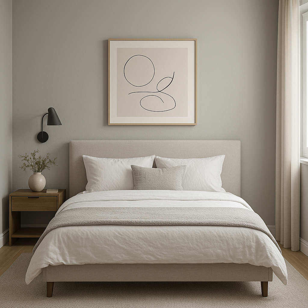
The calming undertones of Silent make it an excellent choice for bedrooms. Combine it with soft whites and pale blues to create a restful retreat, or layer in darker tones for a more dramatic and moody vibe.
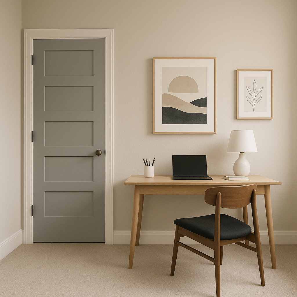
Create a focused yet soothing environment in your home office with Silent. Its neutral tone helps reduce distractions while fostering a sense of calm. Pair it with crisp whites and pops of color for a stimulating workspace.
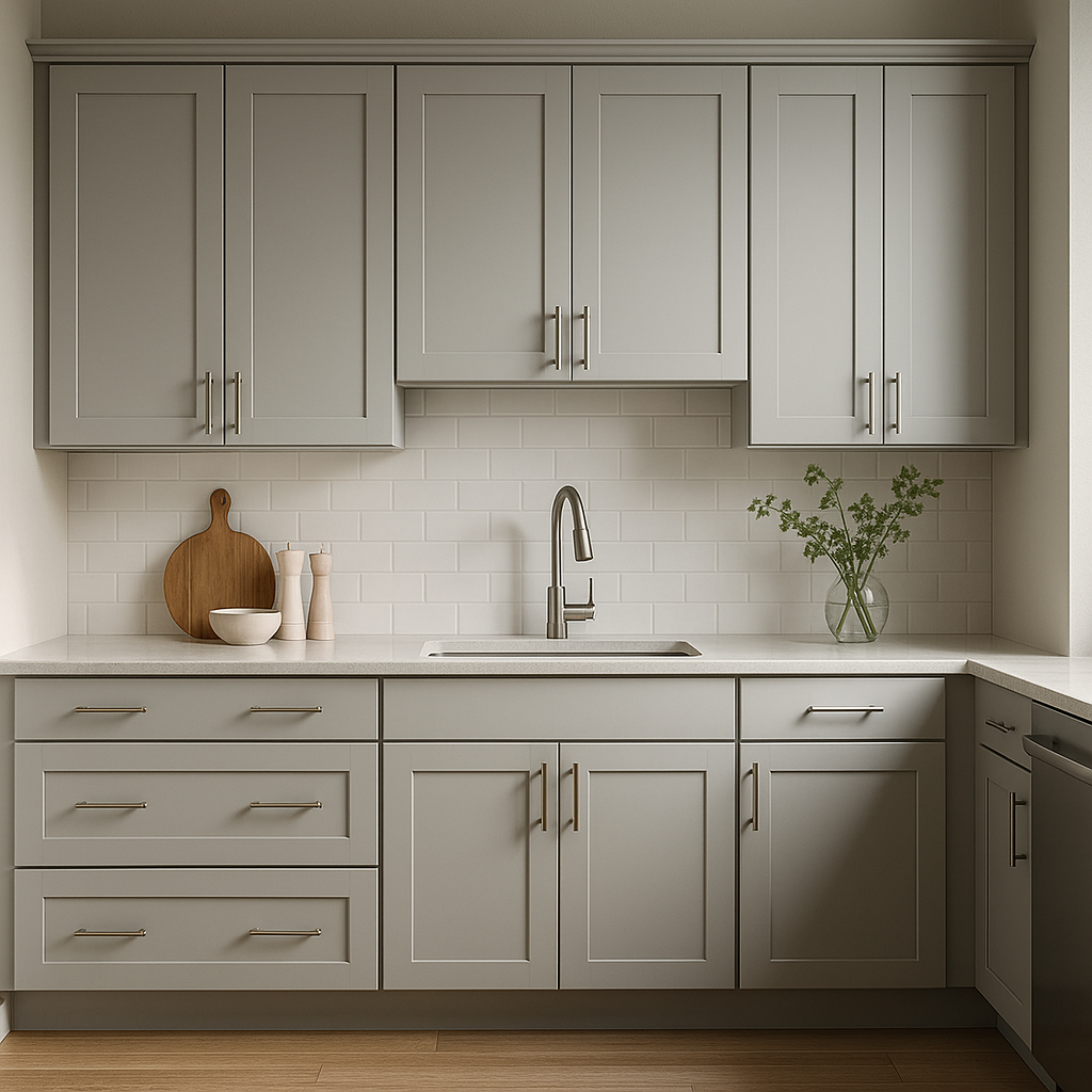
Silent works beautifully in kitchens and bathrooms, offering a clean, polished look. Pair it with white cabinetry and chrome or brushed nickel fixtures for a modern feel, or incorporate natural wood elements for a more rustic charm.
Silent’s versatile and professional appearance makes it ideal for office spaces, waiting rooms, or retail environments. Its neutral tone creates a welcoming ambiance while allowing branding elements and furnishings to stand out.
Benjamin Moore Silent (1613) is more than just a paint color—it’s a sophisticated foundation for creating spaces that feel timeless, tranquil, and effortlessly stylish. Whether used as a main wall color or a subtle accent, Silent brings a sense of calm refinement to any interior.
View Colors Only by Brand (No Imagery):
Sherwin-Williams
|
Benjamin-Moore
|
Behr
|
Valspar
Live on the Eastern Slope of Colorado and looking for a local painting professional, check out all our painting services and reach out for a free estimate.
Copyright © 2026 : Wild Fox Painting Inc. : 12435 Mead Way, Littleton, CO 80125


