Benjamin Moore Stormy (1616) is a timeless and versatile medium gray that exudes sophistication and calm. Perfectly balanced with cool undertones, this shade is a go-to choice for creating serene yet modern spaces. Stormy is ideal for both residential and commercial interiors, offering a flexible foundation that complements a wide variety of design styles, from contemporary to traditional.
Stormy boasts cool undertones that lean slightly toward a bluish-gray. These subtle undertones prevent it from feeling overly dark or heavy, making it an excellent choice for spaces that require depth and character without overwhelming the room. The hint of blue adds a touch of softness, creating an inviting atmosphere that feels grounded yet airy. It’s important to note that lighting plays a significant role in how Stormy appears, with warmer lighting pulling out the gray tones and cooler lighting accentuating the blue undertones.
Benjamin Moore Stormy pairs beautifully with a broad range of colors, making it a versatile option for layering tones and textures in your space. Below are some coordinating color suggestions:
Whites & Neutrals: Pair Stormy with crisp whites like Benjamin Moore Simply White (OC-117) or Chantilly Lace (OC-65) for a clean, modern contrast. For a softer look, consider warmer neutrals like Edgecomb Gray (HC-173) or Classic Gray (OC-23).
Blues: Enhance Stormy’s cool undertones with complementary blues such as Navy Blue (2067-10) or Van Deusen Blue (HC-156). These shades create depth and drama, perfect for accent walls or bold furniture pieces.
Greens: For a natural, earthy vibe, pair Stormy with muted greens like October Mist (1495) or Soft Fern (2144-40). These combinations evoke a sense of tranquility and connection to nature.
Accent Colors: Add energy to your space with pops of vibrant hues like Caliente (AF-290), a bold red, or Yellow Brick Road (2153-30) for a cheerful contrast. These accents work particularly well in accessory pieces such as throw pillows, artwork, or rugs.
Stormy is an incredibly adaptable color that works well in a variety of spaces. Here’s how you can use it to elevate your interiors:
Stormy creates an elegant backdrop for living rooms, blending seamlessly with both modern and traditional furniture. Pair it with warm wood tones for a cozy feel or sleek metallic accents for a contemporary edge. Add plush textures like velvet or wool for a touch of luxury.
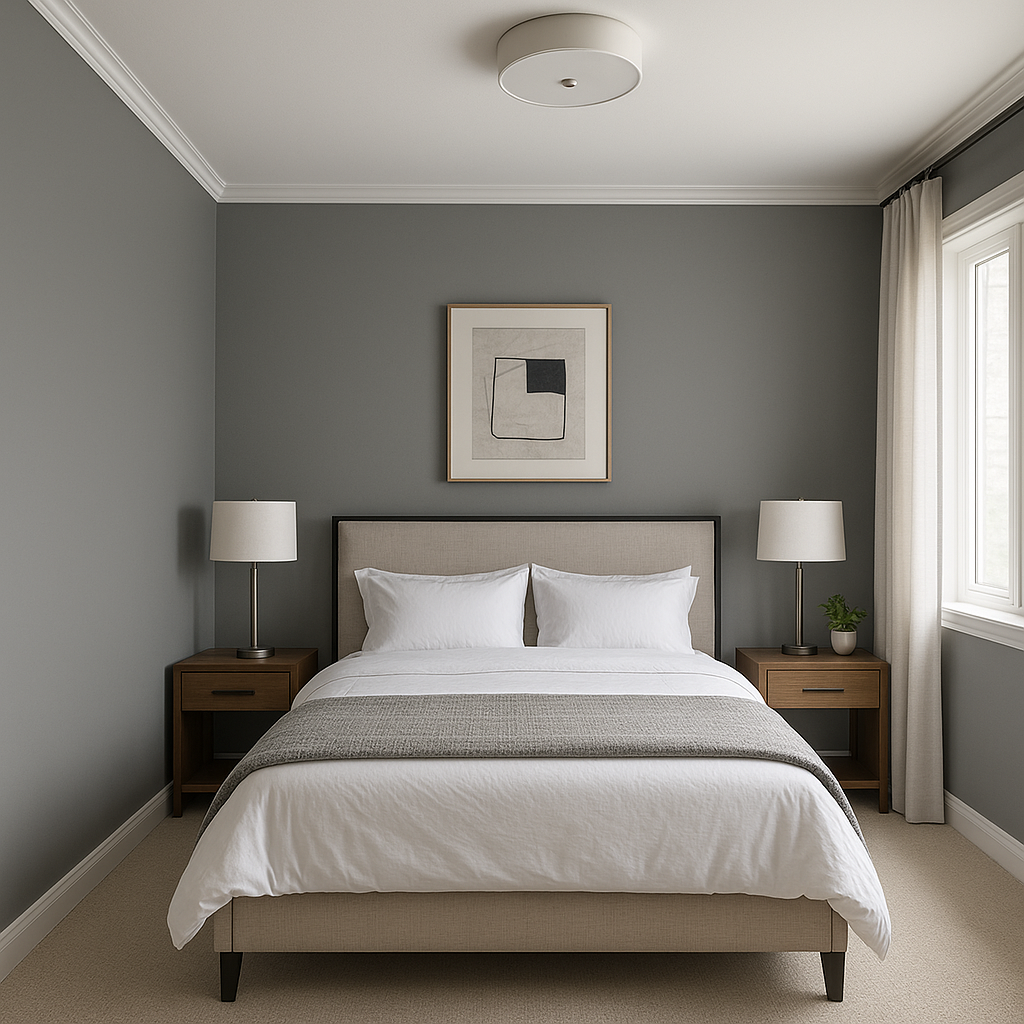
This soothing gray is perfect for bedrooms, where it fosters relaxation and calm. Combine it with soft white bedding and pale blue or green accents to craft a tranquil retreat.
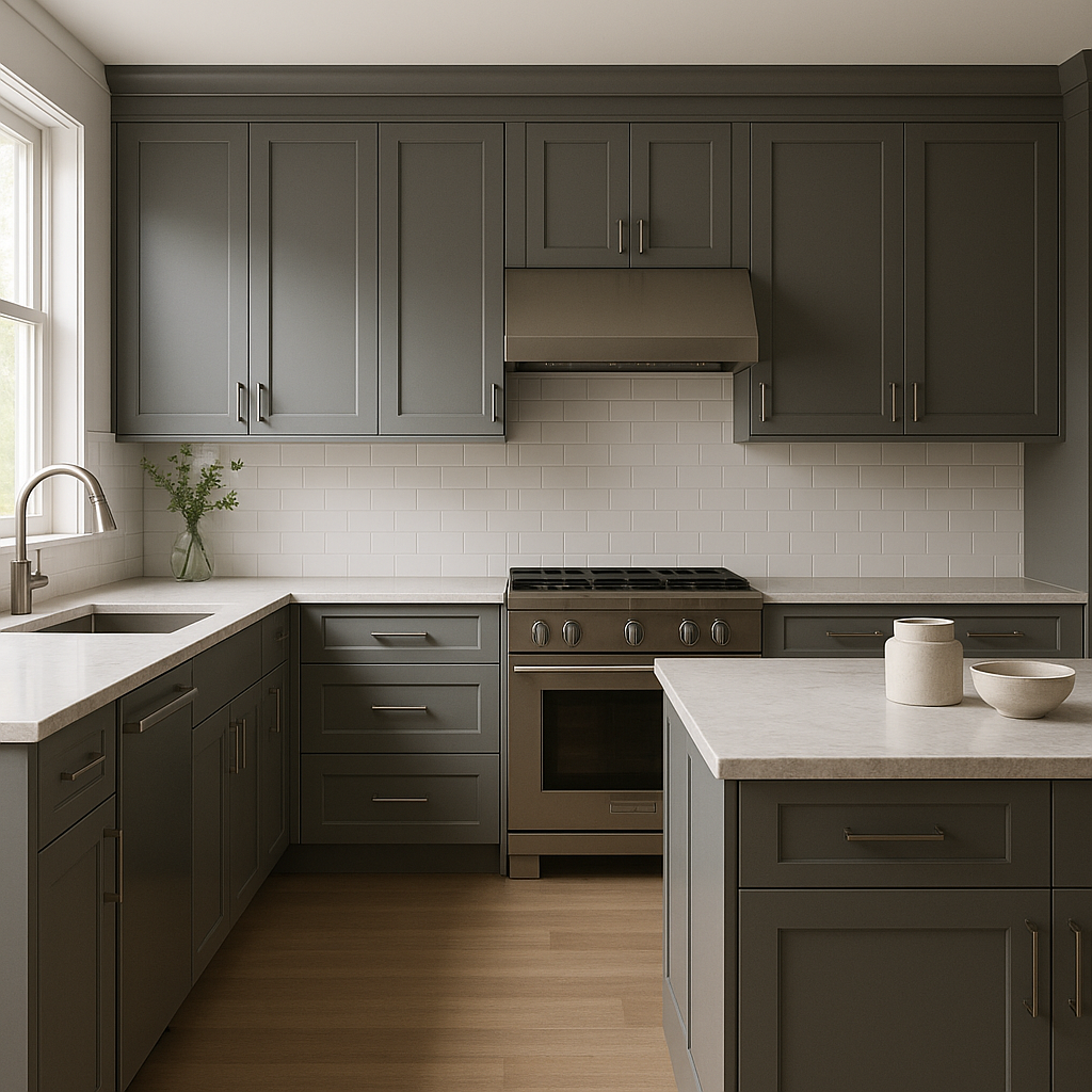
Stormy is a striking choice for kitchen cabinets, especially when paired with white countertops and subway tiles. For a bolder look, consider using it on walls and complementing it with brass or stainless steel hardware.
Stormy shines in bathrooms, offering a spa-like ambiance when paired with bright whites, marble finishes, and brushed nickel fixtures. Its cool undertones work beautifully in small spaces, creating a clean and fresh atmosphere.
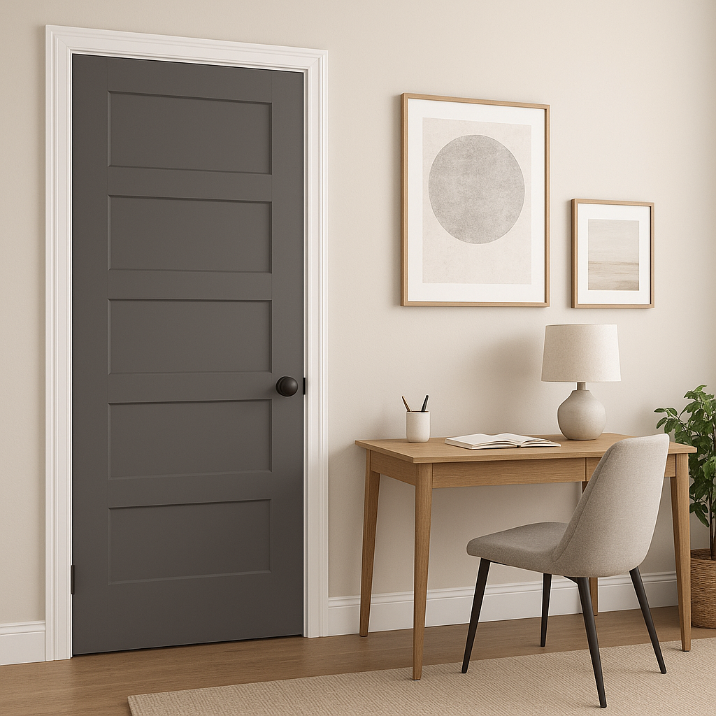
This gray is ideal for home offices, providing a neutral yet inspiring backdrop that enhances productivity. Pair it with natural wood desks and sleek black accents for a professional, polished look.
Stormy can also be used on exteriors to create a refined curb appeal. Pair it with white trim for a classic look or add black shutters for a striking contrast.
As with all paint colors, lighting plays a crucial role in how Stormy appears in your space. In rooms with ample natural light, Stormy will appear slightly lighter and reveal more of its bluish undertones. In spaces with limited light or artificial warmer lighting, it takes on a richer, more neutral gray tone. To ensure the perfect look, test Stormy on your walls in different lighting conditions before committing.
Benjamin Moore Stormy (1616) is a sophisticated gray that transcends trends, offering endless possibilities for creating serene and elegant spaces. Whether you’re designing a cozy bedroom, a refined living room, or a sleek kitchen, this versatile shade provides the perfect canvas for your vision.
View Colors Only by Brand (No Imagery):
Sherwin-Williams
|
Benjamin-Moore
|
Behr
|
Valspar
Live on the Eastern Slope of Colorado and looking for a local painting professional, check out all our painting services and reach out for a free estimate.
Copyright © 2026 : Wild Fox Painting Inc. : 12435 Mead Way, Littleton, CO 80125


