Benjamin Moore Corinthian (162) is a sophisticated and timeless neutral that exudes subtle elegance and versatility. This warm gray hue strikes the perfect balance between cool and warm tones, making it a popular choice for a wide range of interior design styles, from modern minimalism to traditional charm. Corinthian effortlessly creates an inviting atmosphere, making it a go-to color for homeowners and designers alike.
One of the defining characteristics of Corinthian is its refined undertones. This warm gray carries soft beige undertones that give it a welcoming and grounded presence, while a whisper of taupe adds complexity and depth. Unlike cooler grays that lean blue or icy, Corinthian has a delicate warmth that feels cozy without appearing overly yellow or muddy. These subtle undertones ensure the paint color adapts beautifully to varying lighting conditions, making it ideal for spaces with both natural and artificial light.
Benjamin Moore Corinthian (162) pairs harmoniously with a wide range of complementary hues, thanks to its versatile neutrality. Below are some coordinating colors to inspire your next design project:
Trim and Accents: To highlight Corinthian's depth, pair it with crisp whites like Benjamin Moore Chantilly Lace (OC-65) or Simply White (OC-117). These bright whites will provide a clean contrast that enhances Corinthian's warmth.
Earthy Tones: For an organic and grounded palette, consider pairing Corinthian with soft greens like Benjamin Moore Saybrook Sage (HC-114) or gentle browns such as Kingsport Gray (HC-86). These colors bring out Corinthian's taupe undertones and create a serene and nature-inspired aesthetic.
Moody Contrast: If you're aiming for drama and sophistication, pair Corinthian with darker hues like Iron Mountain (2134-30) or Kendall Charcoal (HC-166). The juxtaposition of light and dark creates a striking visual dynamic perfect for modern interiors.
Pops of Color: To introduce vibrancy, accent Corinthian with muted blues like Van Deusen Blue (HC-156) or soft blush tones such as Head Over Heels (AF-250). These complementary shades add personality without overwhelming the space.
The versatility of Corinthian makes it suitable for virtually any room or application. Whether you’re looking to create a sense of calm in a bedroom, sophistication in a living room, or a welcoming atmosphere in a hallway, this warm neutral delivers effortless style. Below are some popular uses for this elegant hue:
Corinthian is an excellent choice for living rooms and family spaces, where comfort and cohesion are key. Its warm undertones make it perfect for creating a relaxing environment while still offering enough depth to feel polished. Pair it with natural wood furniture and textured fabrics for a cozy yet refined look.
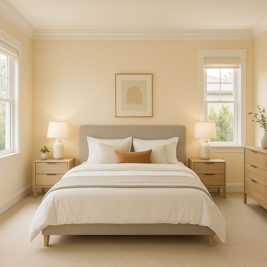
In bedrooms, Corinthian offers a serene backdrop for restful nights. Its understated elegance allows you to layer soft linens, plush throws, and decorative accents in complementary tones for a tranquil retreat. Add dimmable warm lighting to enhance its inviting qualities.
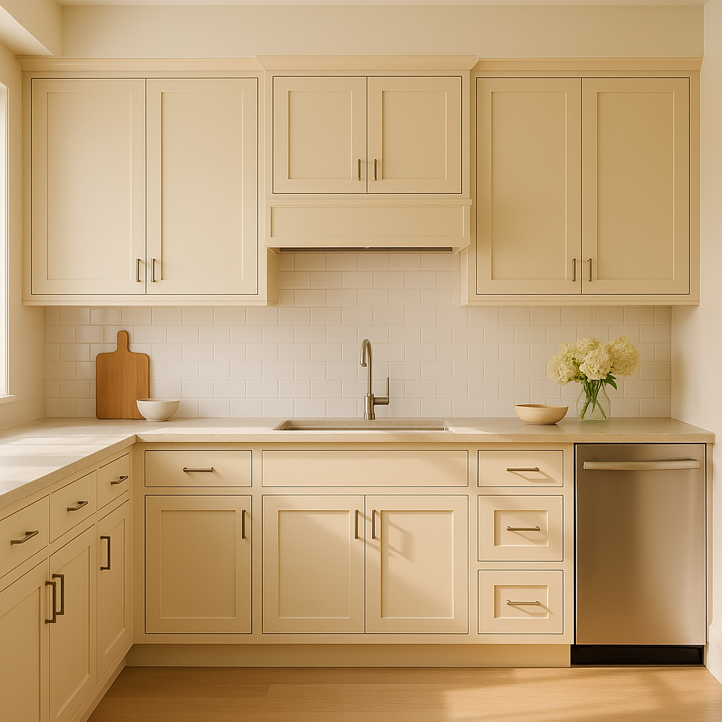
Corinthian adapts beautifully to kitchens and dining areas, especially when paired with white cabinetry or natural stone countertops. Its neutral warmth complements metallic finishes like brushed nickel or brass and works well in both traditional and contemporary kitchen designs.
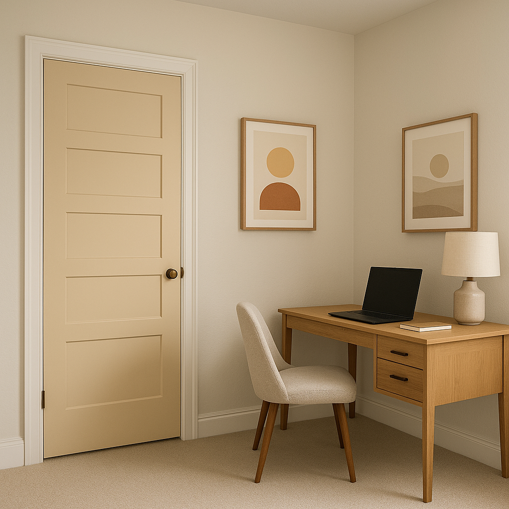
For home offices, Corinthian provides a neutral yet inspiring backdrop that promotes focus and productivity. Pair it with sleek furniture and bold accent pieces for a workspace that feels both professional and stylish.
Corinthian’s versatility shines in transitional spaces like hallways and entryways. Its muted tones create a welcoming introduction to your home, while its adaptability ensures it flows seamlessly into adjacent rooms with differing color schemes.
Benjamin Moore Corinthian (162) is more than just a paint color—it’s a design solution that brings sophistication, warmth, and versatility to any interior. Whether you’re refreshing a single room or designing an entire home, Corinthian’s understated charm ensures it will stand the test of time. With its balanced undertones, ability to coordinate beautifully with other colors, and suitability for various applications, it’s no wonder this hue remains a favorite among designers and homeowners alike.
View Colors Only by Brand (No Imagery):
Sherwin-Williams
|
Benjamin-Moore
|
Behr
|
Valspar
Live on the Eastern Slope of Colorado and looking for a local painting professional, check out all our painting services and reach out for a free estimate.
Copyright © 2026 : Wild Fox Painting Inc. : 12435 Mead Way, Littleton, CO 80125


