Benjamin Moore Blue (1620) is a truly classic shade that embodies sophistication and tranquility. As part of the brand’s extensive color palette, this soft and versatile blue has made its mark as a go-to option for creating serene interiors. Its balanced tone is neither too light nor too dark, making it suitable for a wide range of design styles, from traditional to modern.
Benjamin Moore Blue (1620) is a cool, gray-blue with subtle undertones that lean slightly toward green. These undertones contribute to its versatility, giving the color a gentle depth without overwhelming the space. While the gray element grounds the shade and lends it an air of neutrality, the soft green undertone adds a hint of warmth, making it adaptable to various lighting conditions. In natural daylight, the color appears crisp and airy, while under warm artificial lighting, its green undertones may appear more pronounced, creating a cozy ambiance.
Benjamin Moore Blue (1620) pairs beautifully with an array of complementary shades, offering endless possibilities for cohesive design. Here are some coordinating color options:
Neutral Pairings:
Pair Benjamin Moore Blue with warm neutrals like White Dove (OC-17) or Simply White (OC-117) for a clean and fresh look. These whites balance the coolness of the blue and create a calming atmosphere.
Darker Accents:
To introduce contrast and drama, consider deeper colors such as Iron Mountain (2134-30) or Kendall Charcoal (HC-166). These darker shades provide a grounding effect, perfect for accent walls or furniture pieces.
Earthy Complements:
For a nature-inspired palette, pair it with muted greens like Soft Fern (2144-40) or warm taupes such as Revere Pewter (HC-172). These combinations evoke a sense of organic harmony.
Pops of Color:
Add liveliness to the space by incorporating brighter hues like Golden Straw (2152-50) or Coral Reef (012). These playful accents create visual interest and energize the room.
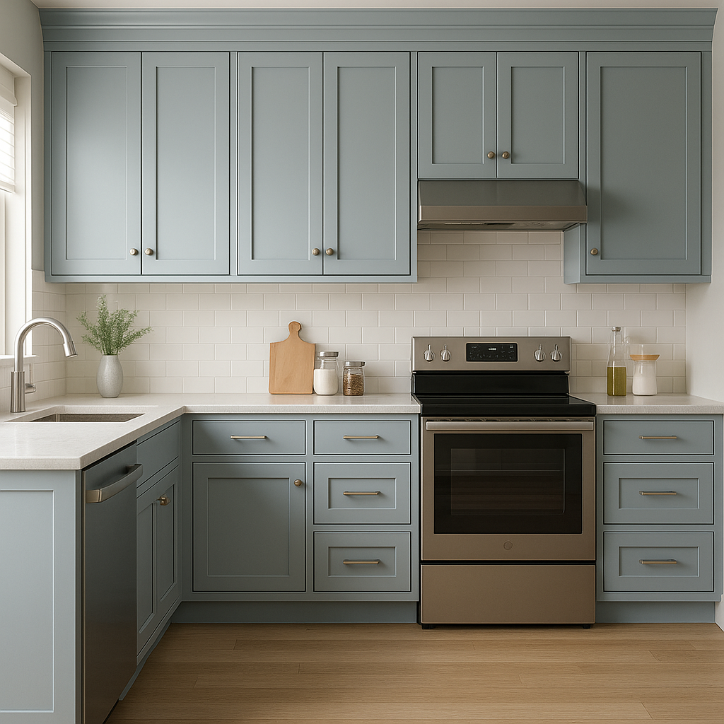
Benjamin Moore Blue is a versatile shade that can be used across various rooms and design applications:
Use Benjamin Moore Blue on the walls of living spaces to foster a relaxing environment. Pair it with crisp white trim and warm wood furniture to strike a balance between elegance and comfort.
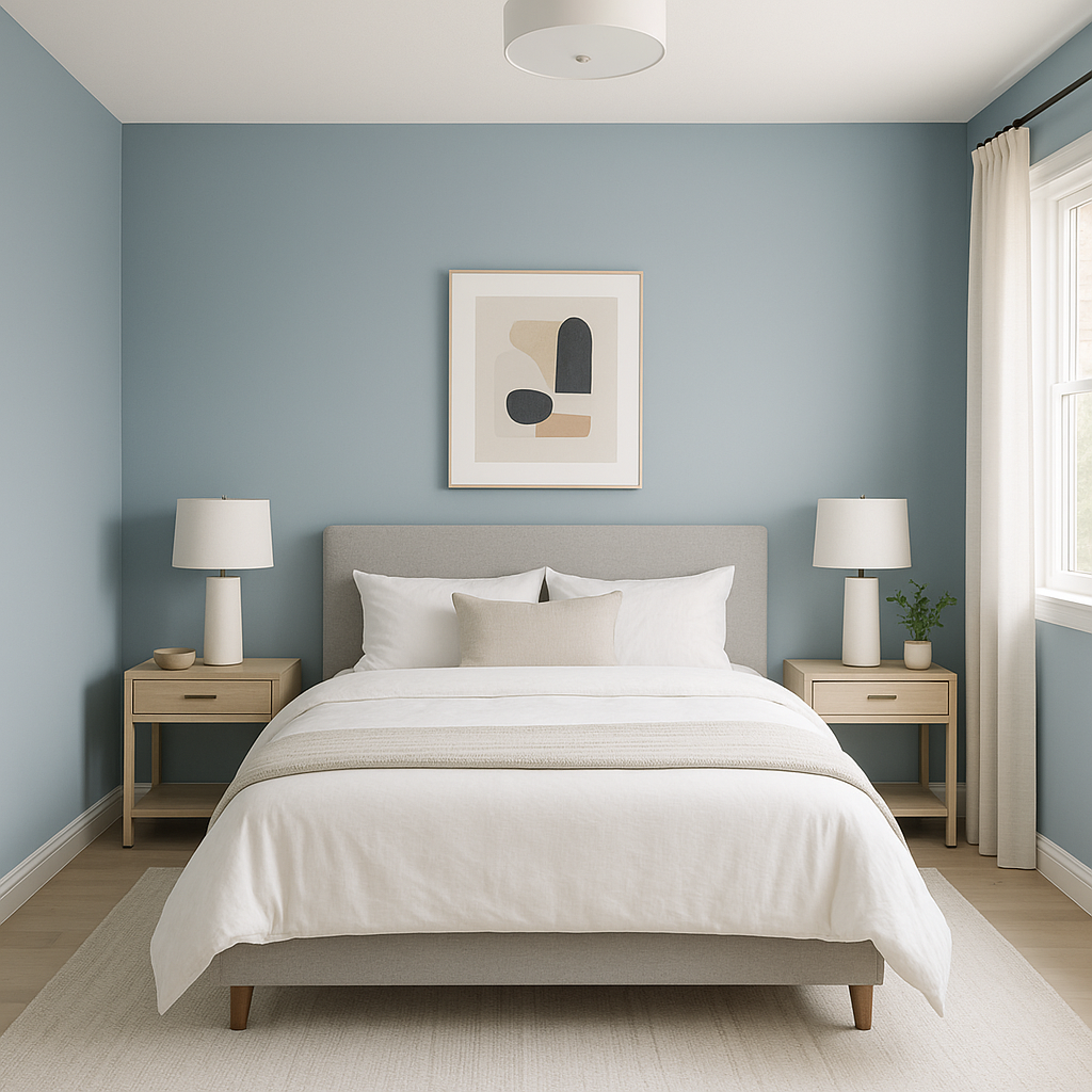
Its serene undertones make it an ideal choice for bedrooms, where tranquility is key. Combine it with plush textures like velvet or linen in neutral tones for a soothing retreat.
Benjamin Moore Blue works beautifully in bathrooms, especially when paired with white subway tiles and chrome fixtures. This combination creates a spa-like atmosphere while maintaining timeless appeal.
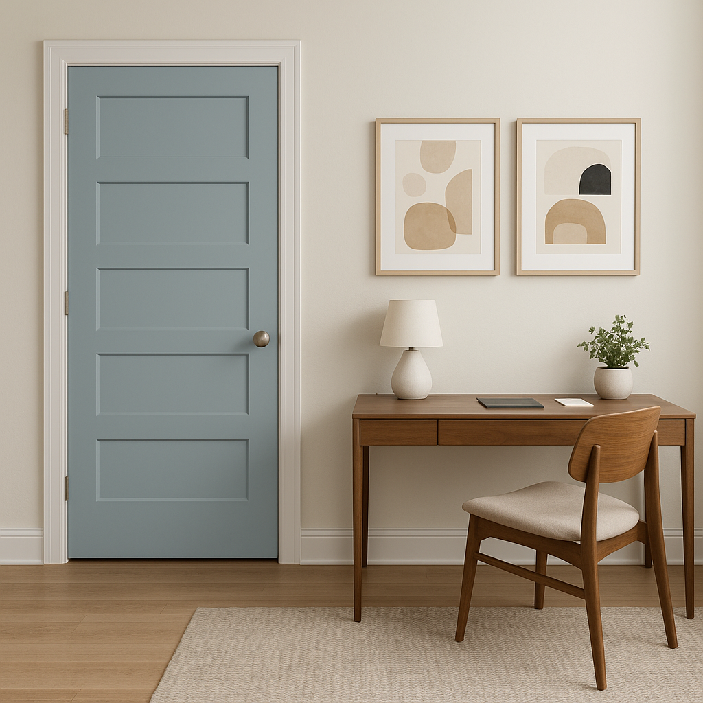
In a home office, this color can inspire focus and calm. Pair it with minimalist furniture and black accents for a simple yet professional look.
If you’re looking to experiment with color without fully committing, Benjamin Moore Blue makes a striking accent wall. It works particularly well behind shelving units or as a backdrop for artwork and décor.
Beyond interiors, Benjamin Moore Blue is also a stunning option for exterior applications. Use it on shutters, doors, or siding for a classic and inviting curb appeal.
Its timeless appeal and versatility make Benjamin Moore Blue a favorite among designers and homeowners alike. Whether you’re looking to create a peaceful sanctuary or add subtle sophistication to your space, this shade offers the perfect blend of coolness and warmth. Its ability to complement a wide range of colors and design styles ensures it remains a staple in interior and exterior design.
Take advantage of its adaptability and let Benjamin Moore Blue (1620) transform your home into a haven of elegance and serenity.
View Colors Only by Brand (No Imagery):
Sherwin-Williams
|
Benjamin-Moore
|
Behr
|
Valspar
Live on the Eastern Slope of Colorado and looking for a local painting professional, check out all our painting services and reach out for a free estimate.
Copyright © 2026 : Wild Fox Painting Inc. : 12435 Mead Way, Littleton, CO 80125


