Benjamin Moore Blue (1625) is a refined and tranquil medium blue that effortlessly blends sophistication with serenity. Evoking the calmness of a clear sky or the depth of ocean waves, this paint color is a perfect balance of cool and classic, making it a versatile choice for a variety of interior design styles. Whether you're creating a coastal retreat, an elegant living space, or a serene bedroom, Benjamin Moore Blue brings understated charm and timeless appeal to any room.
The beauty of Benjamin Moore Blue lies in its subtle undertones, which enhance its versatility. This shade features a cool, soft gray undertone that tempers the intensity of the blue, giving it a muted and sophisticated appearance. The gray undertone ensures that the color doesn’t feel overpowering or overly vibrant, making it ideal for creating a calming and grounded atmosphere. Additionally, the undertones allow this shade to adapt seamlessly to various lighting conditions, appearing slightly lighter and airier in bright spaces while maintaining its depth in dimmer settings.
Benjamin Moore Blue is incredibly versatile and pairs beautifully with a variety of complementary and contrasting shades. Here are some ideas for coordinating colors:
Benjamin Moore Blue is a versatile color that works well in a variety of spaces throughout the home:
For a living room, Benjamin Moore Blue creates a calm and inviting atmosphere. Pair it with light-toned furniture and white accents for a coastal-inspired space, or add darker wood finishes and metallics for a more traditional or elegant look. Consider using this shade on walls to frame large windows, allowing the natural light to highlight its subtle undertones.
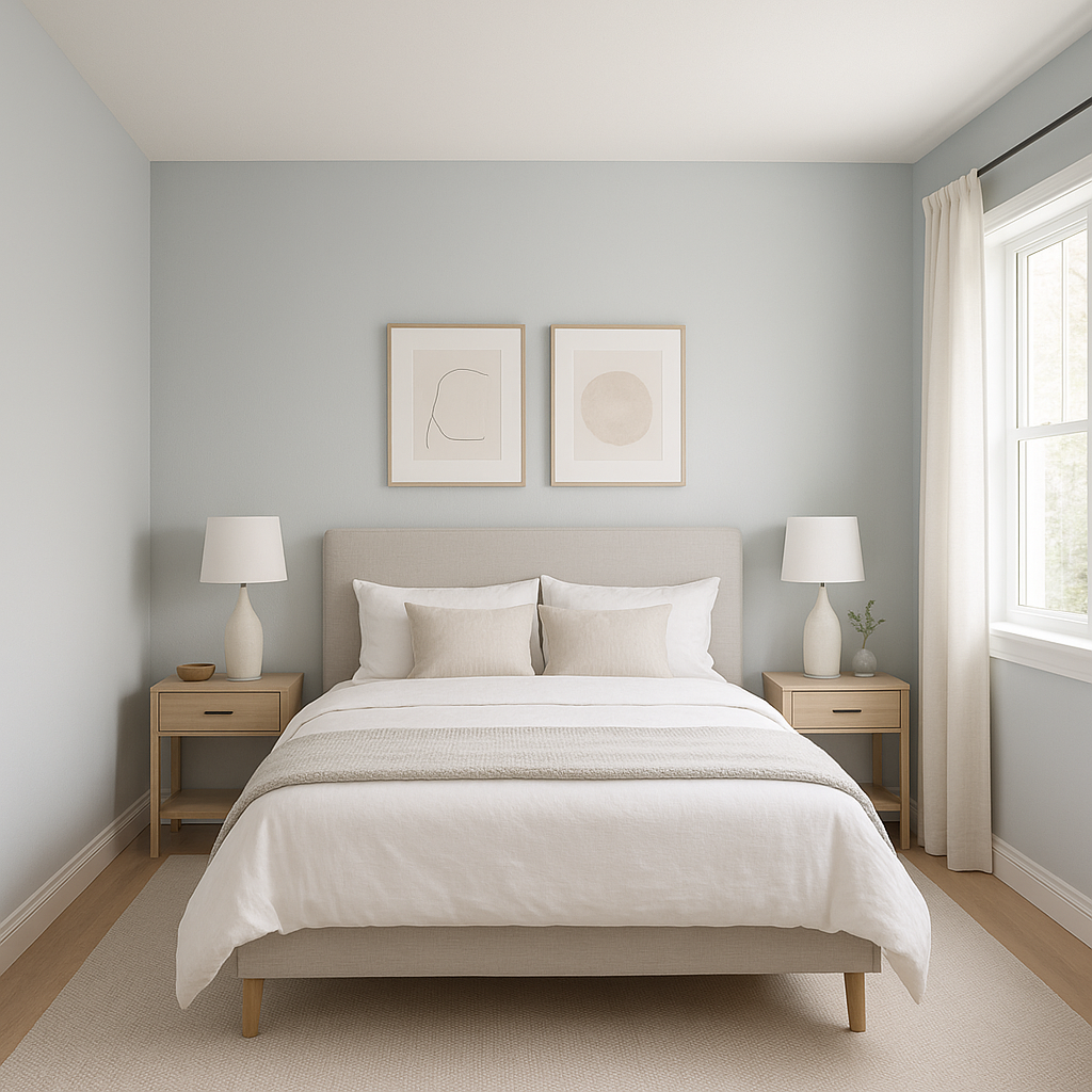
As a bedroom color, Benjamin Moore Blue fosters relaxation and tranquility, making it ideal for unwinding after a long day. Use it on all walls for an enveloping effect or as an accent wall behind the bed. Pair it with soft white bedding and neutral decor for a soothing retreat.
Transform your bathroom into a spa-like haven with Benjamin Moore Blue. Its cool undertones work well with marble countertops, chrome fixtures, and crisp white tiles. Add greenery or natural wood elements for a fresh, organic feel.
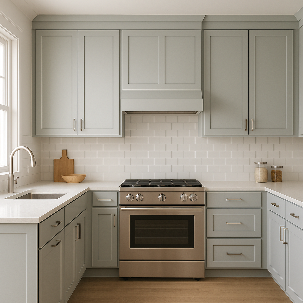
In kitchens, Benjamin Moore Blue can be used on cabinetry or walls to add a sophisticated splash of color. Pair it with white countertops and brass or black hardware for a modern yet timeless aesthetic. Alternatively, use it as a backsplash color to add depth and interest.
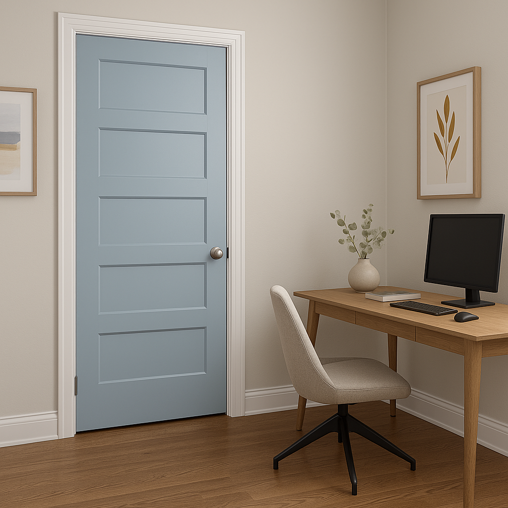
Benjamin Moore Blue is an excellent choice for home offices, as its calming qualities can help promote focus and productivity. Pair it with warm woods or metallic accents to create a balanced workspace that feels both professional and inviting.
Lighting plays a crucial role in how Benjamin Moore Blue appears in your space. In rooms with ample natural light, the color takes on a brighter, airier appearance, emphasizing its serene qualities. In dimly lit spaces, its gray undertones become more pronounced, lending a cozy and sophisticated feel. To ensure the perfect look, test the color in your space under different lighting conditions to see how it interacts with your decor.
Benjamin Moore Blue (1625) is a versatile and timeless color that brings elegance, tranquility, and depth to any room. Its subtle gray undertones, wide range of coordinating colors, and adaptability make it a perfect choice for interior design projects that aim to create a calming and sophisticated environment. Whether you’re seeking a refreshing accent or a serene backdrop, Benjamin Moore Blue is a shade that effortlessly enhances your home’s aesthetic.
View Colors Only by Brand (No Imagery):
Sherwin-Williams
|
Benjamin-Moore
|
Behr
|
Valspar
Live on the Eastern Slope of Colorado and looking for a local painting professional, check out all our painting services and reach out for a free estimate.
Copyright © 2026 : Wild Fox Painting Inc. : 12435 Mead Way, Littleton, CO 80125


