Benjamin Moore Manor (1627) is a refined, medium-tone gray that exudes sophistication and versatility. Perfectly balanced, this shade is a designer’s dream for crafting serene, elegant spaces while offering a modern, understated charm. Its soft neutrality makes it an excellent choice for both residential and commercial interiors, seamlessly blending with various styles from traditional to contemporary.
Manor (1627) features subtle blue undertones that lend it a cool, calm demeanor. These undertones keep the gray from feeling overly warm or flat, ensuring it maintains a fresh and airy quality. While the blue undertones are gentle and not overpowering, they come to life under certain lighting conditions, especially in natural daylight. This makes Manor a dynamic color that adapts beautifully to its surroundings.
The beauty of Manor is its versatility when paired with other colors. To create a cohesive and harmonious palette, consider these coordinating options:
Crisp Whites: Pair Manor with Benjamin Moore Chantilly Lace (OC-65) or Simply White (OC-117) for a clean, classic contrast. These whites highlight Manor’s cool undertones and amplify its modern appeal.
Soft Neutrals: Complement Manor with shades like Edgecomb Gray (HC-173) or Revere Pewter (HC-172) for a monochromatic look that feels layered and inviting.
Deep Charcoal or Black: Add drama by incorporating Benjamin Moore Iron Mountain (2134-30) or Onyx (2133-10) for bold accents on trim, cabinetry, or furniture.
Muted Blues and Greens: Enhance the cool undertones of Manor by introducing soothing hues such as Quiet Moments (1563) or Gentle Gray (1620) for a serene and coastal-inspired aesthetic.
Warm Metallics: Contrast the coolness of Manor with accessories or fixtures in brass, gold, or copper for a touch of warmth and luxury.
Manor (1627) is a versatile gray that can adapt to various spaces and design styles. Here are some of its most effective applications:
Use Manor on walls in living rooms to create a sophisticated yet inviting space. Pair it with plush furnishings, textured rugs, and metallic accents to strike a balance between warmth and coolness.
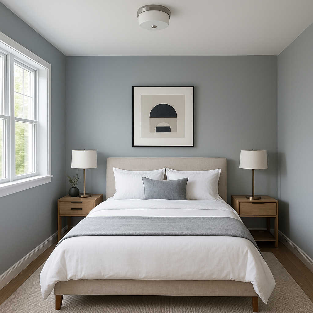
Make Manor the centerpiece of a tranquil bedroom retreat. Its calming undertones provide a restful environment, especially when paired with soft linens and muted pastel accents.
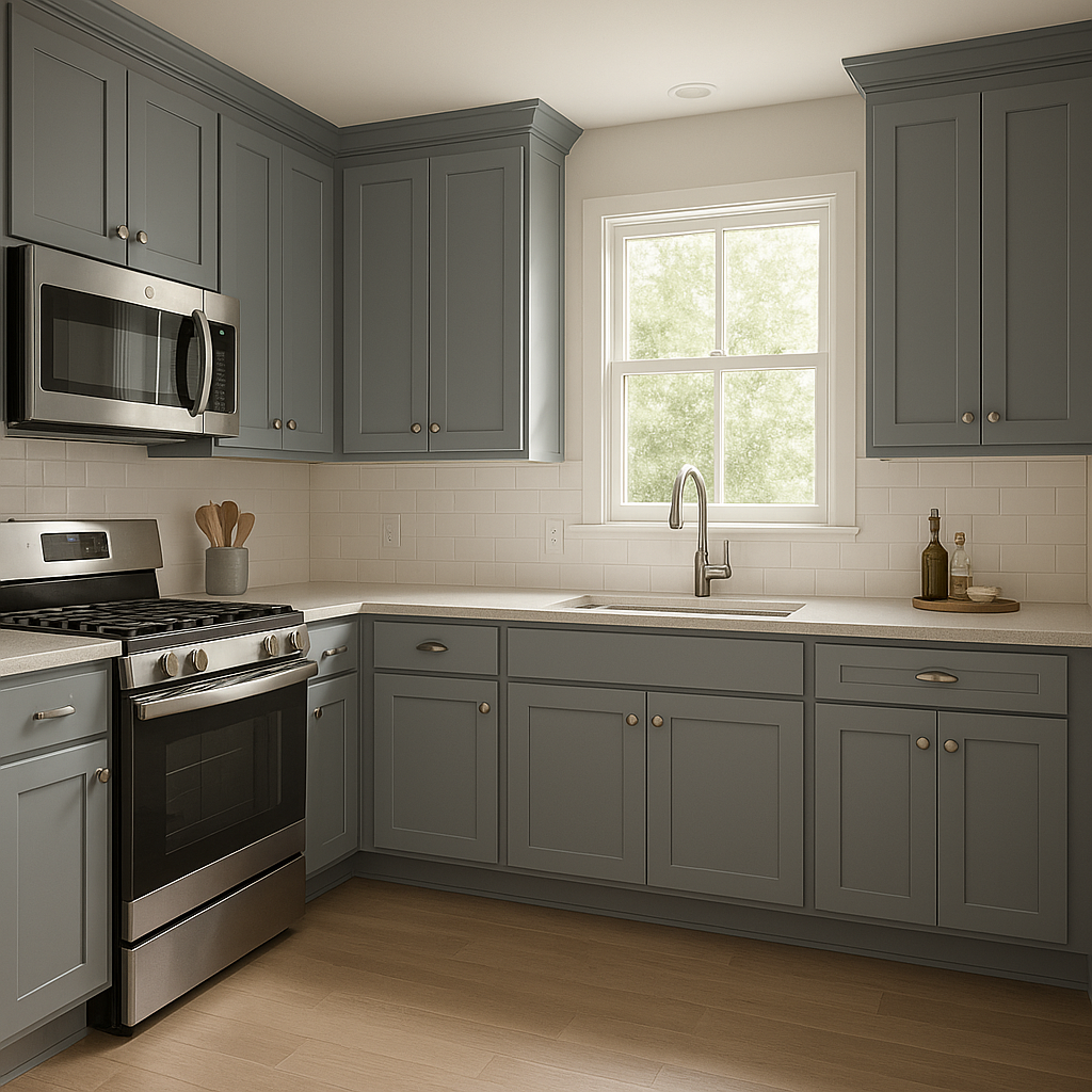
Manor shines in kitchens and bathrooms, particularly when paired with crisp white cabinetry or subway tiles. Its cool undertones give these spaces a polished, modern look while maintaining a timeless vibe.
In home offices, Manor fosters a productive yet relaxed atmosphere. Combine it with sleek furniture and natural wood tones to encourage creativity and focus.
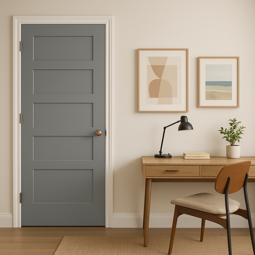
Manor also works beautifully for exterior walls, shutters, or doors. Its adaptable gray tone complements stonework, brick, and natural surroundings, making it ideal for modern or traditional home exteriors.
Lighting plays a crucial role in how Manor (1627) appears in a space. In natural daylight, the blue undertones become more pronounced, giving the color a fresh and airy feel. Under warm artificial lighting, Manor takes on a softer, cozier appearance. Always test the color in your space to see how it interacts with your specific lighting conditions.
Benjamin Moore Manor (1627) is a timeless gray that adapts effortlessly to different environments and styles. Whether you’re aiming for a modern, minimalist vibe or a cozy, traditional aesthetic, Manor provides a perfect foundation. Its subtle cool undertones and compatibility with a wide range of hues make it a go-to choice for designers seeking sophistication and versatility.
Transform your space with Benjamin Moore Manor (1627) and see how this elegant gray can elevate your interiors to new heights of style and comfort.
View Colors Only by Brand (No Imagery):
Sherwin-Williams
|
Benjamin-Moore
|
Behr
|
Valspar
Live on the Eastern Slope of Colorado and looking for a local painting professional, check out all our painting services and reach out for a free estimate.
Copyright © 2026 : Wild Fox Painting Inc. : 12435 Mead Way, Littleton, CO 80125


