Benjamin Moore Somerset 163 is a rich, medium-toned gray that exudes elegance and versatility. This sophisticated shade belongs to the Cool Neutral family and has quickly become a favorite among interior designers and homeowners alike, thanks to its ability to create a serene, balanced atmosphere in any space. Whether you're refreshing a single room or reimagining your entire home, Somerset 163 offers a timeless palette that pairs beautifully with a variety of design styles.
One of the standout characteristics of Benjamin Moore Somerset 163 is its subtle blue undertone. This cool undertone gives the color a sense of depth and calmness, making it ideal for spaces where you want to evoke a tranquil, modern aesthetic. Unlike some grays that can lean too warm or too stark, Somerset 163 strikes the perfect balance, offering a soothing backdrop without feeling too cold or sterile.
The blue undertone also ensures that the color maintains its integrity under different lighting conditions. In natural light, it appears as a soft, sophisticated gray, while artificial lighting may emphasize its cooler, bluish cast. This adaptability makes Somerset 163 a versatile choice for both well-lit and dimly lit spaces.
Somerset 163 is a team player when it comes to coordinating with other hues. Its cool-toned nature allows it to work seamlessly with a variety of colors, whether you're aiming for a monochromatic look or a bold contrast. Some recommended pairings include:
Whites and Off-Whites: Pair Somerset 163 with crisp whites like Benjamin Moore Chantilly Lace (OC-65) or softer options like White Dove (OC-17) for a clean, fresh aesthetic. These combinations work exceptionally well for trim, ceilings, or cabinetry.
Deep Navy Blues: For a dramatic yet cohesive look, consider pairing Somerset 163 with deeper blues like Hale Navy (HC-154). This combination creates a striking contrast while maintaining a cool, harmonious vibe.
Earthy Greens: Add a natural touch by pairing Somerset 163 with muted greens such as Saybrook Sage (HC-114) or October Mist (1495). These colors bring warmth and balance to the coolness of Somerset 163, creating a grounded, organic feel.
Soft Pastels: If you’re looking to introduce a gentle pop of color, pastel shades like Wedgewood Gray (HC-146) or Palladian Blue (HC-144) can enhance the serene quality of Somerset 163 without overwhelming the space.
Charcoal and Black Accents: For a modern, dramatic edge, incorporate darker tones like Kendall Charcoal (HC-166) or Black Beauty (2128-10) into your design. These colors add depth and sophistication, particularly in contemporary or industrial settings.
Thanks to its balanced and versatile nature, Somerset 163 can be used in a variety of spaces and applications throughout your home. Its cool, calming tone makes it suitable for both small and large areas, adapting effortlessly to different design aesthetics. Here are some inspiring ideas for incorporating Somerset 163 into your home:
Somerset 163 creates a serene and inviting backdrop for living rooms. Pair it with plush gray or white furniture, metallic accents, and layered textures for a cozy yet refined space. Its neutral tone allows your décor to shine without competing for attention.
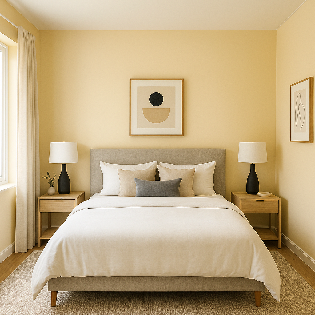
The calming blue undertone of Somerset 163 is perfect for creating a restful retreat in bedrooms. Layer it with soft linens, cool-toned bedding, and dimmable lighting for a tranquil, spa-like atmosphere.
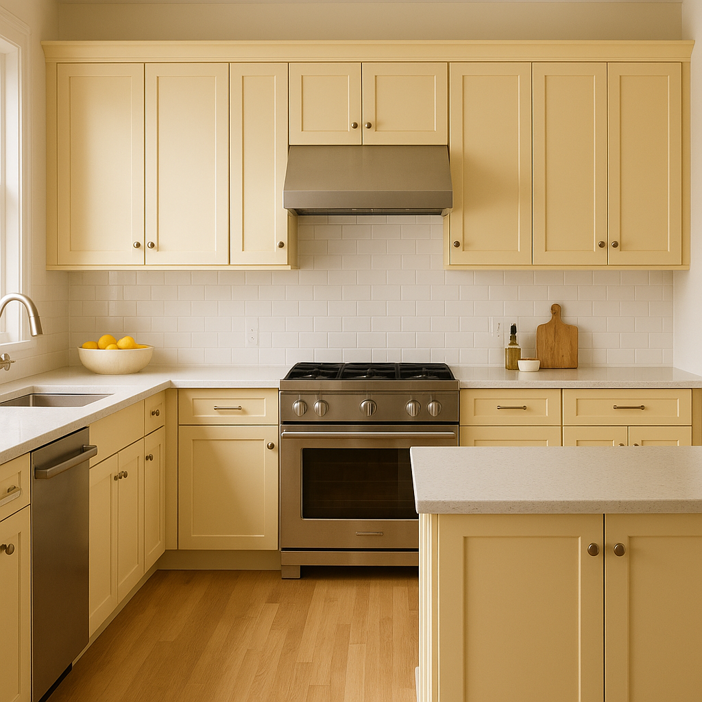
Somerset 163 works beautifully on kitchen cabinets, particularly when paired with white subway tiles, stainless steel appliances, and marble or quartz countertops.
View Colors Only by Brand (No Imagery):
Sherwin-Williams
|
Benjamin-Moore
|
Behr
|
Valspar
Live on the Eastern Slope of Colorado and looking for a local painting professional, check out all our painting services and reach out for a free estimate.
Copyright © 2026 : Wild Fox Painting Inc. : 12435 Mead Way, Littleton, CO 80125


