Benjamin Moore Santorini (1634) is a timeless medium gray with a balanced and serene quality, evoking the tranquil elegance of the renowned Greek island it's named after. This versatile shade works beautifully in a variety of spaces, effortlessly bridging the gap between modern sophistication and classic charm.
Santorini is a gray with subtle cool undertones, leaning toward a blue base that adds a hint of coastal freshness. These understated undertones make it a soothing and adaptable hue, perfect for creating a calm, airy atmosphere in any room. Despite its cool nature, Santorini does not feel stark or sterile, as its slight softness lends a welcoming and approachable touch to interiors.
The undertones in Santorini can shift depending on the lighting in your space. In natural daylight, its blue-gray nuances become more pronounced, offering a crisp and breezy aesthetic. Under warm artificial lighting, Santorini appears slightly softer, making it a perfect choice for cozy evenings. Always test the color in your space to see how it interacts with your specific lighting conditions.
Santorini pairs beautifully with a range of complementary colors, allowing you to craft a harmonious palette for your home. Below are some suggestions for coordinating colors:
Santorini is a versatile paint color that can be used in a variety of ways throughout your home. Its balanced tone makes it suitable for both large-scale applications and smaller accents. Here are some ideas for incorporating Santorini into your interior design:
Santorini creates a serene and sophisticated backdrop for living rooms. Pair it with crisp white trim and natural wood accents for a modern coastal look. Add pops of navy, teal, or coral in your textiles and decor to bring the space to life.
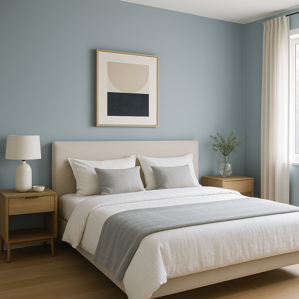
This soothing gray is ideal for bedrooms, where relaxation is key. Combine Santorini with soft whites, light blues, or muted greens to design a restful sanctuary. Consider using plush bedding and textured throws to enhance the cozy vibe.
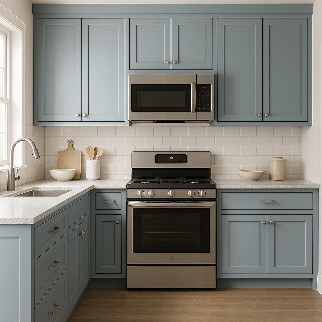
Santorini is a stunning choice for kitchens, whether you use it on walls, cabinetry, or a kitchen island. Pair it with marble or quartz countertops and stainless steel appliances for a clean, contemporary aesthetic. Add warmth with natural wood shelving or gold hardware for an elegant twist.
Bring a spa-like feel to your bathroom with Santorini. Its cool undertones complement white tile, brushed nickel fixtures, and soft pastel accents. Add touches of greenery or woven baskets for an organic feel.
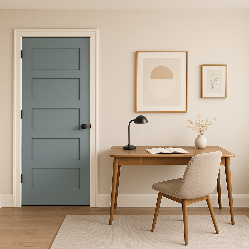
Santorini lends a calming yet professional air to home offices. Use it as a wall color and pair it with crisp white furnishings and navy accents for a space that feels focused and stylish.
Santorini (1634) is more than just a paint color; it’s a mood-setting hue that transforms your interiors into tranquil, polished spaces. With its versatile undertones and ability to coordinate with a wide range of colors, Santorini is an excellent choice for homeowners seeking a timeless yet modern aesthetic. Whether you're designing a coastal retreat, a minimalist haven, or a transitional space, this shade of gray provides a perfect foundation for your creative vision.
View Colors Only by Brand (No Imagery):
Sherwin-Williams
|
Benjamin-Moore
|
Behr
|
Valspar
Live on the Eastern Slope of Colorado and looking for a local painting professional, check out all our painting services and reach out for a free estimate.
Copyright © 2026 : Wild Fox Painting Inc. : 12435 Mead Way, Littleton, CO 80125


