Benjamin Moore Blue (1637) is a refined, sophisticated shade that effortlessly blends tradition with modernity. Its serene and balanced nature makes it a versatile choice for a variety of spaces, whether you're looking to create a calming retreat or a polished, upscale vibe. This shade is part of Benjamin Moore's Classic Color Collection, known for its timeless appeal and enduring elegance.
Benjamin Moore Blue (1637) is a true blue with soft gray undertones that lend it a grounded, muted quality. These undertones prevent the color from feeling overly vibrant or saturated, making it ideal for those seeking a more subdued yet still impactful hue. The gray undertones also allow this color to adapt beautifully under different lighting conditions, shifting from a cooler blue in natural daylight to a cozier tone under warm artificial light. This adaptability is one of the reasons designers love using Benjamin Moore Blue (1637) in versatile design schemes.
Benjamin Moore Blue (1637) pairs wonderfully with a wide range of coordinating colors, allowing you to create a cohesive and balanced interior design palette. Here are some ideal pairings:
Neutral Companions:
Pair it with warm whites like Benjamin Moore White Dove (OC-17) or soft gray tones like Stonington Gray (HC-170) for a clean and classic aesthetic. These neutrals allow Blue (1637) to shine while maintaining a serene atmosphere.
Deep Contrast:
For a bold and dramatic approach, consider pairing it with darker shades like Hale Navy (HC-154) or Kendall Charcoal (HC-166). These rich, contrasting hues complement the muted blue beautifully, creating depth and visual interest.
Earthy Warmth:
Bring warmth to the space by incorporating terracotta tones like Benjamin Moore Terra Cotta Tile (2090-30) or muted greens such as Saybrook Sage (HC-114). These colors add a natural, organic touch to Blue (1637) and make it feel even more inviting.
Accents and Pops of Color:
Add playful accents like Benjamin Moore Coral Gables (2010-40) or cheerful yellows like Concord Ivory (HC-12) for a lively contrast. These brighter hues work well as accents in artwork, pillows, or decorative accessories.
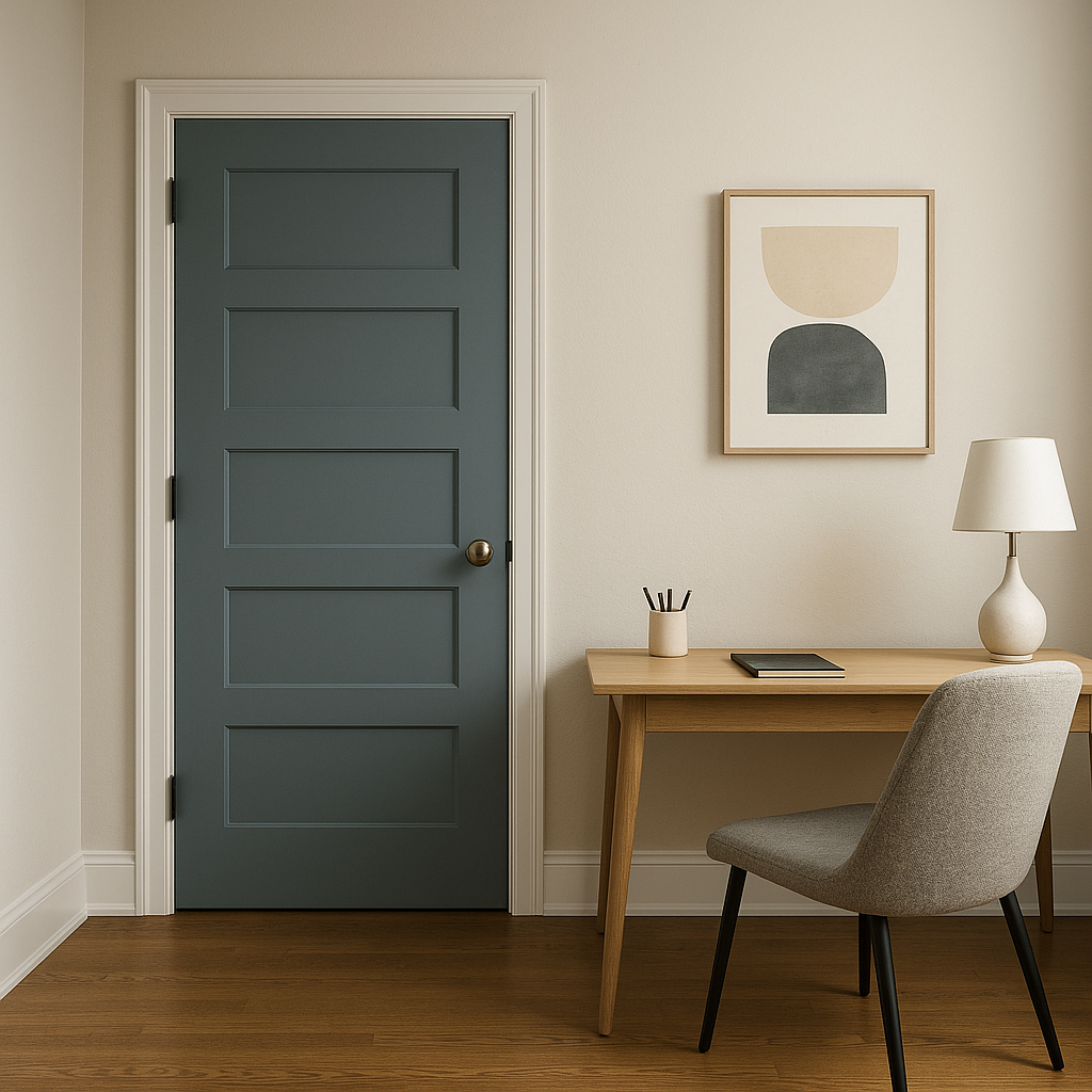
Benjamin Moore Blue (1637) lends itself beautifully to a variety of applications and interior styles. Its versatility makes it suitable for both residential and commercial spaces. Here are some popular ways to use this timeless blue:
Living Rooms:
Create a polished yet inviting living area by using Blue (1637) on the walls. Pair it with neutral furniture and metallic accents like brushed nickel or brass for a sophisticated look. This color adds elegance without overwhelming the space.
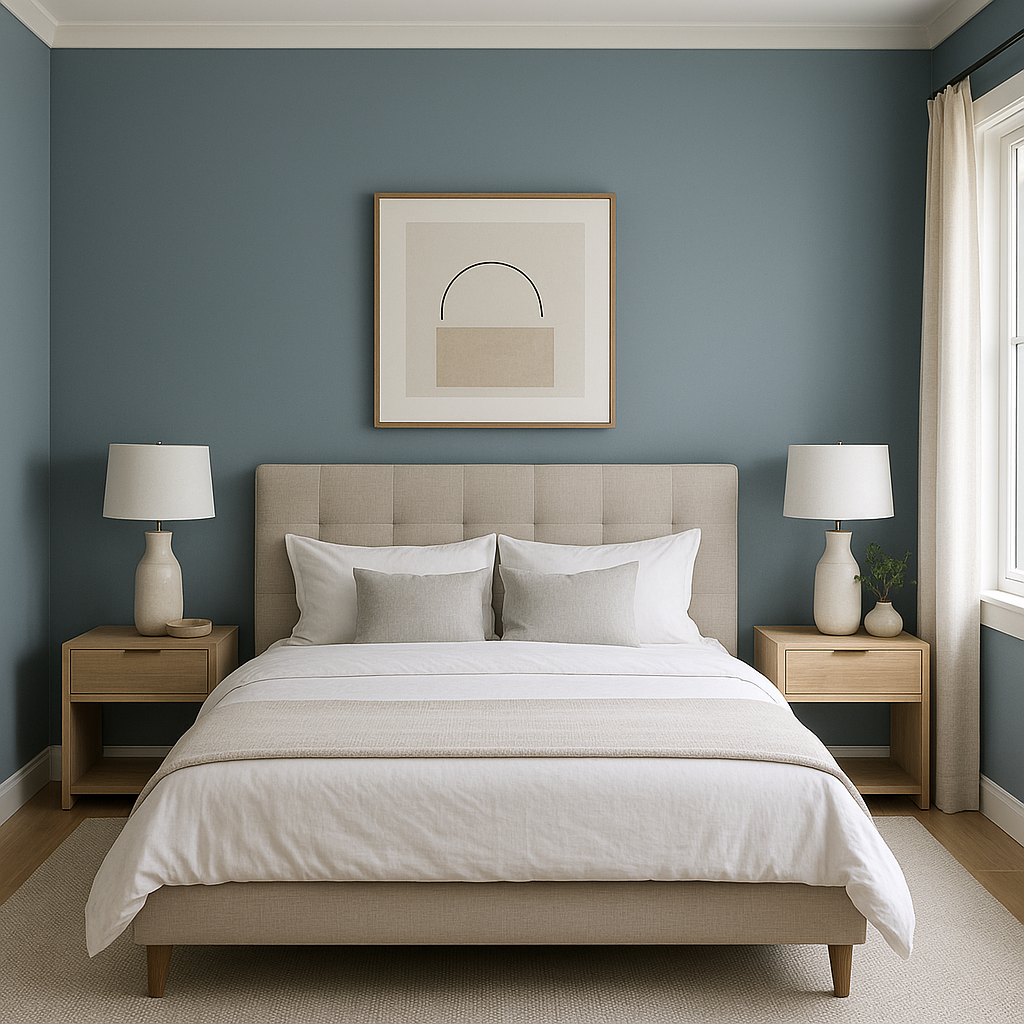
Bedrooms:
Blue is a calming color, making it perfect for bedrooms. Use Benjamin Moore Blue (1637) as an accent wall or paint the entire room to evoke a sense of tranquility and relaxation. Pair it with crisp white bedding and soft textures to achieve a serene sanctuary.
Home Offices:
Foster focus and productivity by incorporating this muted blue into your workspace. Its cool tones promote clarity and calm, making it an excellent choice for walls, cabinetry, or even built-in shelves.
Bathrooms:
For a spa-like bathroom, Blue (1637) works beautifully. Pair it with white subway tiles, polished chrome fixtures, and fluffy white towels for a clean and refreshing space.
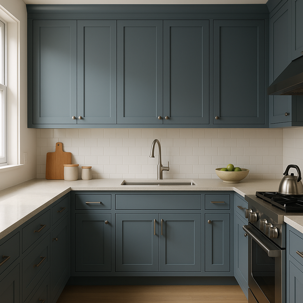
Kitchens and Dining Areas:
Consider using Blue (1637) on kitchen cabinetry or dining room walls. It pairs well with natural wood finishes and marble countertops, creating a timeless and elegant look.
Benjamin Moore Blue (1637) balances classic sophistication with contemporary versatility. Its subtle gray undertones and adaptable nature make it a top choice for designers and homeowners alike. Whether you're crafting a peaceful retreat or a refined gathering space, this color delivers depth, character, and a timeless aesthetic that stands the test of time.
View Colors Only by Brand (No Imagery):
Sherwin-Williams
|
Benjamin-Moore
|
Behr
|
Valspar
Live on the Eastern Slope of Colorado and looking for a local painting professional, check out all our painting services and reach out for a free estimate.
Copyright © 2026 : Wild Fox Painting Inc. : 12435 Mead Way, Littleton, CO 80125


