Benjamin Moore Midnight (1638) is a deep, rich color that exudes sophistication and elegance. Perfectly balanced, this dark hue offers an understated drama that can transform any space into a chic and inviting retreat. Midnight is part of Benjamin Moore’s "Deep Color Collection," showcasing its ability to make a bold statement while retaining a timeless appeal.
Midnight (1638) possesses subtle cool undertones that lean toward blue-gray. This unique blend of undertones gives the color a velvety depth, making it versatile for both modern and traditional spaces. The coolness in the hue prevents it from feeling overly black or harsh, ensuring it retains a softer, more approachable aesthetic.
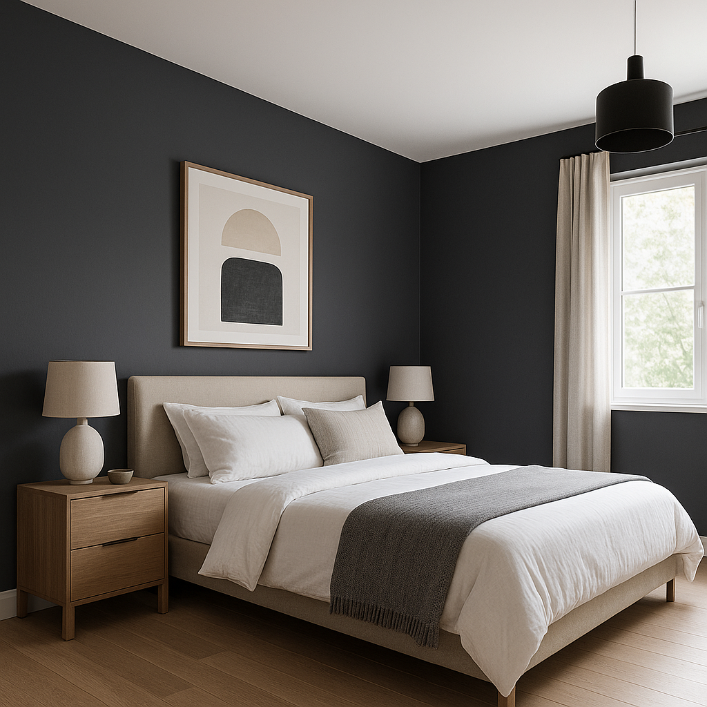
The blue-gray undertones also make Midnight ideal for creating a serene and moody ambiance, particularly in bedrooms, dining rooms, or home offices. When paired with the right lighting, these undertones can shift slightly, offering intriguing variations throughout the day.
Benjamin Moore Midnight works beautifully with a range of complementary shades, allowing you to craft harmonious and layered designs. Some coordinating colors to consider include:
Additionally, metallic accents like brass, gold, or chrome can further enhance the luxurious feel of Midnight. Pairing it with natural wood tones adds warmth and texture, creating a grounding contrast.
Midnight (1638) is a versatile paint color that can be used in various ways throughout your home. Its dark elegance makes it suitable for accent walls, cabinetry, or even full-room applications in spaces where you want to evoke intimacy and sophistication.
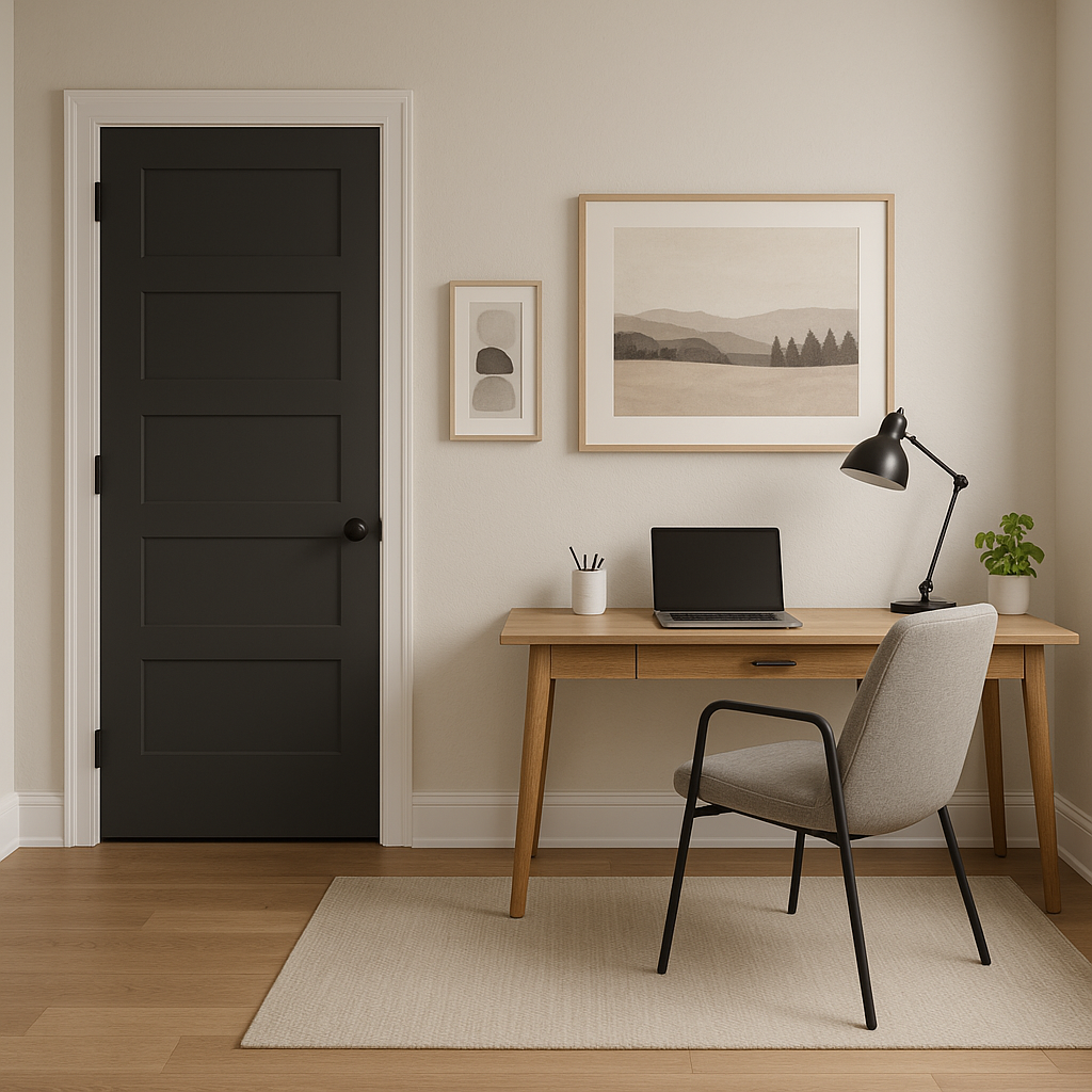
If you’re looking to introduce depth and contrast without committing to painting an entire room, Midnight is an excellent choice for accent walls. It works beautifully behind a bed in a master bedroom, as a dramatic backdrop for artwork in a living room, or to highlight architectural details like built-in shelves or fireplaces.
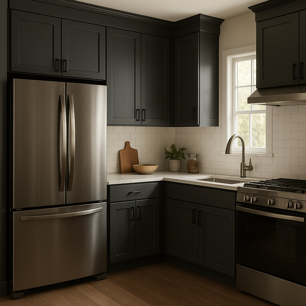
Midnight’s bold yet refined appearance makes it a stunning option for kitchen cabinetry or built-in furniture. Pair it with light countertops, backsplash tiles, or hardware finishes like brushed brass or matte black for a striking yet balanced design.
When used for an entire room, Midnight creates a cocoon-like effect, making the space feel cozy and intimate. It’s ideal for dining rooms, powder rooms, or home offices where mood and focus are key. Be sure to incorporate ample lighting, whether natural or artificial, to prevent the space from feeling overly dark.
Benjamin Moore Midnight also shines as an exterior color. It can add drama to siding, trim, or front doors, creating a bold yet sophisticated curb appeal. Pair it with crisp whites or soft neutrals for a timeless combination that stands out.
To enhance the beauty of Benjamin Moore Midnight, consider layering textures and finishes within your design. Velvet upholstery, wool rugs, or metallic accents can complement the rich depth of the color, while natural greenery or indoor plants provide an organic touch.
For artwork or décor, opt for pieces that feature light or metallic tones to create balance and contrast against the dark backdrop. Mirrors can also be strategically placed to reflect light and make the room feel more expansive.
Benjamin Moore Midnight (1638) is a versatile and timeless shade that can add a layer of sophistication to any design. Whether you’re looking to create a dramatic accent or a moody retreat, this color is sure to elevate your space with its refined depth and elegance.
View Colors Only by Brand (No Imagery):
Sherwin-Williams
|
Benjamin-Moore
|
Behr
|
Valspar
Live on the Eastern Slope of Colorado and looking for a local painting professional, check out all our painting services and reach out for a free estimate.
Copyright © 2026 : Wild Fox Painting Inc. : 12435 Mead Way, Littleton, CO 80125


