Benjamin Moore Blue (1641) is a classic, mid-tone blue that exudes sophistication, tranquility, and versatility. Perfectly balanced, this shade straddles the line between cool and warm, making it an exceptional choice for a wide range of interior design styles. Whether you're crafting a serene retreat or an elegant living space, Benjamin Moore Blue (1641) delivers a refined aesthetic that feels effortlessly timeless.
This rich hue has subtle gray undertones that lend it a grounded, sophisticated appearance. The gray allows the blue to feel soft and approachable rather than overly vibrant, making it a versatile choice for interiors. These undertones also help Benjamin Moore Blue (1641) adapt beautifully to varying lighting conditions.
This balance of undertones ensures that Benjamin Moore Blue (1641) is never overwhelming, making it ideal for spaces where comfort and elegance are paramount.
To bring out the best in Benjamin Moore Blue (1641), pair it with complementary and coordinating hues that enhance its depth and richness.
Benjamin Moore Blue (1641) shines in a variety of applications, from intimate residential spaces to professional environments. Its calming yet sophisticated nature makes it a favored choice for walls, cabinetry, and accent pieces.
Transform your living room into a serene and inviting space by using Benjamin Moore Blue (1641) on the walls. Pair it with neutral furniture and metallic accents like brushed gold or silver for a polished look.
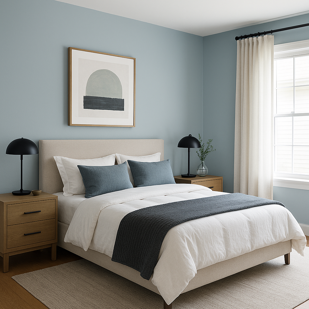
Create a restful retreat by combining Benjamin Moore Blue (1641) with soft whites and muted grays. Its calming undertones make it perfect for bedrooms, promoting relaxation and tranquility.
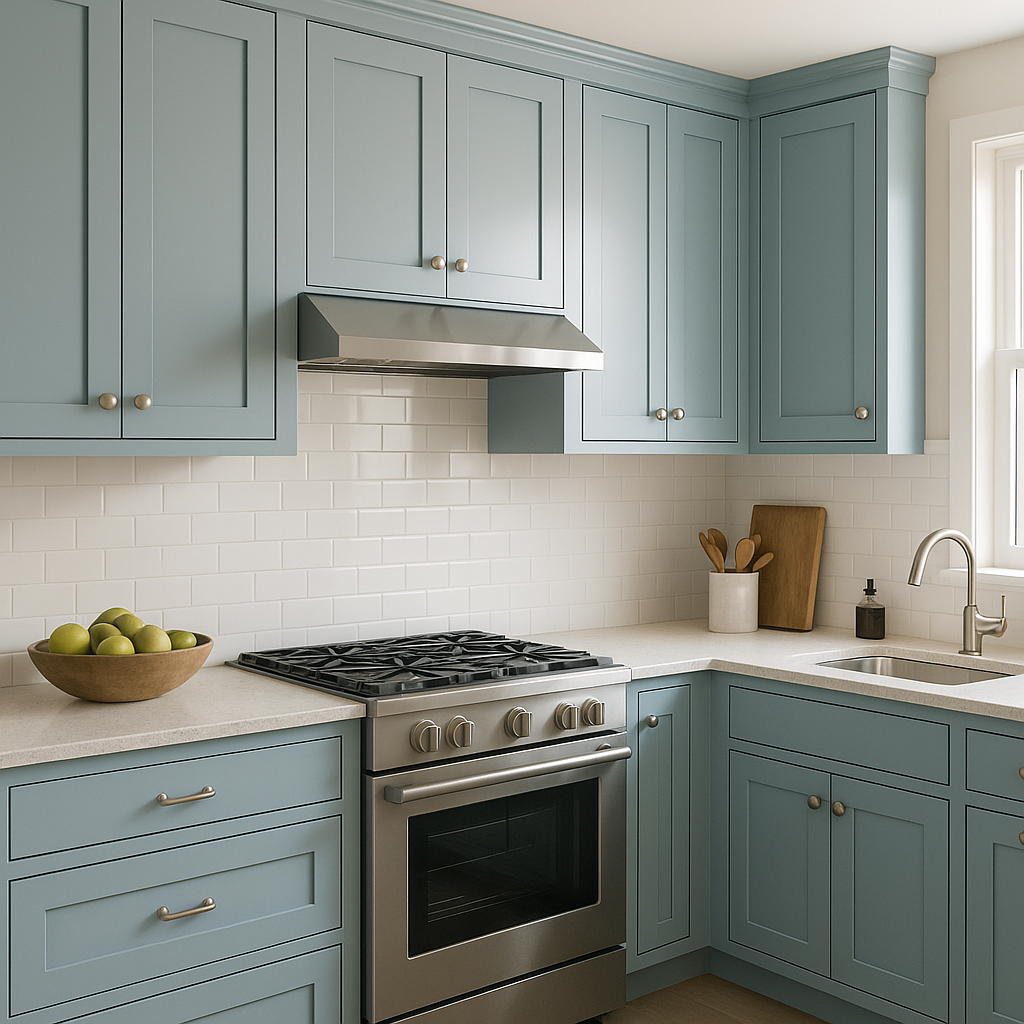
For a modern yet timeless kitchen, consider using Benjamin Moore Blue (1641) on cabinetry or as a backsplash. Pair it with white marble countertops and polished nickel hardware for a crisp, elegant aesthetic.
Elevate your bathroom design with Benjamin Moore Blue (1641) on the walls or vanity. Complement the shade with white tiles, chrome fixtures, and soft gray towels for a spa-like atmosphere.
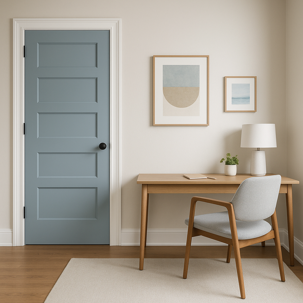
Use Benjamin Moore Blue (1641) as an accent wall to add depth and interest to any room. Pair it with lighter neutral tones to maintain balance while allowing the blue to stand out.
Benjamin Moore Blue (1641) is the epitome of timeless design. Its ability to adapt to various lighting conditions and pair effortlessly with a wide range of colors makes it an interior designer’s dream. From coastal-inspired homes to urban apartments, this shade brings elegance and tranquility to every space it graces.
With its refined undertones, versatile applications, and sophisticated aesthetic, Benjamin Moore Blue (1641) is the perfect choice for creating interiors that feel both stylish and welcoming.
View Colors Only by Brand (No Imagery):
Sherwin-Williams
|
Benjamin-Moore
|
Behr
|
Valspar
Live on the Eastern Slope of Colorado and looking for a local painting professional, check out all our painting services and reach out for a free estimate.
Copyright © 2026 : Wild Fox Painting Inc. : 12435 Mead Way, Littleton, CO 80125


