Benjamin Moore Cape 1642 is a stunning, deep blue hue that exudes quiet sophistication and timeless elegance. This versatile color is part of Benjamin Moore's Classic Color Collection, a palette designed to offer enduring and elegant options for any space. Cape 1642 is a medium-to-dark blue with balanced undertones that make it adaptable to a wide range of design styles and spaces.
Cape 1642 features a subtle gray undertone that softens its rich blue base, giving it a refined and slightly muted appearance. This undertone tempers the boldness of the blue, making it neither too bright nor overly saturated. The result is a color with depth and character that feels both grounding and serene. Its gray undertone allows Cape 1642 to work beautifully in both traditional and modern interiors, offering a touch of sophistication without overwhelming the space.
In certain lighting conditions, Cape 1642 may reveal a hint of green, adding a layer of complexity to the color. This dynamic quality allows it to shift slightly depending on the time of day and the type of light in the space, making it an engaging choice for walls, cabinetry, or accent areas.
To complement Cape 1642, consider pairing it with colors that enhance its depth and elegance. Here are some coordinating colors to help create a harmonious palette:
Soft Neutrals: Pair Cape 1642 with warm whites like Benjamin Moore White Dove OC-17 or Simply White OC-117 to create a crisp and airy contrast. These shades balance the richness of the blue and add a sense of lightness to the space.
Cool Grays: For a monochromatic look, combine it with cooler grays such as Benjamin Moore Stonington Gray HC-170 or Gray Owl OC-52. These tones complement the gray undertones in Cape 1642, creating a sophisticated and cohesive vibe.
Earthy Greens and Browns: Earthy colors such as Benjamin Moore Saybrook Sage HC-114 or Kendall Charcoal HC-166 can add warmth and depth to a room. These nature-inspired hues enhance the versatility of Cape 1642 while grounding the overall design.
Accent Colors: For a pop of contrast, consider brighter shades like Benjamin Moore Caliente AF-290 (a bold red) or Golden Straw 2152-50 (a soft yellow). These colors create visual interest and can be used sparingly for accents or décor.
Cape 1642's versatility makes it an excellent choice for a wide range of applications. Whether you're creating a cozy retreat, a dramatic focal point, or a serene backdrop, this color adapts beautifully to different spaces and design themes.
Living Rooms: Use Cape 1642 on the walls to create a relaxing and inviting atmosphere. Pair it with light-colored furniture and metallic accents for a sophisticated look.
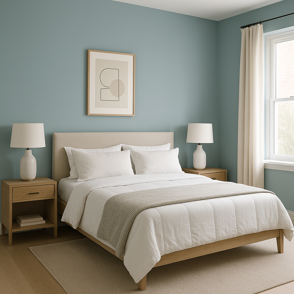
Bedrooms: This calming blue works well in bedrooms, where its rich depth fosters a sense of tranquility. Combine it with crisp white bedding and soft gray accents for a restful retreat.
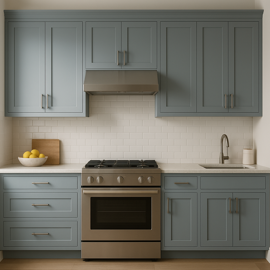
Kitchens and Bathrooms: Cape 1642 is an excellent choice for cabinetry in kitchens or bathrooms. Its rich tone adds a touch of luxury, especially when paired with marble countertops or brass hardware.
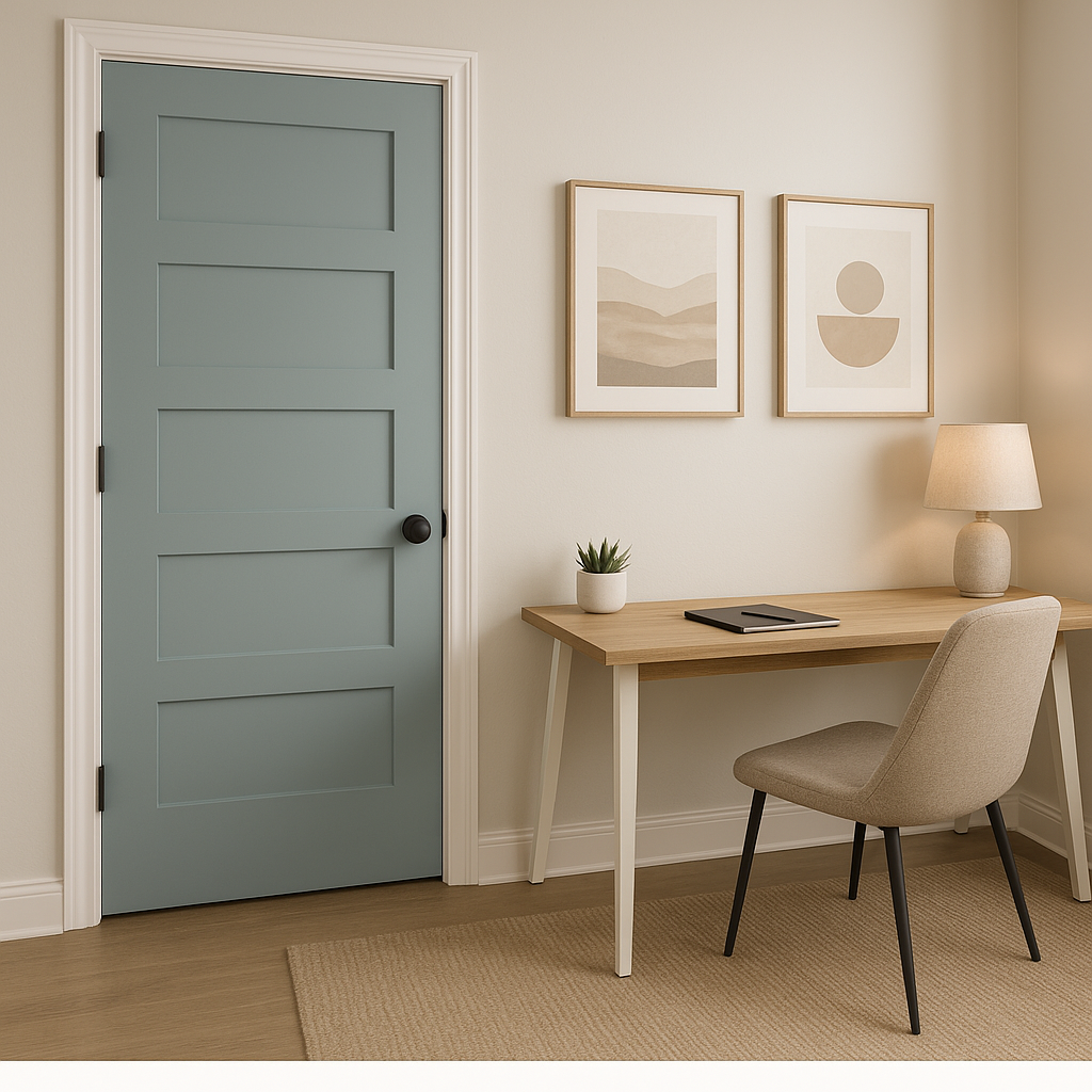
Accent Walls: For a bold statement, use Cape 1642 as an accent wall to anchor a room. It pairs well with neutral walls and adds depth to the overall design.
Exteriors: As an exterior color, Cape 1642 creates a striking and classic look. Pair it with white trim for a timeless coastal vibe or with darker accents for a modern aesthetic.
View Colors Only by Brand (No Imagery):
Sherwin-Williams
|
Benjamin-Moore
|
Behr
|
Valspar
Live on the Eastern Slope of Colorado and looking for a local painting professional, check out all our painting services and reach out for a free estimate.
Copyright © 2026 : Wild Fox Painting Inc. : 12435 Mead Way, Littleton, CO 80125


