Benjamin Moore Lookout (1646) is a sophisticated medium gray that exudes timeless charm and versatility. With its understated elegance, this shade is perfect for both modern and traditional interiors, offering a neutral base that complements a wide range of design styles. Whether you're creating a cozy retreat or a sleek, contemporary space, Lookout provides the perfect balance between warmth and coolness.
Lookout (1646) carries subtle blue undertones that give the color a cool and calming presence. These undertones make it an ideal choice for spaces where tranquility and relaxation are key. Unlike overly warm grays, which can feel heavy or dated, Lookout’s cool undertones provide a crisp, refreshing vibe that pairs beautifully with other cool or neutral tones. Depending on the lighting, the blue undertones may appear more pronounced, lending a soft coastal feel to the room.
Benjamin Moore Lookout (1646) is incredibly versatile and pairs beautifully with a variety of complementary hues. For a harmonious palette, consider these coordinating colors:
Lookout’s neutral yet dynamic personality makes it suitable for a wide range of applications throughout your home or workspace. Here are some creative ways to incorporate this color into your interiors:
Transform your living room into a relaxing haven with Lookout as the main wall color. Its cool undertones provide a soothing backdrop for furniture in natural wood finishes, soft whites, or bold navy accents. Pair it with textured throws and plush rugs for added warmth and depth.
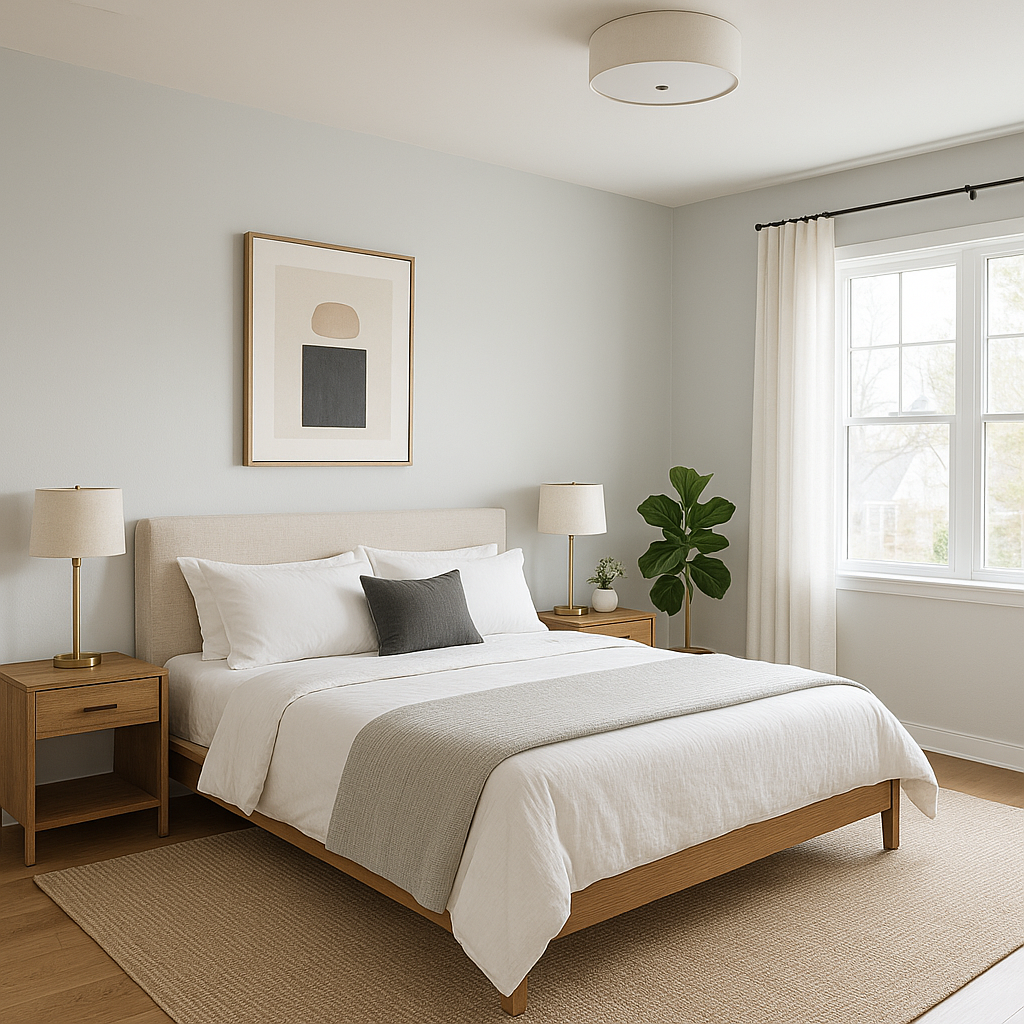
Create a peaceful retreat by using Lookout in your bedroom. Its blue undertones foster tranquility, making it an excellent choice for a restful environment. Layer the space with bedding in light grays, crisp whites, or muted blues for a cohesive look.
In a home office setting, Lookout’s clean and refined appearance can boost focus and productivity. Pair it with sleek furniture, metallic accents, and pops of greenery for an energizing yet grounded workspace.
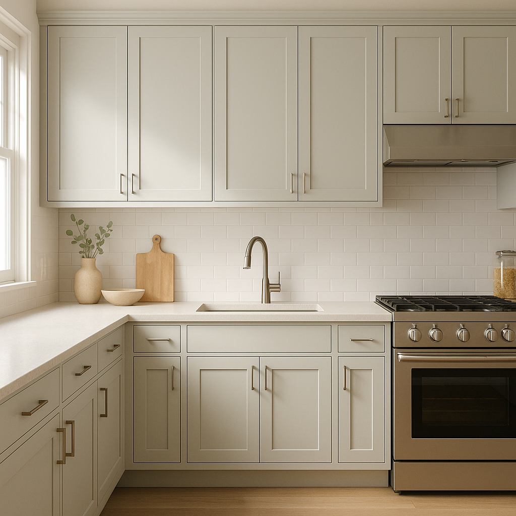
For a modern kitchen, Lookout works beautifully on cabinetry or walls, especially when paired with bright white countertops and polished chrome hardware. The color’s cool undertones lend a fresh and airy feel to the space.
Use Lookout to create a spa-like atmosphere in bathrooms. Pair it with white subway tiles, marble countertops, and accents in soft blues or greens for a serene and polished look.
Lookout is also an excellent choice for exterior siding or trim. Pair it with crisp whites for a classic look, or combine it with deeper grays and blues for a contemporary aesthetic.
The appearance of Benjamin Moore Lookout (1646) can vary depending on the lighting in your space. In natural light, its blue undertones may become more pronounced, creating a crisp and airy feel. In spaces with warm artificial lighting, Lookout may lean more neutral, offering a balanced and grounded presence. Always test the color in different lighting conditions to ensure it complements your design vision.
Benjamin Moore Lookout (1646) is a versatile and timeless gray that seamlessly adapts to various styles and spaces. Whether used on walls, furniture, or accents, its understated elegance makes it a go-to choice for creating interiors that feel both refined and inviting.
View Colors Only by Brand (No Imagery):
Sherwin-Williams
|
Benjamin-Moore
|
Behr
|
Valspar
Live on the Eastern Slope of Colorado and looking for a local painting professional, check out all our painting services and reach out for a free estimate.
Copyright © 2026 : Wild Fox Painting Inc. : 12435 Mead Way, Littleton, CO 80125


