Benjamin Moore Polaris (1649) is a captivating medium-to-light blue that evokes a sense of calm and sophistication. Inspired by the celestial beauty of the North Star, this timeless hue strikes a perfect balance between cool elegance and subtle warmth. Its versatility makes it a favored choice for both modern and traditional spaces, offering a soothing backdrop that complements a wide range of design aesthetics.
Polaris features soft gray undertones that lend it a refined, muted quality. These undertones prevent the blue from feeling overly vibrant or saturated, making it an ideal choice for spaces where tranquility and balance are desired. The gray undertones enhance its versatility, allowing Polaris to harmonize effortlessly with both cool and warm color palettes. Depending on the lighting, Polaris can appear slightly more blue in bright, natural light or lean toward its grayish side in dimmer, artificial lighting.
The subtle charm of Polaris makes it easy to pair with a variety of complementary hues. Some excellent coordinating colors include:
Polaris is a versatile color that works beautifully in a variety of interior spaces, whether you're aiming for a serene retreat or a polished, professional look. Below are some recommended uses:
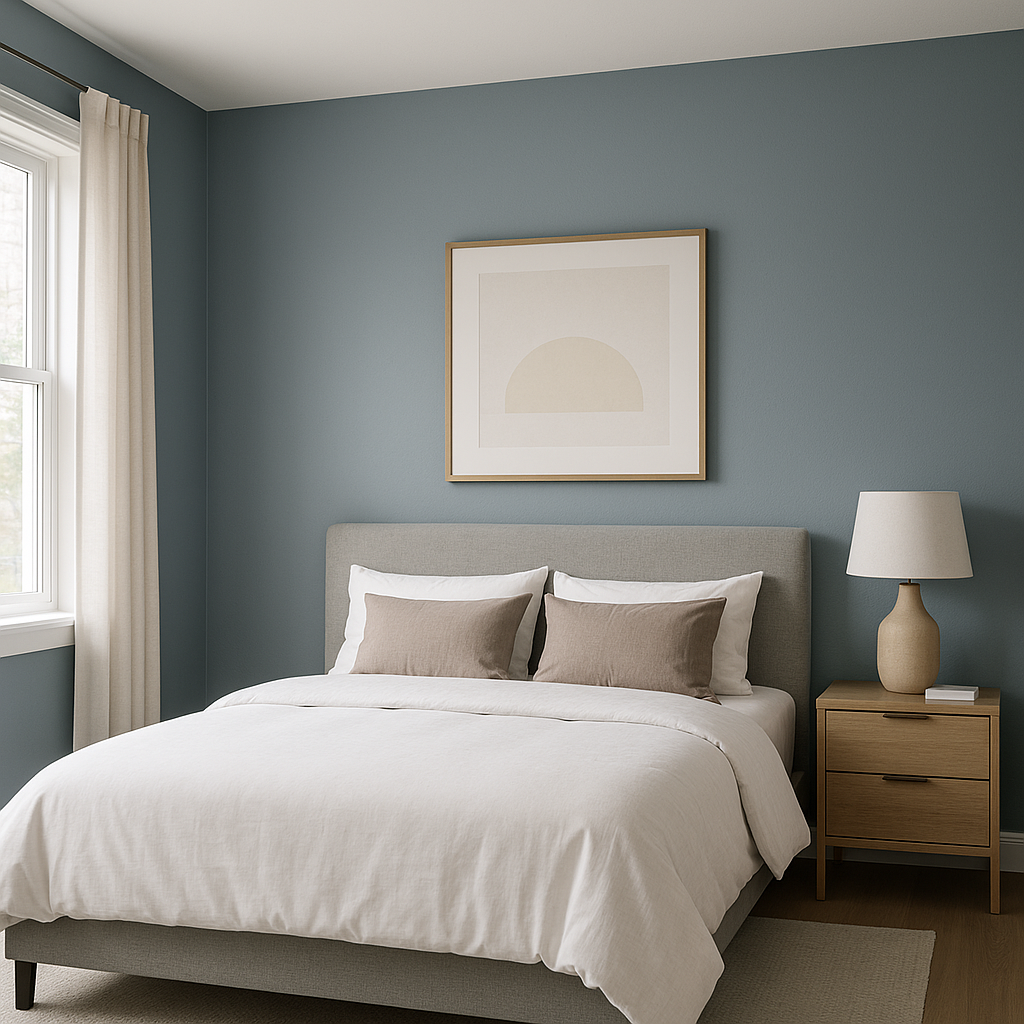
The calming nature of Polaris makes it a perfect choice for bedrooms. Pair it with soft whites and light grays for bedding and furniture to create a peaceful sanctuary ideal for relaxation.
Polaris can serve as an excellent wall color for living rooms, especially in spaces with ample natural light. Combine it with neutral furniture and metallic accents for a sophisticated and modern look.
This cool blue works wonderfully in bathrooms, evoking the tranquil vibes of spa-like retreats. Pair it with crisp white tiles and chrome or brushed nickel fixtures for a fresh, clean aesthetic.
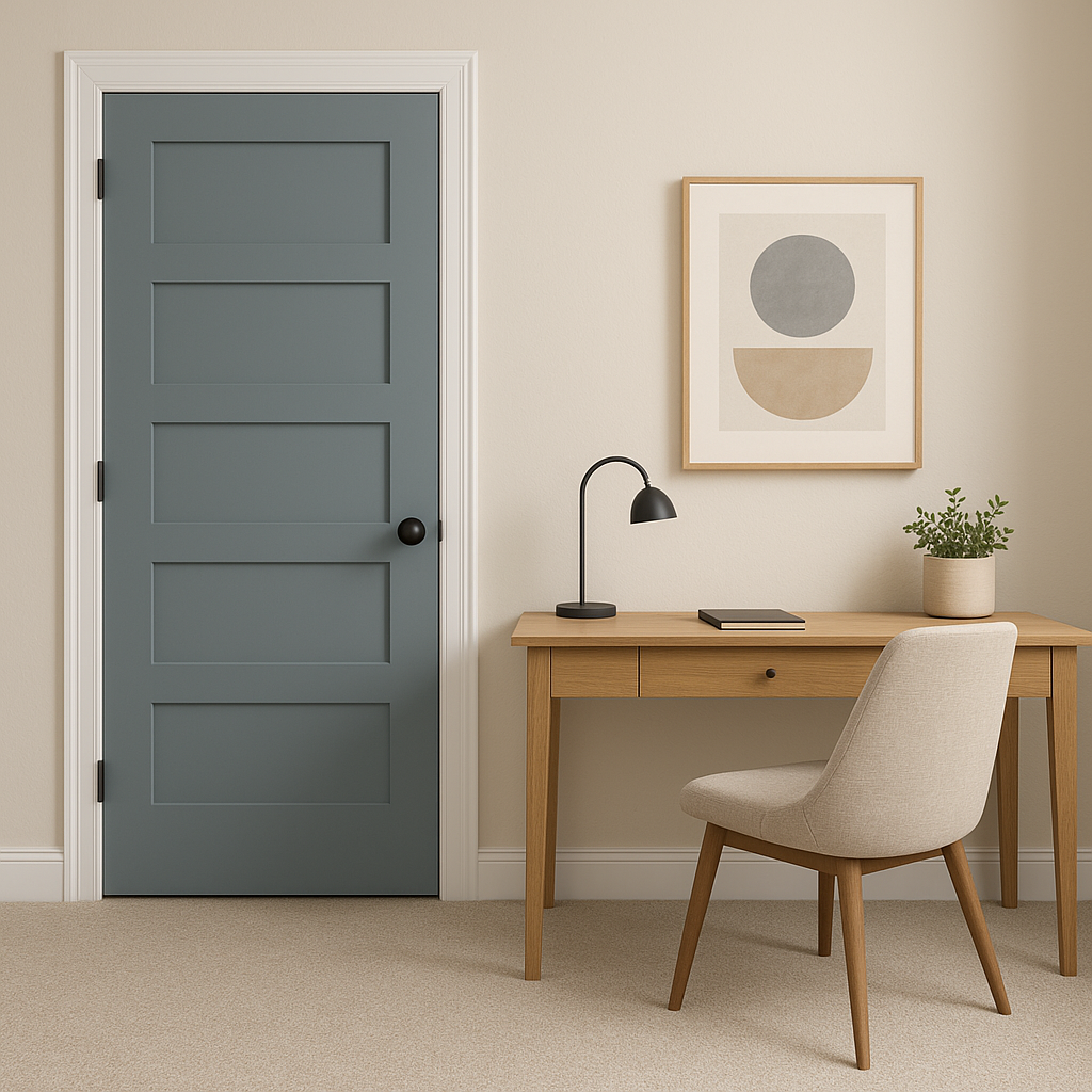
In home offices, Polaris fosters focus and productivity without feeling overwhelming. Use coordinating grays and whites to keep the space grounded and professional.
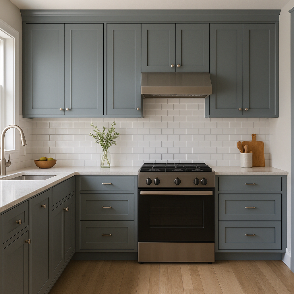
Polaris brings a breath of fresh air to kitchens, serving as a striking wall color or cabinetry shade. Combine it with white countertops and backsplash tiles for a bright, airy effect, or balance it with rich wood tones for a more grounded design.
For those who prefer a touch of color without committing to an entire room, Polaris makes a stunning choice for accent walls. Use it behind a bed, sofa, or shelving unit to create visual interest and depth.
As with any paint color, the appearance of Polaris can vary depending on the lighting in your space. In rooms with ample natural light, Polaris leans toward a crisp blue tone, while in spaces with softer, artificial lighting, its gray undertones become more prominent. Always test a sample in your home’s unique lighting conditions to ensure it achieves the desired effect.
Benjamin Moore Polaris (1649) is a versatile and graceful blue that can transform any space into a haven of serenity and style. Whether you’re designing a modern retreat or a classic, timeless room, Polaris offers endless possibilities for creating a harmonious and inviting atmosphere.
View Colors Only by Brand (No Imagery):
Sherwin-Williams
|
Benjamin-Moore
|
Behr
|
Valspar
Live on the Eastern Slope of Colorado and looking for a local painting professional, check out all our painting services and reach out for a free estimate.
Copyright © 2026 : Wild Fox Painting Inc. : 12435 Mead Way, Littleton, CO 80125


