Benjamin Moore Stillwater (1650) is a luxurious, deep green that exudes sophistication and tranquility. With its rich, saturated tone, Stillwater serves as a striking choice for spaces where you want to create a sense of depth, intimacy, and grounded elegance. This color is part of Benjamin Moore's Classic Color Collection, a curated palette designed to stand the test of time while offering a refined aesthetic.
Stillwater is a dark green with cool undertones that lean slightly blue. This subtle hint of blue gives the color a modern edge, preventing it from feeling overly traditional or flat. The cool undertones make it versatile for pairing with other hues, bringing balance and harmony to a room's design.
Benjamin Moore Stillwater pairs beautifully with both neutrals and bold accents. Here are a few coordinating color suggestions to enhance its impact:
Stillwater’s versatility allows it to work in a variety of spaces and design styles. It can serve as a statement color or a grounding hue. Here are a few ways to use Stillwater effectively:
Stillwater is an exceptional choice for accent walls, particularly in living rooms, dining rooms, or bedrooms. Its dramatic depth creates a focal point without overwhelming the space. Pair it with lighter walls for contrast and balance.
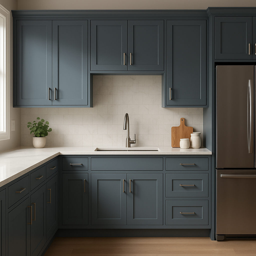
For kitchens, bathrooms, or home offices, Stillwater can elevate cabinetry and built-ins with its bold yet elegant presence. This color works beautifully on lower cabinets paired with marble countertops and brass hardware, creating a modern, upscale look.
Stillwater’s rich tone is perfect for creating cozy, intimate spaces like reading nooks or libraries. Pair it with warm wood finishes or leather furniture for a timeless, classic appeal.
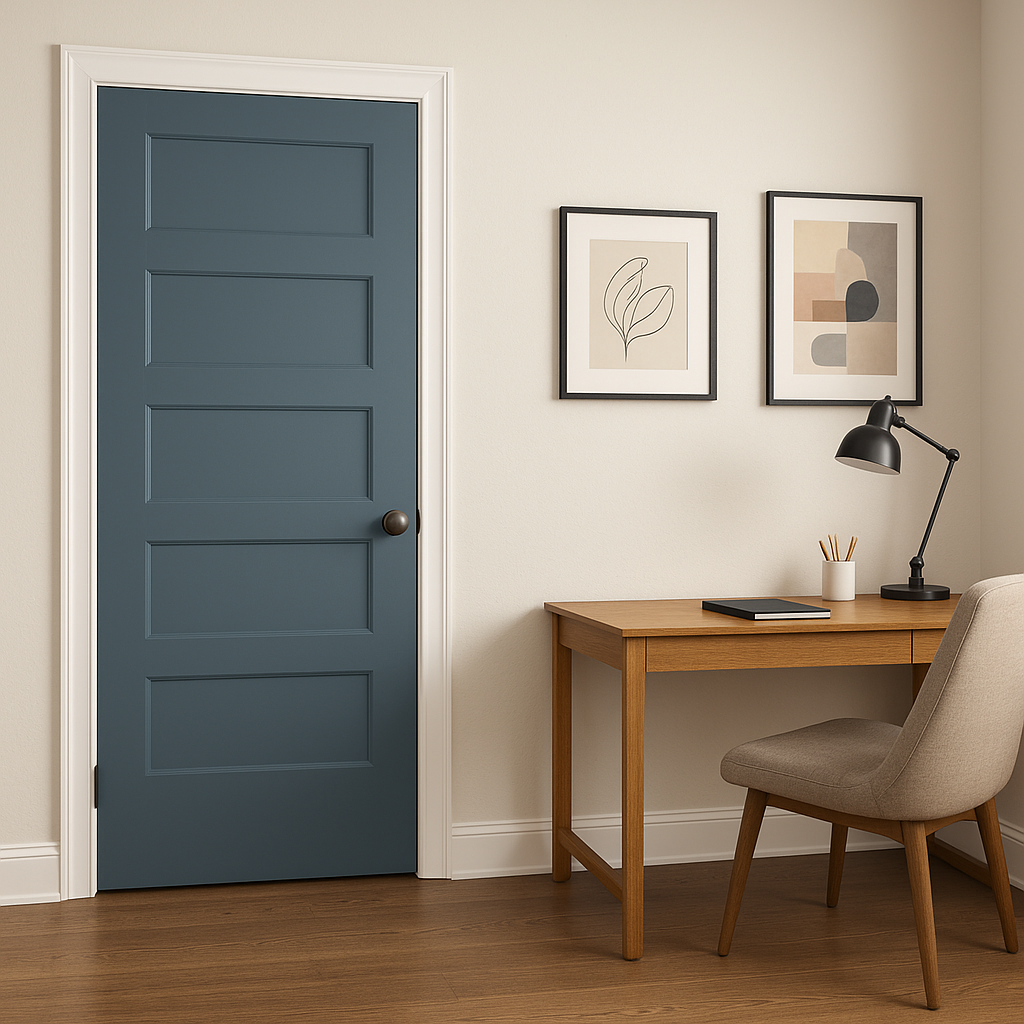
Extend Stillwater’s charm outdoors by using it as a front door color or exterior trim. Its deep green hue adds curb appeal and pairs wonderfully with neutral siding or stonework.
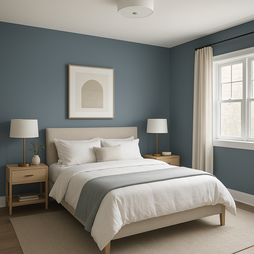
As a calming and serene color, Stillwater is ideal for bedrooms. It encourages relaxation and pairs effortlessly with soft linens in ivory, blush, or muted blues.
Stillwater’s appearance can shift depending on lighting conditions. In spaces with ample natural light, the blue undertones in Stillwater may become more pronounced, giving it a slightly cooler feel. In dimmer settings, the rich green deepens further, creating an intimate and enveloping atmosphere. Use this color intentionally based on the mood you wish to evoke in the room.
Benjamin Moore Stillwater (1650) is more than just a paint color—it’s a design statement. Whether you’re looking to add depth to a room, create a serene retreat, or make a bold visual impact, Stillwater’s timeless elegance and versatility make it a standout choice. With its cool undertones, wide range of coordinating options, and ability to transform any space, Stillwater is a color that will continue to inspire for years to come.
View Colors Only by Brand (No Imagery):
Sherwin-Williams
|
Benjamin-Moore
|
Behr
|
Valspar
Live on the Eastern Slope of Colorado and looking for a local painting professional, check out all our painting services and reach out for a free estimate.
Copyright © 2026 : Wild Fox Painting Inc. : 12435 Mead Way, Littleton, CO 80125


