Benjamin Moore New (1651) is a captivating color that bridges the gap between classic elegance and modern sophistication. This versatile blue-green hue offers a dynamic presence, making it a favorite for interior designers seeking a fresh yet timeless aesthetic. Whether used as a standout accent or a grounding wall color, New (1651) adds depth and personality to any space.
Benjamin Moore New (1651) belongs to the blue-green family, but it carries a unique complexity that sets it apart. The color leans slightly more toward green, yet its soothing blue undertones create a harmonious balance. This duality evokes a sense of calm, reminiscent of ocean waters or lush botanical gardens.
Its medium depth is perfect for spaces where you want to add character without overwhelming the surroundings. The undertones are cool, making it ideal for creating a tranquil ambiance. These subtle cool tones also pair beautifully with a variety of complementary colors, lending itself to an adaptable design palette.
Benjamin Moore New (1651) pairs well with a range of hues, from neutrals to bold accents. To create a cohesive and polished look, consider these coordinating colors:
These coordinating shades allow you to play with contrast and harmony, whether you're aiming for a minimalist design or a layered, eclectic look.
Benjamin Moore New (1651) is an incredibly versatile shade suitable for a variety of spaces. Here's how you can incorporate it into your interiors:
Use New (1651) on walls to create a cozy yet sophisticated atmosphere. Pair it with light-colored furniture and metallic accents to add a touch of elegance. Incorporating textured textiles like velvet or linen in complementary shades can further enhance the room's depth.
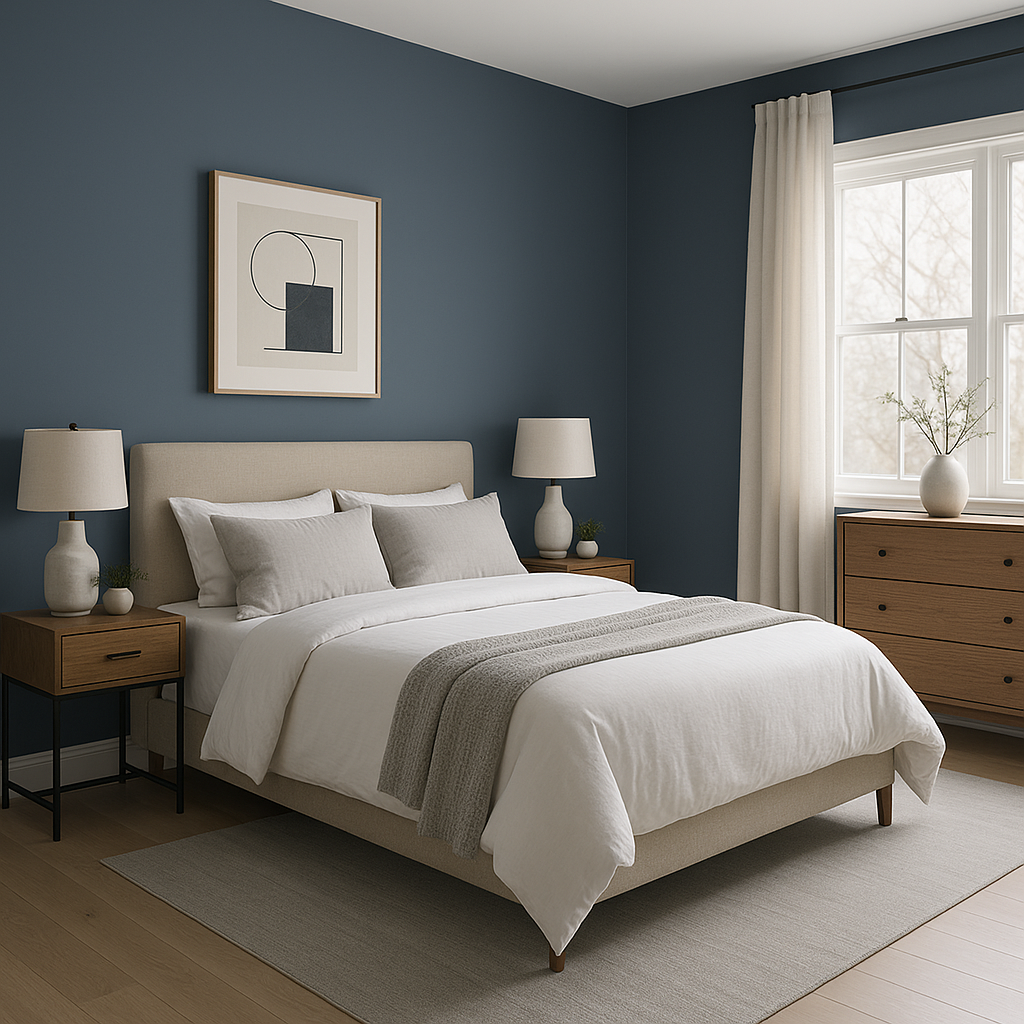
The calming undertones of New (1651) make it a perfect choice for bedrooms. Create a sanctuary-like retreat by combining this color with soft whites and muted grays. Add natural wood elements or woven textures for warmth and balance.
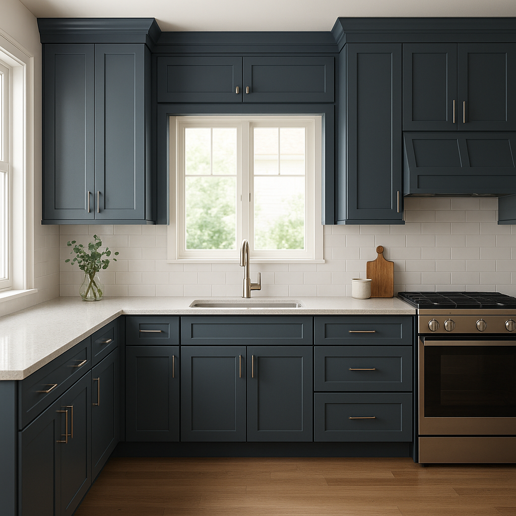
In kitchens, New (1651) works beautifully on cabinetry, creating a fresh and inviting environment. Pair it with white quartz countertops and brushed nickel hardware for a modern look. In bathrooms, this color shines on walls, contrasting beautifully with white tiles and chrome fixtures for a clean, spa-like space.
If you’re looking to make a statement, New (1651) is an excellent choice for an accent wall. Pair it with neutral tones on surrounding walls to draw attention to architectural details or focal points like a fireplace or built-in shelving.
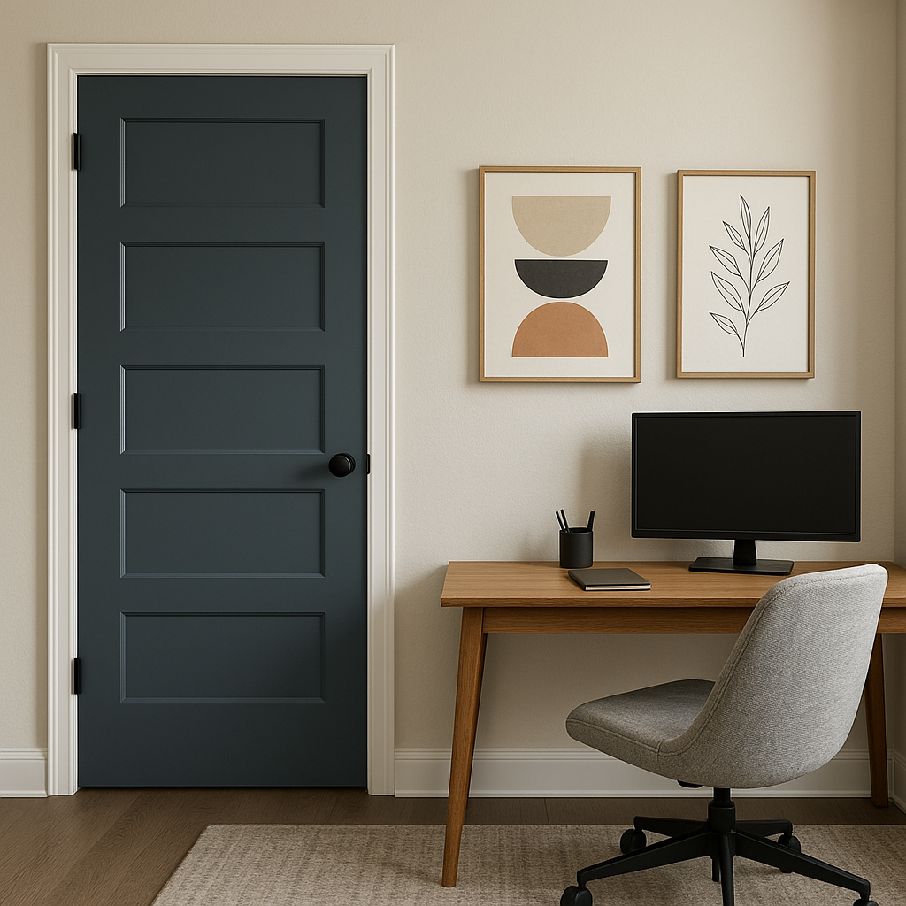
The tranquil nature of New (1651) makes it a great choice for home offices. It fosters focus and creativity, especially when paired with white or light gray furniture and decor.
Benjamin Moore New (1651) offers a perfect balance between boldness and subtlety. Its cool undertones make it universally appealing, while its unique blend of blue and green adds a touch of personality to any room. Whether you’re designing a serene bedroom, a lively social space, or a productive work environment, this color adapts effortlessly to your needs.
With its ability to coordinate beautifully with other shades and materials, New (1651) is a reliable choice for both seasoned designers and homeowners looking to elevate their interiors. It’s a timeless hue that will remain stylish for years to come, ensuring that your space feels fresh and inviting no matter the trends.
View Colors Only by Brand (No Imagery):
Sherwin-Williams
|
Benjamin-Moore
|
Behr
|
Valspar
Live on the Eastern Slope of Colorado and looking for a local painting professional, check out all our painting services and reach out for a free estimate.
Copyright © 2026 : Wild Fox Painting Inc. : 12435 Mead Way, Littleton, CO 80125


