Benjamin Moore Blue (1655) is a sophisticated and enduring shade that embodies the essence of refined style. This color is part of Benjamin Moore's Classic Color Collection, a palette that has stood the test of time by offering hues that seamlessly blend tradition with modernity. Blue (1655) is a rich, medium-toned blue that evokes a sense of calm and order, making it an exceptional choice for a variety of interior design applications.
What makes Benjamin Moore Blue (1655) so versatile is its balanced undertones. This shade carries subtle gray undertones, which add depth and keep the blue from feeling overly bright or saturated. The gray influence makes it an easy color to integrate into both neutral and bold palettes without overwhelming the space. The result is a blue that feels grounded and sophisticated rather than airy or juvenile, making it ideal for creating a serene and polished atmosphere.
Benjamin Moore Blue (1655) pairs beautifully with a variety of coordinating hues, allowing for endless design possibilities. Whether you're looking to create a monochromatic scheme or want to mix complementary shades, this blue is remarkably adaptable. Here are some recommended pairings:
Neutral Pairings:
Bold Accents:
Complementary Colors:
Benjamin Moore Blue (1655) is a versatile shade that works equally well in traditional, transitional, or contemporary homes. Its timeless appeal ensures it can be used across a variety of design styles without feeling dated. Below are some ideas for incorporating this elegant hue into your spaces:
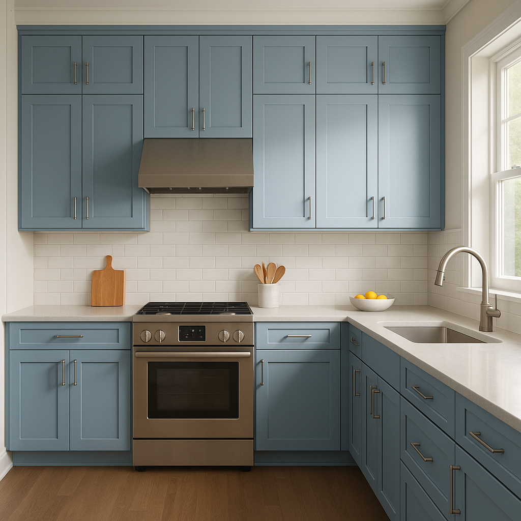
Living Room: Use Blue (1655) on walls to create a sophisticated and restful ambiance. Pair it with neutral furniture and metallic accents, such as brushed gold or silver, for a high-end look.
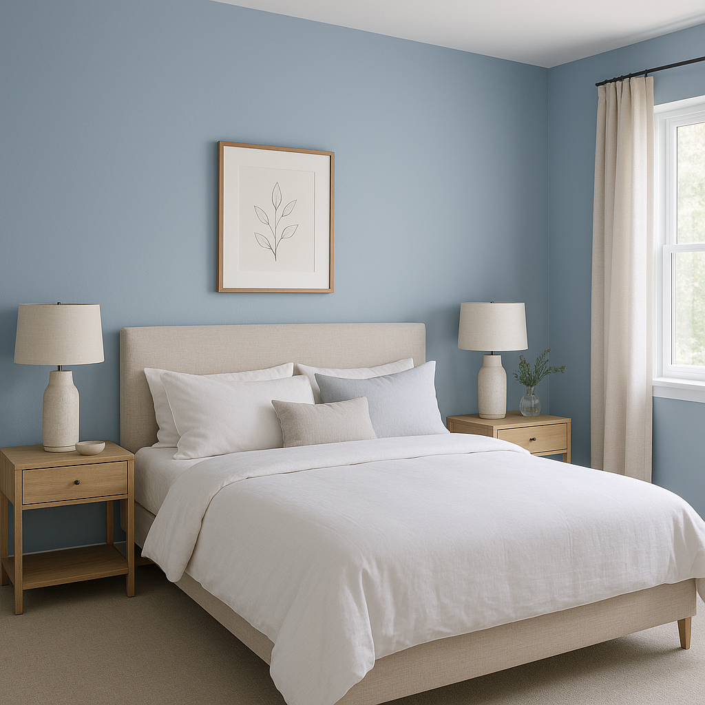
Bedroom: As a wall color for bedrooms, Blue (1655) fosters a tranquil environment. Pair it with crisp white bedding and soft gray textiles for a serene retreat.
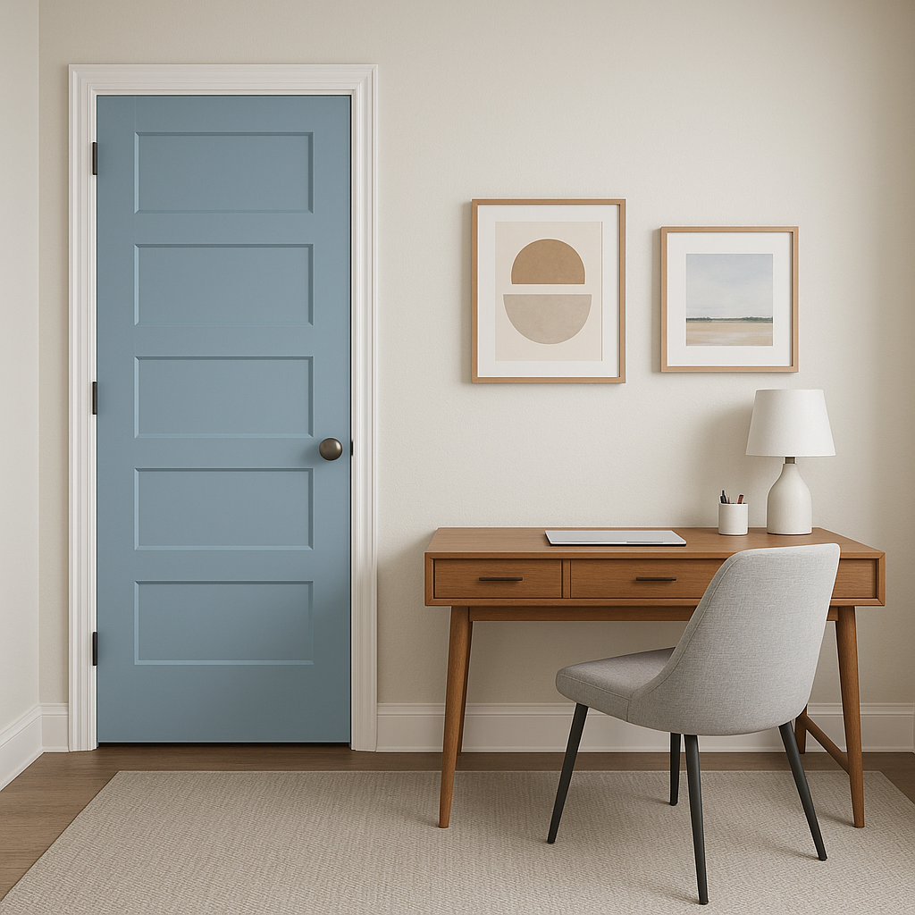
Home Office: Blue (1655) is an excellent choice for home offices as its calming undertones promote focus and productivity. Combine it with natural wood furniture and understated decor for a balanced workspace.
Bathroom: For a spa-like feel, apply Blue (1655) to vanity cabinets or walls. Complement it with marble countertops and polished nickel fixtures for a luxurious finish.
Accent Walls: If you’re not ready to commit to painting an entire room, use Blue (1655) for an accent wall. It works beautifully behind bookshelves, headboards, or as a backdrop for art pieces.
The appearance of Benjamin Moore Blue (1655) can shift depending on the lighting in your space. In rooms with ample natural light, the gray undertones become more apparent, lending a soft and elegant feel. Under warmer artificial lighting, the blue deepens slightly, giving it a richer, cozier effect. When planning your design, consider how lighting will interact with this shade to achieve your desired mood.
This color’s timeless elegance lies in its versatility and ability to adapt to different spaces and styles. Whether you're creating a serene retreat, an inviting gathering space, or a productive work environment, Blue (1655) offers the perfect balance of sophistication and approachability. Its ability to coordinate with a wide range of colors ensures it will remain a staple in your home for years to come.
View Colors Only by Brand (No Imagery):
Sherwin-Williams
|
Benjamin-Moore
|
Behr
|
Valspar
Live on the Eastern Slope of Colorado and looking for a local painting professional, check out all our painting services and reach out for a free estimate.
Copyright © 2026 : Wild Fox Painting Inc. : 12435 Mead Way, Littleton, CO 80125


