Benjamin Moore’s Niagara (1657) is a sophisticated, muted blue that exudes calmness and refinement. With its understated elegance, this versatile shade offers the perfect balance of depth and softness, making it a beloved choice for a variety of interior spaces. Niagara is a timeless hue that seamlessly blends classic charm with modern appeal, making it adaptable for both traditional and contemporary aesthetics.
Niagara (1657) is a cool-toned blue with subtle gray undertones that bring a sense of tranquility to any room. The gray softens the richness of the blue, preventing it from feeling too bold or overpowering. This combination creates a balanced, versatile color that evokes the soothing essence of water or a misty horizon. The gray undertones also make Niagara a fantastic option for spaces that require a more neutral yet character-rich palette.
Depending on the lighting, Niagara can shift in appearance. In natural light, it leans more toward a soft and airy blue, whereas in artificial or dim lighting, its gray undertones become more pronounced, giving it a sophisticated depth.
Benjamin Moore Niagara (1657) pairs beautifully with a wide range of colors, making it a flexible choice for creating cohesive and harmonious interiors. Here are some suggestions for coordinating colors:
Niagara’s soft, calming nature makes it an excellent choice for a wide variety of rooms and design styles. Its versatility ensures it can adapt to both small and large spaces with ease. Here are some ideas for incorporating Niagara into your home or office:
Niagara creates a serene and inviting atmosphere, making it ideal for living rooms. Pair it with light neutral furniture and natural textures like wood or linen to evoke a coastal or Scandinavian-inspired vibe. Add warm metallic accents like brass or gold for a touch of sophistication.
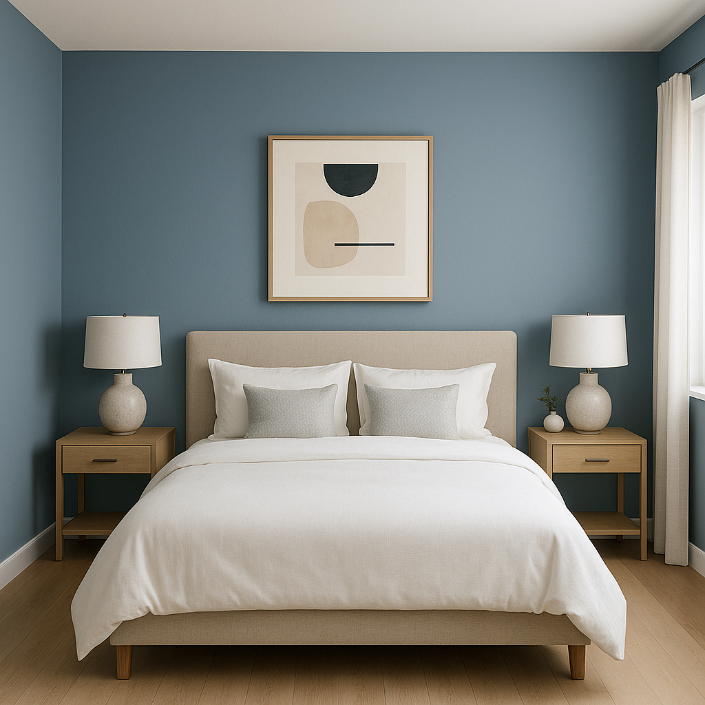
This restful shade is perfect for bedrooms, where its tranquil undertones help foster relaxation. Use it on the walls and pair it with crisp white bedding and soft gray or beige accents for a clean, serene retreat. Niagara also works beautifully with darker wood furniture for a more traditional aesthetic.
Niagara’s watery, spa-like quality makes it a natural choice for bathrooms. Combine it with white subway tiles, polished chrome fixtures, and soft gray or white cabinetry to create a fresh and clean look.
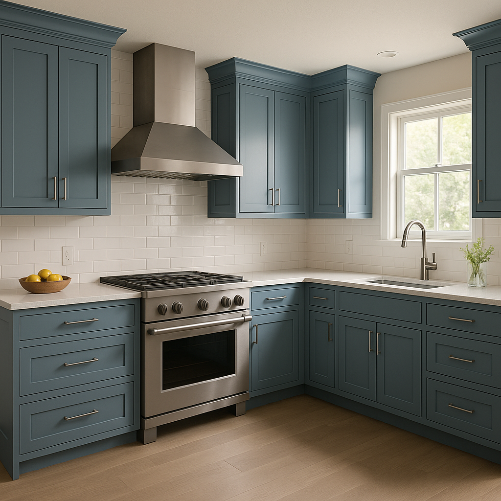
Consider using Niagara on kitchen cabinetry for a modern yet timeless feel. It pairs beautifully with marble countertops, white walls, and a subway tile backsplash. For a bolder statement, combine it with dark countertops or black hardware.
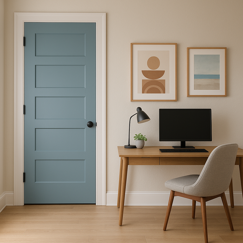
Niagara fosters focus and tranquility, making it an excellent color for home offices or study areas. Pair it with natural wood desks, soft lighting, and neutral accents to create a balanced and productive workspace.
If you’re not ready to commit to painting an entire room, Niagara works beautifully as an accent wall or on furniture pieces such as bookshelves, cabinets, or dressers. Its muted tone ensures it enhances a space without overwhelming it.
Benjamin Moore Niagara (1657) is a stunning soft blue with gray undertones that brings a sense of calm and sophistication to any space. Its versatility allows it to coordinate seamlessly with a variety of colors, from neutrals to bold accents, making it a fantastic choice for interiors ranging from coastal to modern. Whether used on walls, cabinetry, or as an accent color, Niagara creates an atmosphere of quiet elegance that stands the test of time.
Transform your space with the enduring beauty of Niagara and enjoy the serene ambiance it brings to your home.
View Colors Only by Brand (No Imagery):
Sherwin-Williams
|
Benjamin-Moore
|
Behr
|
Valspar
Live on the Eastern Slope of Colorado and looking for a local painting professional, check out all our painting services and reach out for a free estimate.
Copyright © 2026 : Wild Fox Painting Inc. : 12435 Mead Way, Littleton, CO 80125


