Benjamin Moore Spellbound (1659) is a graceful, medium-toned gray-blue that effortlessly enhances interiors with its sophisticated charm and serene appeal. This enchanting color is versatile, making it ideal for both modern and traditional spaces. Whether you're designing a coastal retreat, a contemporary urban loft, or a cozy transitional living area, Spellbound brings a sense of tranquility paired with understated drama.
Spellbound is a complex hue with cool undertones that lean heavily toward blue, complemented by subtle gray influences. The gray aspect softens the blue, ensuring the color never feels too bright or overwhelming. This delicate balance results in a calm, grounded shade with just enough depth to make a statement without overpowering a room.
In certain lighting conditions, Spellbound may reveal hints of purple undertones, adding a touch of mystery and allure. These shifts in tone make it an engaging choice for spaces with varying natural or artificial light.
Benjamin Moore Spellbound pairs beautifully with a variety of complementary and contrasting colors, making it a versatile choice for creating cohesive palettes.
Neutral Pairings:
Combine Spellbound with warm neutrals like White Dove (OC-17) or Simply White (OC-117) for a crisp, balanced look that highlights its cool undertones. Alternatively, pair it with deeper grays like Kendall Charcoal (HC-166) for added sophistication.
Bold Contrasts:
For a more daring design, accent Spellbound with jewel tones such as Hale Navy (HC-154) or Caliente (AF-290). These deeper hues create a striking contrast that elevates the space’s energy while maintaining harmony.
Earthy Complements:
Incorporate soft greens like Pale Olive (2140-40) or muted browns like Kingsport Gray (HC-86) for a grounded and organic feel. These colors bring a sense of warmth and balance to Spellbound’s cool character.
Spellbound is highly adaptable, making it suitable for a range of interior design applications.
Living Rooms:
Use Spellbound on the walls in a living room to create a calming yet polished atmosphere. It pairs beautifully with plush furniture in neutral tones, metallic accents, and layered textiles for a cozy yet elevated space.
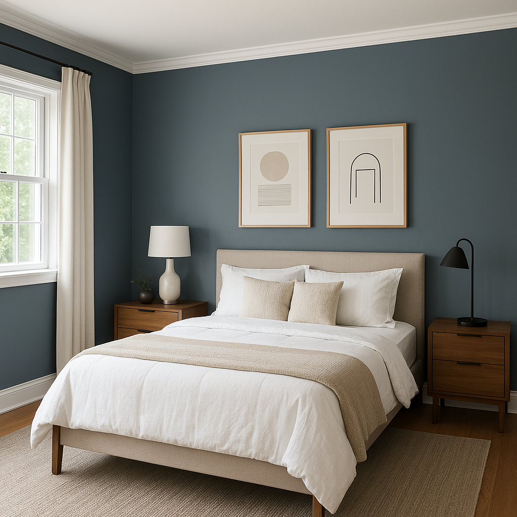
Bedrooms:
Spellbound’s soothing gray-blue tones make it ideal for bedroom walls, fostering relaxation and tranquility. Pair it with crisp white bedding and soft accent colors like blush or sage green for a serene retreat.
Bathrooms:
In bathrooms, Spellbound evokes a spa-like aesthetic, especially when combined with white subway tiles, chrome fixtures, and natural wood accents.
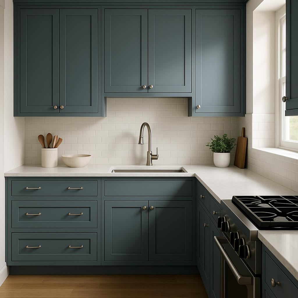
Kitchens:
Whether applied to cabinetry or walls, Spellbound adds a refined touch to kitchens. Pair it with white countertops and stainless-steel appliances for a modern look, or use it alongside natural wood finishes for a rustic vibe.
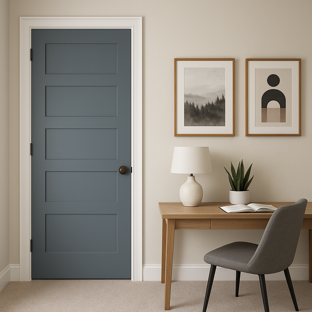
Accent Spaces:
Spellbound works wonderfully as an accent color for feature walls, built-ins, or furniture pieces. Its depth and complexity add visual interest without overwhelming the space.
Spellbound’s harmonious blend of gray and blue makes it a designer favorite for creating spaces that feel elegant, restful, and timeless. Its versatility allows it to adapt to different design styles and lighting conditions, ensuring it remains relevant no matter the trends.
Whether you're looking to refresh your home with a crisp-yet-cozy color or add a subtle touch of sophistication to your space, Benjamin Moore Spellbound (1659) is a captivating choice for interiors that exude charm and serenity.
View Colors Only by Brand (No Imagery):
Sherwin-Williams
|
Benjamin-Moore
|
Behr
|
Valspar
Live on the Eastern Slope of Colorado and looking for a local painting professional, check out all our painting services and reach out for a free estimate.
Copyright © 2026 : Wild Fox Painting Inc. : 12435 Mead Way, Littleton, CO 80125


