Benjamin Moore Polar (1660) is a striking gray that effortlessly combines sophistication and versatility. As part of the brand’s premium selection, Polar offers a refined balance of warmth and coolness, making it a favorite for interior designers seeking a modern yet approachable neutral. Whether you're refreshing a single room or creating a cohesive look throughout your home, Polar is a color that adapts beautifully to different styles and lighting conditions.
Polar is a medium gray with subtle blue undertones, lending it a cool, serene quality. These undertones make it an excellent choice for spaces where you want to evoke calmness and sophistication. While it leans cooler, Polar remains soft and approachable, avoiding the starkness of cooler grays or the heaviness of darker shades.
Its blue undertones ensure that it pairs exceptionally well with other cool tones, but it also holds its own when contrasted with warmer hues. This balance makes Polar an incredibly versatile color for a wide range of design aesthetics, from contemporary minimalism to transitional spaces.
Benjamin Moore Polar (1660) shines when paired with complementary and contrasting hues. Here are some coordinating colors that enhance its beauty:
Neutral Pairings:
Cool Accents:
Warm Contrasts:
Benjamin Moore Polar (1660) is versatile enough to work in almost any space. Its adaptable nature makes it perfect for both residential and commercial interiors. Here are some popular applications:
Living Rooms: Polar is ideal for living rooms where you want a modern yet inviting vibe. Pair it with plush furniture in navy or charcoal for a sophisticated look, or add pops of color like mustard or teal for a playful twist.
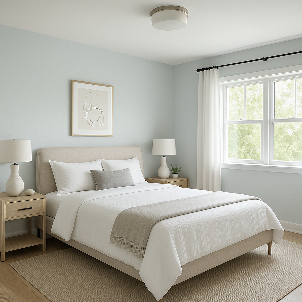
Bedrooms: The cool, tranquil undertones of Polar create a serene atmosphere in bedrooms. Combine it with crisp white bedding and soft blue or silver accents for a dreamy retreat.
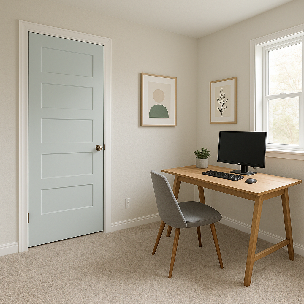
Home Offices: Polar’s refined gray tones help foster focus and calm, making it an excellent choice for home office walls. Add metallic finishes or dark wood furniture for a polished, professional look.
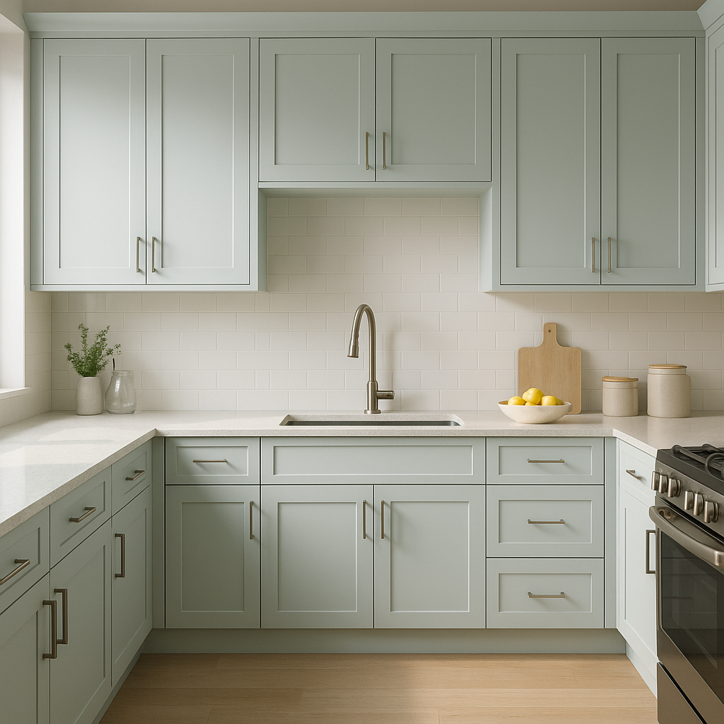
Kitchens: Polar shines in kitchens, especially when paired with white cabinetry and brushed nickel hardware. Its understated elegance works equally well with modern or farmhouse design aesthetics.
Bathrooms: The cool undertones of Polar lend themselves beautifully to spa-like bathrooms. Pair it with marble countertops, chrome fixtures, and soft pastel towels for a refreshing, calming space.
Hallways and Entryways: Polar creates a sophisticated backdrop for artwork and mirrors, making it ideal for transitional areas like hallways and entryways.
Benjamin Moore Polar (1660) can appear slightly different depending on the lighting in your space. In rooms with abundant natural light, its blue undertones are more pronounced, creating a fresh and airy feel. In spaces with warmer artificial lighting, Polar takes on a softer, more balanced appearance. This chameleon-like quality makes it a dependable choice when designing spaces with varied lighting conditions.
Benjamin Moore Polar (1660) is more than just a paint color—it’s a design statement. Its ability to balance cool sophistication with timeless elegance makes it a favorite among interior designers and homeowners alike. Whether you’re aiming for a sleek modern aesthetic or a warm, welcoming ambiance, Polar provides the perfect gray backdrop to bring your vision to life.
View Colors Only by Brand (No Imagery):
Sherwin-Williams
|
Benjamin-Moore
|
Behr
|
Valspar
Live on the Eastern Slope of Colorado and looking for a local painting professional, check out all our painting services and reach out for a free estimate.
Copyright © 2026 : Wild Fox Painting Inc. : 12435 Mead Way, Littleton, CO 80125


