Benjamin Moore Blue (1668) is a rich, versatile shade that exudes timeless elegance and understated sophistication. This classic blue is part of Benjamin Moore’s Historical Color Collection, a curated palette inspired by 18th and 19th-century architecture. It strikes a balance between boldness and tranquility, making it a go-to choice for creating serene yet memorable spaces. Whether you're designing a contemporary city loft, a coastal retreat, or a traditional home, Benjamin Moore Blue is an adaptable color that brings depth and charm to any interior.
Benjamin Moore Blue (1668) boasts subtle gray undertones that soften its intensity, creating a muted, sophisticated hue. These gray notes ground the blue, giving it a cool neutrality that feels approachable and versatile. Unlike bright or overly saturated blues, this shade has a quiet confidence that allows it to pair beautifully with a variety of colors and styles. The soft gray undertones also make it a calming choice, ideal for spaces where relaxation and focus are key.
One of the standout features of Benjamin Moore Blue (1668) is its ability to work seamlessly with a wide range of coordinating colors. Here are some pairing suggestions to help you craft a cohesive and visually dynamic palette:
Neutrals: Pair it with warm whites like White Dove (OC-17) or cool neutrals like Gray Owl (OC-52) for a clean and balanced look. These shades complement the blue’s gray undertones, enhancing its sophistication.
Earthy Tones: Create a grounded, nature-inspired palette by combining Benjamin Moore Blue with soft beiges like Edgecomb Gray (HC-173) or muted greens such as Sagebrush (CC-646).
Accent Colors: For a bold, stylish contrast, pair it with warm golden hues like Golden Straw (2152-50) or deep reds like Dinner Party (AF-300). These vibrant accents bring out the richness of the blue, adding energy and vibrancy to your decor.
Monochromatic Scheme: For a layered, monochromatic look, use lighter blues like Brittany Blue (1633) or darker, more dramatic shades such as Hale Navy (HC-154).
Thanks to its versatility, Benjamin Moore Blue (1668) can be used in a variety of ways throughout your home. Its calming nature and timeless appeal make it suitable for almost any room:
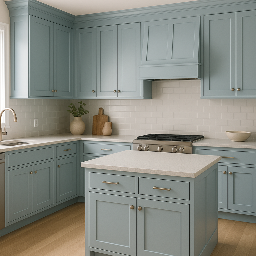
Benjamin Moore Blue creates a cozy and inviting atmosphere when used in living areas. Pair it with plush furnishings in neutral tones and metallic accents for a polished, modern aesthetic. Its understated elegance also complements traditional design styles, especially when paired with wainscoting or crown molding.
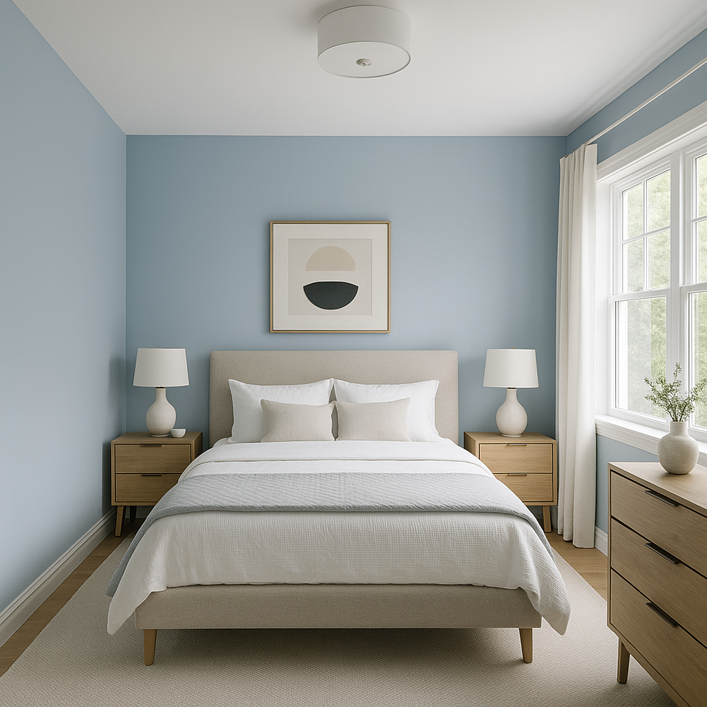
The tranquil and soothing nature of Benjamin Moore Blue makes it a perfect choice for bedrooms. Use this shade on the walls to promote relaxation and pair it with soft linens in neutral whites or pastel shades for a serene retreat.
For dining spaces, this blue adds depth and a refined touch. Incorporate metallic finishes, such as gold or brass light fixtures, and wooden furniture to create a warm and inviting ambiance perfect for entertaining.
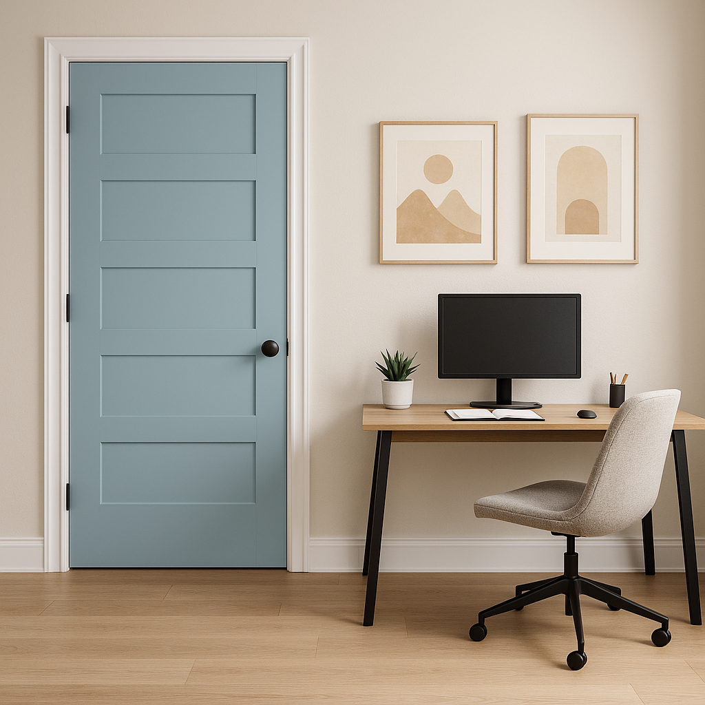
Benjamin Moore Blue’s muted gray undertones inspire focus and calm, making it an excellent choice for home offices. Pair it with sleek, modern furniture and pops of color in accessories to maintain a professional yet stylish vibe.
In bathrooms, Benjamin Moore Blue brings a spa-like serenity. Complement it with crisp white tiles, marble countertops, and polished chrome fixtures for a clean and luxurious feel.
This shade is also a fantastic option for exteriors, including shutters, front doors, or siding. Its timeless appeal pairs beautifully with white trim, giving your home a classic and sophisticated curb appeal.
Benjamin Moore Blue (1668) is the epitome of adaptable elegance. Its muted gray undertones and rich blue hue can be tailored to fit a variety of styles, from modern to traditional. This shade is ideal for those who want to incorporate color into their home without overwhelming the space. Whether you use it as the main color in a room or as an accent, Benjamin Moore Blue has the ability to elevate your interiors with its timeless charm and versatility.
Let Benjamin Moore Blue (1668) inspire your next design project—it’s a color that never goes out of style.
View Colors Only by Brand (No Imagery):
Sherwin-Williams
|
Benjamin-Moore
|
Behr
|
Valspar
Live on the Eastern Slope of Colorado and looking for a local painting professional, check out all our painting services and reach out for a free estimate.
Copyright © 2026 : Wild Fox Painting Inc. : 12435 Mead Way, Littleton, CO 80125


