Benjamin Moore West (1671) is a sophisticated charcoal gray that exudes timeless elegance and versatility. Its rich, deep hue strikes a harmonious balance between dramatic sophistication and understated neutrality, making it an exceptional choice for modern and classic interiors alike. Whether you're designing a cozy living room, a chic kitchen, or a refined office space, Benjamin Moore West offers a sense of depth and character that elevates any design scheme.
West (1671) has subtle blue undertones that give this dark gray a cool edge without feeling overly cold or stark. These undertones allow it to pair beautifully with both warmer and cooler color palettes, making it a dynamic choice for a wide variety of spaces. The blue undertones also add a touch of calm sophistication, lending this hue an air of serenity that’s perfect for creating a grounding atmosphere in your home.
Benjamin Moore West (1671) is remarkably versatile and pairs well with a range of coordinating colors. Here are some inspired combinations to help you create a cohesive look:
Benjamin Moore West (1671) is a versatile color that works beautifully in various spaces and applications. Here are some creative ways to incorporate it into your home:
Use West (1671) as an accent wall color in living rooms, bedrooms, or dining areas to create a striking focal point. Its bold yet refined presence draws attention while maintaining a sense of sophistication.
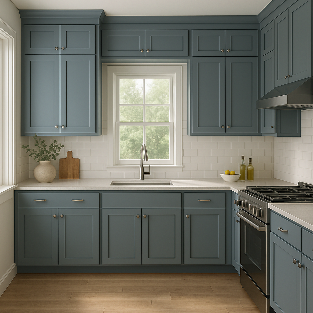
For a sleek, modern look, consider painting kitchen cabinets, built-in shelving, or furniture pieces in West (1671). This deep charcoal gray adds a touch of drama and elegance, especially when paired with polished hardware and clean lines.
West is equally stunning for exterior use, whether for siding, shutters, or front doors. Its cool undertones ensure it looks crisp in natural light, giving your home a contemporary yet classic curb appeal.
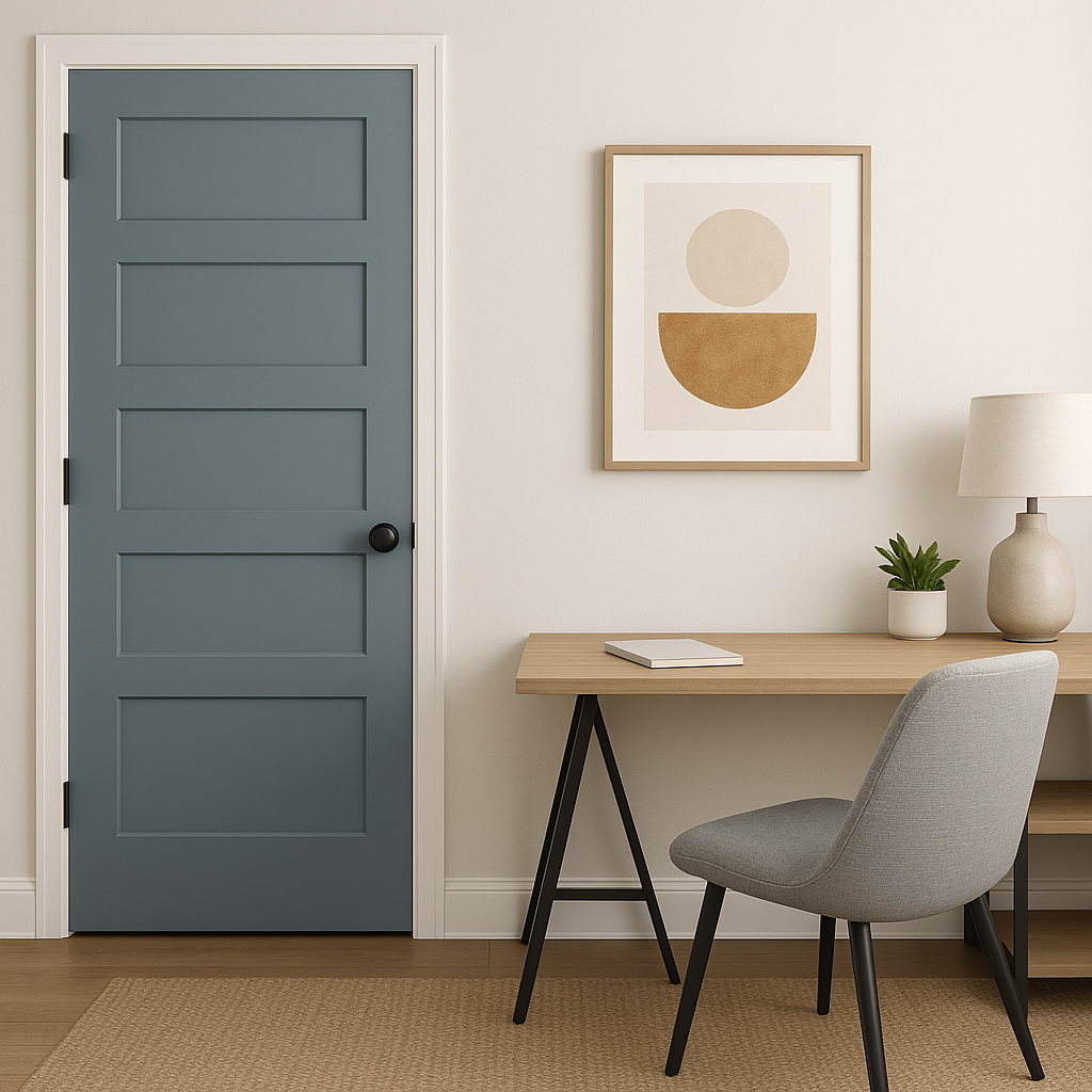
For a bold statement, use West (1671) on ceilings or trim for contrast against lighter wall colors. This unconventional use can add depth and architectural interest to your space.
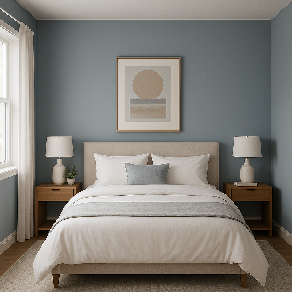
Create an intimate and cozy atmosphere by painting entire rooms in West (1671). It works beautifully in home offices, reading nooks, or media rooms where you want to encourage relaxation and focus.
Benjamin Moore West (1671) is a designer’s dream, offering the perfect blend of drama and versatility. Its ability to complement a wide range of colors, textures, and design styles makes it an ideal choice for homeowners seeking a bold yet adaptable hue. Whether your aesthetic leans modern, traditional, or somewhere in between, West (1671) provides the depth and character needed to elevate your space with timeless appeal.
View Colors Only by Brand (No Imagery):
Sherwin-Williams
|
Benjamin-Moore
|
Behr
|
Valspar
Live on the Eastern Slope of Colorado and looking for a local painting professional, check out all our painting services and reach out for a free estimate.
Copyright © 2026 : Wild Fox Painting Inc. : 12435 Mead Way, Littleton, CO 80125


